
Unlocking the Power of Effective Forms
Effective forms are crucial for capturing leads, boosting conversions, and gathering essential data. This listicle presents eight form design best practices to help you create user-friendly forms that drive results. Learn how single-column layouts, clear labels, and minimalist design, among other techniques, can transform your forms into powerful tools. Whether you're a freelancer, marketer, event planner, or researcher, implementing these form design best practices will improve user experience and maximize your data collection efforts.
1. Single-Column Layout
One of the most fundamental form design best practices is utilizing a single-column layout. This approach presents form fields vertically in a single column, creating a clear visual hierarchy and a straightforward path for users to follow. By mimicking the natural top-to-bottom reading pattern prevalent in most Western cultures, single-column layouts simplify the form completion process and reduce cognitive load. This streamlined experience guides users through the form with minimal effort, making it easier for them to provide the necessary information. This practice is crucial for anyone looking to optimize their forms for better conversion rates and user experience, from freelancers capturing leads to large organizations managing complex applications.

Single-column layouts are characterized by the vertical alignment of all form fields, creating a clear visual progression path. Labels are typically left-aligned and consistent throughout the form. This approach significantly reduces cognitive load compared to multi-column layouts, where users must scan horizontally and vertically to determine the correct input order. This inherent simplicity also translates into better mobile responsiveness, making single-column layouts a natural fit for various devices.
This simple yet effective design offers numerous benefits. It improves completion rates by providing a clear, unambiguous path forward. Users don't need to decipher where to go next, which reduces cognitive load and frustration. The inherently responsive nature of single-column layouts makes them ideal for mobile users, eliminating the need for extensive redesign or adaptation. Furthermore, single-column forms are easier for screen readers and other accessibility tools to interpret, improving usability for users with disabilities. Finally, displaying validation messages becomes more straightforward, as the linear flow ensures that feedback appears directly below the corresponding field.
While single-column layouts are generally beneficial, they do have some potential drawbacks. They can sometimes make forms appear longer than they are, potentially intimidating users. Lengthy forms might require more scrolling, although this is often less of a concern than the cognitive overhead of multi-column layouts. In cases where fields have a logical grouping (e.g., first name/last name), a side-by-side arrangement within the single column, or even breaking into a two-column structure for that specific section, can be more user-friendly.
Several successful companies leverage the power of single-column layouts. Mailchimp's signup forms are a prime example of clean, single-column design. Stripe Checkout utilizes a focused single-column approach to streamline the payment process. Even for complex multi-step processes, Airbnb's booking forms maintain a single-column structure to guide users efficiently.
To effectively implement single-column layouts in your form design best practices, consider these tips:
- Use white space: Create visual "chunks" between fields for improved readability.
- Consistent alignment: Maintain consistent left alignment for both labels and input fields.
- Multi-step approach: For very long forms, break them down into smaller, more manageable steps.
- Prioritize key fields: Position the most important fields at the top of the form.
- Adaptive widths: Use a wider column (400-500px) on desktop and full width on mobile devices.
The effectiveness of single-column layouts has been championed by influential figures in the field of user experience. Luke Wroblewski, in his book "Web Form Design," advocated strongly for this pattern. Research by the Nielsen Norman Group on form usability consistently reinforces the benefits of single-column design. These principles are further echoed in Material Design and Apple's Human Interface Guidelines. By implementing this best practice, you can significantly improve the usability and conversion rates of your forms.
2. Clear and Concise Labels
Clear and concise labels are a cornerstone of effective form design best practices. They directly impact a user's ability to understand, complete, and submit a form accurately and efficiently. Essentially, labels tell the user exactly what information is required in each input field. Without clear labels, users are left guessing, leading to frustration, errors, and ultimately, form abandonment. This is crucial for freelancers, solopreneurs, marketing teams, and anyone else using forms to collect information.
How Clear Labels Work:
Effective labels function as miniature instructions, guiding the user through the form. They provide context and meaning to the input fields. By using descriptive yet concise language, labels eliminate ambiguity and ensure that users provide the correct information in the correct format. This simple aspect of form design best practices significantly improves the user experience.
Features of Effective Labels:
- Descriptive yet concise text: Labels should use as few words as possible while still accurately describing the requested information. For example, "Email Address" is preferable to "Please enter your email address where we can contact you."
- Consistent positioning: Labels should be placed consistently relative to their corresponding input fields. Generally, placing labels above the fields works best for desktop layouts, while left-aligned labels are often preferred for mobile-first designs due to limited screen width.
- Clear visual connection to their corresponding inputs: The label should be visually linked to the input field it describes through proximity and potentially through visual cues like color and spacing.
- Proper use of sentence case or title case: Sentence case ("First name") is generally recommended for better readability, particularly on the web. Avoid all caps ("FIRST NAME") as it can be perceived as shouting.
- Explicit wording: Avoid using jargon, abbreviations, or clever language that might be confusing to some users. Clarity is paramount.
Pros of Using Clear and Concise Labels:
- Reduces confusion: Users understand exactly what information is required.
- Improves form completion accuracy: Clear instructions lead to accurate data input.
- Enhances accessibility: Screen readers rely on labels to convey information to visually impaired users.
- Reduces the need for additional help text: Well-written labels often eliminate the need for lengthy explanations.
- Minimizes user frustration and abandonment: A smooth, easy-to-understand form encourages completion.
Cons of Focusing on Clear Labels:
- Balancing brevity and clarity: It can be challenging to convey all necessary information concisely.
- Pressure to use branded language: Marketing teams may push for labels that prioritize branding over clarity, potentially confusing users.
- Internationalization challenges: Translating labels while maintaining clarity and conciseness can be complex.
Examples of Successful Implementation:
- Gov.uk: Known for its exceptional use of plain language in its forms, providing clear and unambiguous labels.
- Apple: Uses simple, direct labels like "Email" and "Password" in its account creation forms.
- Amazon: Employs precise labels like "Shipping Address" throughout its checkout process.
Actionable Tips for Implementing Clear and Concise Labels:
- Consistent positioning: Place labels above input fields for mobile-first designs and consider left-alignment for desktop.
- Sentence case: Use sentence case (e.g., "Email address") for improved readability.
- Avoid colons: Unless absolutely necessary for visual hierarchy, avoid using colons after labels.
- Include units of measurement: Specify units when applicable (e.g., "Height (cm)").
- User testing: Test your labels with actual users to identify any points of confusion.
Why Clear Labels Deserve a Place in Form Design Best Practices:
Clear and concise labels are fundamental to a positive user experience. They contribute directly to increased completion rates, reduced errors, and improved accessibility. By prioritizing clarity, you empower users to interact with your forms efficiently and effectively, ultimately benefiting both the user and your business or organization. This is particularly relevant for diverse target audiences, including freelancers, marketers, event planners, HR professionals, researchers, and educators, all of whom rely on forms for various crucial tasks. Following these form design best practices allows for more efficient lead capture and higher conversion rates.
Popularized By:
The importance of clear and concise labels has been championed by usability experts like Caroline Jarrett, author of "Forms that Work," and Jakob Nielsen, whose usability heuristics emphasize clarity and efficiency. The GOV.UK Design System also provides a strong example of the practical application of this principle.
3. Meaningful Error Messages
Error messages are an often-overlooked aspect of form design, yet they play a crucial role in the user experience. Instead of simply pointing out a mistake, effective error messages guide users towards the correct input, transforming a potentially frustrating experience into a seamless one. They clearly indicate what went wrong and precisely how to fix it, appearing at the exact moment and location where users need guidance. This ensures users don't abandon the form out of confusion or frustration, ultimately leading to higher completion rates and improved data quality.

Meaningful error messages are characterized by several key features: proximity to the field with the error, a clear visual indication (typically red text and/or icons), specific instructions for correction, real-time validation where appropriate, and non-technical, human-friendly language. For instance, instead of a generic "Invalid input" message, a well-crafted message would say "Please enter a valid email address, including the '@' symbol." This provides the user with the exact information they need to correct the error.
Examples of Successful Implementation:
- Mailchimp: Uses friendly, conversational error messages like "We need this information" instead of the more sterile "This field is required."
- Netflix: Provides specific password requirement feedback in real-time as users type, guiding them towards creating a strong password that meets their criteria.
- Amazon: Highlights errors in red with clear instructions on what needs correction, ensuring a smooth checkout process.
Pros of Meaningful Error Messages:
- Significantly reduces form abandonment when errors occur.
- Helps users quickly identify and fix problems.
- Prevents frustration from repeated submission attempts.
- Educates users about form requirements, leading to better data quality and accuracy.
Cons of Meaningful Error Messages:
- Can be technically challenging to implement field-specific error messages, requiring more development effort.
- Real-time validation, if poorly implemented, can be distracting to users.
- Developers often default to generic error messages without UX input, neglecting the importance of user-friendly guidance.
Tips for Implementing Meaningful Error Messages:
- Proximity: Place error messages near the relevant field, not just at the top of the form. This immediately draws the user's attention to the specific issue.
- Visual Cues: Use color and icons to distinguish errors, but ensure sufficient contrast and don't rely solely on color for accessibility reasons.
- Clarity: Write messages in plain language that explains how to fix the issue, not just what is wrong.
- Real-Time Validation: Consider real-time validation for complex fields like passwords or email addresses to provide immediate feedback.
- Testing: Thoroughly test error scenarios with real users to identify any potential usability issues and ensure clarity.
Why Meaningful Error Messages Deserve a Place in Best Practices:
Meaningful error messages are essential for creating a positive user experience and improving form completion rates. They directly address Steve Krug's usability principle of "Don't Make Me Think" by providing clear and concise guidance, minimizing user effort and frustration. This is especially important for freelancers, marketers, event planners, HR professionals, and researchers who rely on forms for lead generation, data collection, and various other critical tasks. By guiding users through the process smoothly, even when mistakes happen, meaningful error messages contribute significantly to a more efficient and user-friendly experience. This best practice is supported and popularized by resources such as Formulate by Adam Silver, Material Design's error state guidelines, Nielsen Norman Group research on form errors, and reinforces the core principles of user-centered design.
4. Logical Field Grouping and Progressive Disclosure
One of the most effective form design best practices for boosting completion rates and creating a positive user experience is logical field grouping and progressive disclosure. This technique simplifies complex forms by breaking them down into smaller, more manageable chunks, presented in a logical sequence. It leverages visual cues, multi-step processes, and conditional logic to guide users through the form, revealing only the relevant fields at each stage. This minimizes cognitive load and makes the overall process less daunting.
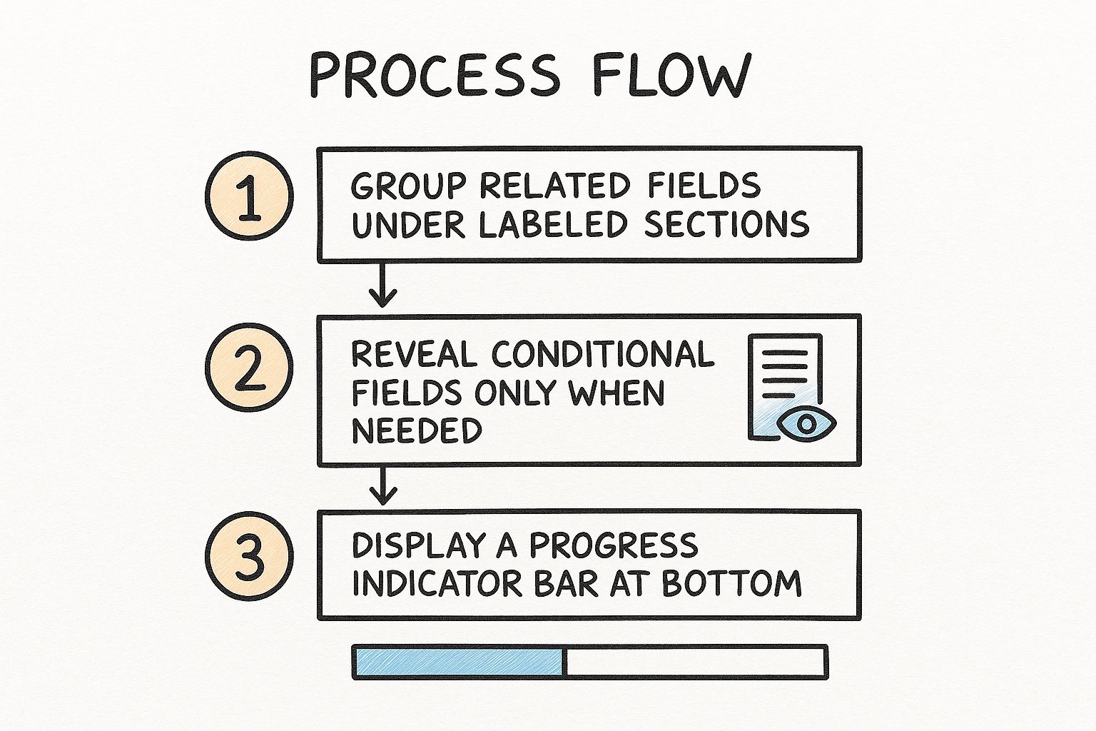
The infographic above visualizes the process of optimizing a form using logical grouping and progressive disclosure. It starts with identifying related fields and then groups them into logical sections. Next, it demonstrates how conditional logic can be used to show only relevant fields based on user input. Finally, it highlights the importance of clear progress indicators in multi-step forms. By following these steps, forms become more user-friendly and encourage higher completion rates.
This approach offers numerous benefits. By grouping related fields together visually, using clear labels for sections, and employing a logical sequence that mirrors the user's thought process, forms become significantly less overwhelming. This contributes to improved completion rates and allows users to focus on one topic at a time. Multi-step forms with clear progress indicators offer natural break points, enabling users to save their progress and return later. Conditional logic further enhances personalization by displaying only the fields relevant to each individual user.
Examples of successful implementations include TurboTax's guided tax filing process, Typeform's conversational forms, Shopify's structured merchant onboarding, and adaptive health insurance applications. These examples demonstrate the versatility of this technique across diverse industries and use cases.
However, there are some potential drawbacks to consider. Multi-step forms can sometimes obscure the total length and commitment required, and poorly implemented progressive disclosure can make forms feel unnecessarily complex. This approach can also increase development complexity and testing requirements. Additionally, reviewing all answers before submission can be slightly more challenging in multi-step forms.
Tips for Implementing Logical Field Grouping and Progressive Disclosure:
- Group fields by topic or purpose: Create clear sections like "Contact Information," "Payment Details," or "Product Preferences."
- Use visual cues: Employ background colors, borders, or whitespace to delineate sections and improve readability.
- Progress indicators: For multi-step forms, always include a clear progress indicator and allow back/forward navigation.
- Optional sections: Consider allowing users to skip optional sections to streamline the process.
- User testing: Conduct thorough testing with real users to ensure your grouping and flow make logical sense to them.
This form design best practice is particularly valuable for freelancers, solopreneurs, marketing and sales teams, event planners, HR professionals, researchers, and educators who need efficient and engaging ways to collect information from their target audience. Logical field grouping and progressive disclosure, popularized by platforms like Typeform and principles from human-computer interaction research and Material Design guidelines, deserves its place in this list due to its proven ability to enhance user experience and drive form completion rates. By thoughtfully implementing these techniques, you can transform potentially cumbersome forms into streamlined, user-friendly experiences.
5. Minimalist Design and Field Reduction
One of the most impactful form design best practices is embracing minimalist design and field reduction. This approach centers around eliminating all unnecessary fields and visual clutter to create the simplest, most streamlined user experience possible. The core principle is that every field added to a form increases the cognitive load on the user and decreases the likelihood of completion. Therefore, every piece of information requested should be essential and justified. This is critical for maximizing conversions and achieving your form's objective, whether it's lead generation, event registration, or data collection.
Minimalist form design isn't just about aesthetics; it's about optimizing for completion. Features of this approach include: only including absolutely necessary fields; a clear visual distinction between required and optional fields (if optional fields are even included at all); a clean, distraction-free visual design; the use of default values and smart predictions where appropriate; and the elimination of redundant information collection (e.g., asking for both city and zip code when one can be derived from the other).
The benefits of this minimalist approach are substantial. It dramatically improves completion rates – studies have shown that removing even a single field can significantly increase conversions. It reduces user cognitive load and frustration, leading to a smoother and more positive experience. Furthermore, it speeds up completion time, a particularly important factor for users on mobile devices. Finally, and perhaps most importantly, it shows respect for users’ time and privacy by only asking for what is truly needed. This respect builds trust and encourages engagement.
However, there are potential downsides to consider. Adopting minimalist design may mean sacrificing the collection of "nice-to-have" marketing or business intelligence data. It can also require more sophisticated back-end systems to infer missing data points or connect disparate pieces of information. Furthermore, internal stakeholders often resist removing fields they perceive as valuable, even if their necessity isn't supported by data.
Examples of successful minimalist form design abound:
- Google's search form: Arguably the most used form on the internet, it consists of a single field yet allows users to perform incredibly complex searches.
- Amazon's "Buy Now": This one-click purchasing option eliminates entire checkout forms, streamlining the buying process.
- Medium's signup: Initially, Medium only asks for an email address, collecting further information later as needed, embodying the principle of gradual engagement.
- Apple Pay: This payment system minimizes checkout friction by eliminating redundant address and payment fields.
To implement minimalist design principles in your own forms, consider these actionable tips:
- Audit every field: Ask yourself, "What would happen if we removed this?" If the impact is minimal, seriously consider removing the field.
- Mark optional fields clearly (or remove them entirely): Optional fields often add unnecessary complexity. If possible, collect this information later in the user journey.
- Progressive data collection: Consider collecting additional information progressively after core tasks are completed.
- Smart defaults: Use smart defaults based on common selections or previous user behavior to reduce input effort.
- Browser autofill: Leverage browser autofill capabilities for standard fields like name, address, and email.
The minimalist approach to form design, popularized by concepts like Luke Wroblewski's "gradual engagement" and backed by research from experts like Jared Spool, demonstrates that less truly can be more. It's a crucial best practice for anyone aiming to improve form completion rates and create a more user-friendly experience. This philosophy, with roots in design movements like Bauhaus, has been adopted by companies like Basecamp, pioneers in simplified signup processes. By prioritizing essential information and streamlining the user experience, minimalist form design delivers significant benefits for both businesses and users.
6. Microcopy and Contextual Help
Microcopy and contextual help are crucial for creating user-friendly forms that encourage completion and minimize frustration. This form design best practice involves using small, strategically placed text snippets to guide users through the process, providing clarification and support exactly when and where they need it. Instead of overwhelming users with lengthy instructions upfront, microcopy and contextual help integrate seamlessly within the form itself, maintaining a clean design while offering invaluable assistance. This approach proves invaluable for freelancers, solopreneurs, marketing teams, event planners, HR professionals, researchers, and educators alike, streamlining data collection and boosting user engagement.
Microcopy refers to those concise bits of instructional text placed near form fields. Contextual help expands on this, incorporating elements like tooltips, hints, and examples that appear when needed. These elements work together to create a more intuitive and supportive form experience.
Features of Effective Microcopy and Contextual Help:
- Short, helpful text snippets: Clarify requirements without overwhelming the user.
- Field-specific examples: Demonstrate correct formatting (e.g., date formats, phone numbers).
- Tooltips or expandable help text: Provide more detailed explanations for complex fields.
- Placeholder text: Illustrates the expected input (best used for examples, not instructions).
- Progressive disclosure of help: Reveals more information only when the user interacts with a specific field.
Pros:
- Proactive assistance: Answers user questions before they arise, reducing confusion.
- Improved data quality: Clearer instructions lead to fewer errors and more accurate submissions.
- Clean design: Provides guidance without cluttering the main form interface.
- Reduced support requests: Empowers users to complete the form independently.
- Enhanced user experience: Creates a more conversational and human interaction.
Cons:
- Potential for clutter: Overuse can make the form appear busy and overwhelming.
- Placeholder text limitations: Disappearing placeholder text can create usability issues if it contains vital instructions.
- Writing and editing effort: Crafting concise and effective microcopy requires careful attention.
- Translation challenges: Adapting microcopy for different languages and cultures adds complexity.
Examples of Successful Implementation:
- Slack: Explains why they need certain information during signup, building trust and transparency.
- Stripe: Uses subtle examples within payment forms to show correctly formatted card numbers.
- Dropbox: Provides real-time password strength indicators with specific suggestions for improvement.
- MailChimp: Employs a conversational tone in their form microcopy to guide users through complex options.
Actionable Tips for Implementing Microcopy and Contextual Help:
- Explain the "why": Tell users why you need specific information, not just what to enter.
- Show, don't just tell: Use format examples for complex inputs like dates, phone numbers, or credit card numbers.
- Use placeholder text strategically: Reserve placeholders for examples, not crucial instructions.
- Keep it concise: Aim for one line of help text whenever possible.
- Test and iterate: Conduct user testing to identify areas where more (or less) explanation is needed.
Why Microcopy and Contextual Help Deserve a Place in Form Design Best Practices:
This approach significantly enhances user experience and form completion rates. By providing concise, targeted assistance at the point of need, microcopy and contextual help empower users to navigate forms with confidence, resulting in more accurate data and a smoother overall process. It's a key element in creating forms that are not just functional, but truly user-centered. This is particularly important for target audiences seeking scalable lead capture, increased conversions, streamlined event registrations, efficient application collection, or effective survey distribution. By implementing these best practices, you can transform your forms from potential points of friction into valuable tools for engagement and data collection.
7. Accessible Form Design
Accessible form design is crucial for ensuring your forms can be used by everyone, including people with disabilities. This best practice prioritizes inclusivity by focusing on how users interact with your forms, regardless of their abilities or the assistive technologies they may use. This approach leverages semantic HTML, proper labeling, keyboard navigability, and support for assistive technologies to create a positive and inclusive experience for all. By prioritizing accessibility, you are not only opening your services and content to a wider audience, but also demonstrating corporate social responsibility and adhering to legal requirements. This ultimately leads to a better user experience for all users.
Here's why accessible form design deserves its place among the best practices: It directly addresses the needs of the 15-20% of the population with disabilities, and often improves usability for everyone. Accessible forms are also more likely to comply with legal requirements such as the Americans with Disabilities Act (ADA), Section 508, and the Web Content Accessibility Guidelines (WCAG). Furthermore, accessibility practices often align with search engine preferences, boosting your SEO.
Key Features of Accessible Forms:
- Proper Semantic HTML5 Elements: Utilize elements like
<form>,<label>,<input>,<select>,<textarea>,<button>,<fieldset>, and<legend>to structure and provide meaning to form elements. This allows assistive technologies to accurately interpret and convey the form's purpose and functionality to users. - ARIA Attributes (Where Needed): For complex interactions that standard HTML doesn't fully cover, use Accessible Rich Internet Applications (ARIA) attributes to provide additional context and instructions to assistive technologies.
- Sufficient Color Contrast: Ensure sufficient contrast between text and background colors, as well as for interactive elements, to make them easily discernible for users with low vision.
- Keyboard Navigability: All interactive elements within the form should be accessible and operable using only a keyboard, allowing users who cannot use a mouse to navigate and complete the form.
- Support for Assistive Technologies: Forms must be compatible with screen readers (like NVDA, JAWS, and VoiceOver), voice recognition software, and other assistive technologies.
- Programmatically Associated Error Messages: Error messages must be clearly and programmatically associated with the corresponding input fields, enabling assistive technologies to convey the error to the user.
Pros:
- Increased Inclusivity: Makes forms usable for people with a wide range of disabilities.
- Improved Overall Usability: Often enhances the user experience for all users, not just those with disabilities.
- Legal Compliance: Ensures compliance with accessibility regulations.
- SEO Benefits: Aligns with search engine best practices.
- Positive Brand Image: Demonstrates corporate social responsibility.
Cons:
- Development Overhead: Requires careful attention to detail during development and thorough testing.
- Design Constraints: May limit some visual design choices.
- Training Needs: Team members may require additional training or expertise in accessibility.
Examples of Accessible Forms:
- GOV.UK: Known for its simple and highly accessible forms adhering to strict accessibility guidelines.
- Deque's Pattern Library: Provides practical examples of accessible form components and best practices.
- Bank of America: Maintains WCAG 2.1 AA compliance for its online banking forms.
- PayPal: The checkout process supports screen readers and keyboard navigation, ensuring accessibility for users with disabilities.
Actionable Tips for Creating Accessible Forms:
- Proper Label Use: Always use
<label>elements and associate them correctly with input fields using theforattribute. - Field Grouping: Use
<fieldset>and<legend>to group related fields, improving clarity and navigation. - Keyboard Accessibility: Ensure all interactive elements are accessible and operable using only the keyboard.
- Screen Reader Testing: Test forms with screen readers like NVDA, JAWS, or VoiceOver to identify and fix accessibility issues.
- Avoid Color-Only Indicators: Don't rely solely on color to indicate errors or required fields. Use additional visual cues, such as icons or text.
- Sufficient Color Contrast: Maintain a minimum contrast ratio of 4.5:1 for text and 3:1 for large text.
- Programmatic Error Linking: Ensure error messages are programmatically linked to their respective input fields using ARIA attributes.
Resources and Influencers:
- WebAIM (Web Accessibility in Mind): Provides valuable resources and training on web accessibility.
- W3C Web Accessibility Initiative (WAI): Develops international standards and guidelines for web accessibility.
- Marcy Sutton: A prominent accessibility advocate and engineer.
- The A11Y Project: Offers practical guidance and tools for implementing accessibility.
By following these best practices and dedicating the necessary development attention, you can create forms that are inclusive, user-friendly, and compliant with accessibility standards, leading to a better experience for all users and reinforcing positive form design best practices.
8. Mobile-First Responsive Design
In today's mobile-driven world, prioritizing mobile users is no longer a luxury, but a necessity for effective form design best practices. Mobile-first responsive design flips the traditional approach on its head, starting with the smallest screen size (typically mobile) and then progressively enhancing the design for larger screens like tablets and desktops. This ensures your forms are not only functional but also provide a seamless and enjoyable user experience across all devices.
This approach is crucial because over 50% of web traffic globally comes from mobile devices. People are using their smartphones and tablets to shop, register for events, submit applications, and complete countless other tasks that involve online forms. Failing to optimize for these users means potentially losing a significant portion of your audience and hindering your conversion rates.
How it Works:
Mobile-first responsive design starts by designing the core functionality and content for a small screen. This forces designers to prioritize the most essential elements and create a streamlined experience. As the screen size increases, additional features and content are progressively added, enhancing the experience for larger screens without compromising the mobile experience. This is often achieved using techniques like flexible grids, flexible images, and media queries in CSS.
Features of Mobile-First Form Design:
- Touch-friendly tap targets: Buttons and interactive elements should be at least 44×44 pixels to accommodate finger taps.
- Simplified layouts: Content should be organized in a clear, vertical hierarchy that works well on narrow screens, avoiding clutter and unnecessary elements.
- Optimized input types: Using HTML5 input types like
email,tel,date, andnumbertriggers the appropriate mobile keyboard, simplifying data entry for users. - Minimal typing requirements: Wherever possible, reduce the amount of typing required by using features like auto-complete, selection lists, and pre-filled data.
- Responsive design: The form should adapt seamlessly to any screen size, ensuring a consistent experience across devices.
- Performance optimization: Forms should be optimized to load quickly even on slow mobile connections, minimizing bounce rates and frustration.
Pros:
- Accommodates the majority of web traffic: Caters to the growing number of mobile users.
- Forces prioritization of essential content: Leads to cleaner and more effective forms.
- Creates better experiences in constrained environments: Considers limited screen space, bandwidth, and processing power.
- Improves overall conversion rates: A positive mobile experience translates to higher completion rates.
- Satisfies Google's mobile-friendly ranking criteria: Boosts your website's visibility in search results.
Cons:
- May not fully utilize larger screens: Some designers find it challenging to maximize the available space on desktop displays while maintaining a mobile-first approach.
- Requires thorough testing: Ensuring compatibility across various devices and operating systems can be complex.
- May limit complex interactions: Certain intricate interactions that are easily implemented on desktop might be challenging to replicate on mobile.
Examples of Successful Implementation:
- Twitter's mobile sign-up process: Employs appropriately sized fields and buttons for easy touch interaction.
- Uber's app forms: Utilizes native input types to simplify mobile data entry.
- Instagram's registration: Optimized for touch interaction and mobile keyboards.
- Mobile banking apps: Leverage device capabilities like fingerprint scanning for streamlined authentication.
Actionable Tips for Implementation:
- Use HTML5 input types: Employ
email,tel,date, etc., for appropriate mobile keyboards. - Design large tap targets: Ensure interactive elements are at least 44×44 pixels.
- Position labels above fields: Improves usability on narrow screens.
- Consider alternative input methods: Offer options like selection from lists instead of typing.
- Test on actual mobile devices: Don't rely solely on simulations.
- Prevent horizontal scrolling: Ensure form elements fit within the screen width.
Why Mobile-First Deserves its Place in Form Design Best Practices:
Mobile-first responsive design is no longer a trend but a fundamental principle of good form design. It recognizes the shift in user behavior and prioritizes the experience of the majority of internet users. By adopting this approach, you can create forms that are not only accessible but also user-friendly, leading to increased engagement, higher conversion rates, and ultimately, greater success. This is essential for freelancers, marketing teams, event planners, HR professionals, researchers, and anyone else seeking to connect with their audience effectively in today's mobile world. It's a key component of form design best practices and crucial for achieving your online goals.
8 Best Practices Comparison
| Best Practice | Implementation Complexity 🔄 | Resource Requirements ⚡ | Expected Outcomes 📊 | Ideal Use Cases 💡 | Key Advantages ⭐ |
|---|---|---|---|---|---|
| Single-Column Layout | Low 🔄 | Low ⚡ | Clear visual path, improved completion rates 📊 | Mobile & multi-step forms | Reduces cognitive load, mobile-friendly, accessible |
| Clear and Concise Labels | Low-Medium 🔄 | Low ⚡ | Reduced confusion, improved accuracy 📊 | Any form needing clarity | Enhances accessibility, reduces frustration |
| Meaningful Error Messages | Medium 🔄 | Medium ⚡ | Lower abandonment, quicker error resolution 📊 | Forms with validation needs | Specific, polite guidance improves data quality |
| Logical Field Grouping & Progressive Disclosure | Medium-High 🔄 | Medium-High ⚡ | Reduced overwhelm, better focus, higher completion 📊 | Complex/long forms needing organization | Makes forms manageable, personalized & saves progress |
| Minimalist Design & Field Reduction | Medium 🔄 | Low-Medium ⚡ | Higher conversion, faster completion 📊 | Any form prioritizing essential data | Reduces cognitive load, respects user privacy |
| Microcopy and Contextual Help | Medium 🔄 | Medium ⚡ | Fewer errors, better guidance, reduced support 📊 | Complex fields or confusing inputs | Provides timely help, conversational experience |
| Accessible Form Design | Medium-High 🔄 | Medium-High ⚡ | Inclusive usability, legal compliance 📊 | All forms, especially public/government | Enables all users, improves SEO, legal adherence |
| Mobile-First Responsive Design | Medium-High 🔄 | Medium-High ⚡ | Higher mobile conversions, better mobile UX 📊 | Mobile-heavy traffic or diverse devices | Optimized for touch, performance, broader reach |
Elevate Your Forms: Design for Success in 2025
From single-column layouts and concise labels to mobile responsiveness and accessibility, implementing these form design best practices is crucial for optimizing user experience and boosting conversions. By focusing on clarity, conciseness, and user-friendliness, you can significantly reduce form abandonment and gather more valuable data. Remember the key takeaways: prioritize minimalist design, use microcopy strategically, ensure your forms are accessible to all users, and always test and iterate based on user behavior. Mastering these concepts streamlines data collection, enhances user satisfaction, and ultimately drives success, regardless of whether you’re gathering leads, managing event sign-ups, or conducting research.
Optimizing your forms is just one part of creating a seamless user experience. To further enhance your online store’s performance, consider these ecommerce UX best practices from CartBoss which explore broader strategies for boosting conversions.
Prioritizing user-centric form design isn't just a best practice—it's a necessity. By creating forms that are both functional and enjoyable to use, you empower your audience, build stronger relationships, and achieve your business objectives more effectively. Ready to take your forms to the next level? Explore the power of AI-driven optimization with BuildForm, a platform designed to implement and automate these form design best practices, allowing you to focus on what matters most: connecting with your audience.
Article created using Outrank