The Evolution of Form Design: From Paper to Digital
From basic paper forms to interactive digital experiences, form design has come a long way. Early forms were static documents, filled out by hand and processed manually. This resulted in slow processing times and limited interaction.
However, the arrival of computers signaled a major change, leading to digital forms and the birth of modern user interface (UI) design. This shift has dramatically altered how we gather and manage information. Understanding the history of UI design offers valuable perspective on current form design principles.
The move from physical to digital reflects changing user expectations for a smooth, intuitive experience. The history of UI design, spanning over 50 years, traces this evolution, from rudimentary methods like stone carvings to the complex digital interfaces we use daily. This mirrors the broader trend away from command-line interactions and towards visually intuitive systems. Explore this topic further
The Rise of Digital Forms and the Impact of the GUI
The introduction of graphical user interfaces (GUIs) in the 1970s and 80s revolutionized how users interacted with computers. GUIs replaced complex command-line instructions with icons, windows, and the mouse. This made computers much easier for the average person to use. This increased accessibility spurred the development of the first digital forms.
The launch of Apple’s Macintosh in 1984 and the release of Windows 3.1 in 1992 were key moments in the popularization of the GUI. These advancements set the stage for the widespread adoption of digital forms.
From Desktop to Mobile: Adapting to New Devices
This initial transition to digital forms was just the first step. The rise of mobile devices introduced new design considerations. Smaller screens, touch-based input, and increasing user expectations for speed and efficiency demanded changes in form design.
This meant prioritizing touch-optimized layouts, larger input fields, and more streamlined user flows. Forms needed to be reimagined for the smaller screens and different interaction styles of mobile devices.
The Influence of User Experience (UX)
As technology progressed, the emphasis shifted from simply recreating paper forms digitally to optimizing the overall user experience (UX). UX principles became crucial in UI form design.
This focus on UX resulted in improvements like inline validation, real-time feedback, and personalized form experiences. These enhancements led to higher completion rates and greater user satisfaction. Forms evolved from mere data collection tools to key elements of a seamless and engaging online experience.
The objective is no longer just about capturing data; it's about creating a positive and efficient experience for the user. This highlights the significant impact of user-centered design principles on the billions of people who interact with technology every day.
Core Principles That Drive Form Completion Rates
User interface form design is about crafting an engaging experience that encourages users to complete the process. It involves understanding user interaction and optimizing for higher completion rates. Minimizing cognitive load, the mental effort needed to complete a task, is crucial. A lengthy, complex form with confusing instructions can easily overwhelm users and lead to form abandonment.
Strategic Simplicity and Visual Hierarchy
Strategic simplicity means using clear language, logical field grouping, and progressive disclosure to avoid overwhelming users. A well-defined visual hierarchy guides users through the form, showing them what to focus on and in what order. This is achieved using headings, subheadings, whitespace, and visual cues. Users can then quickly understand the questions and efficiently complete the form.
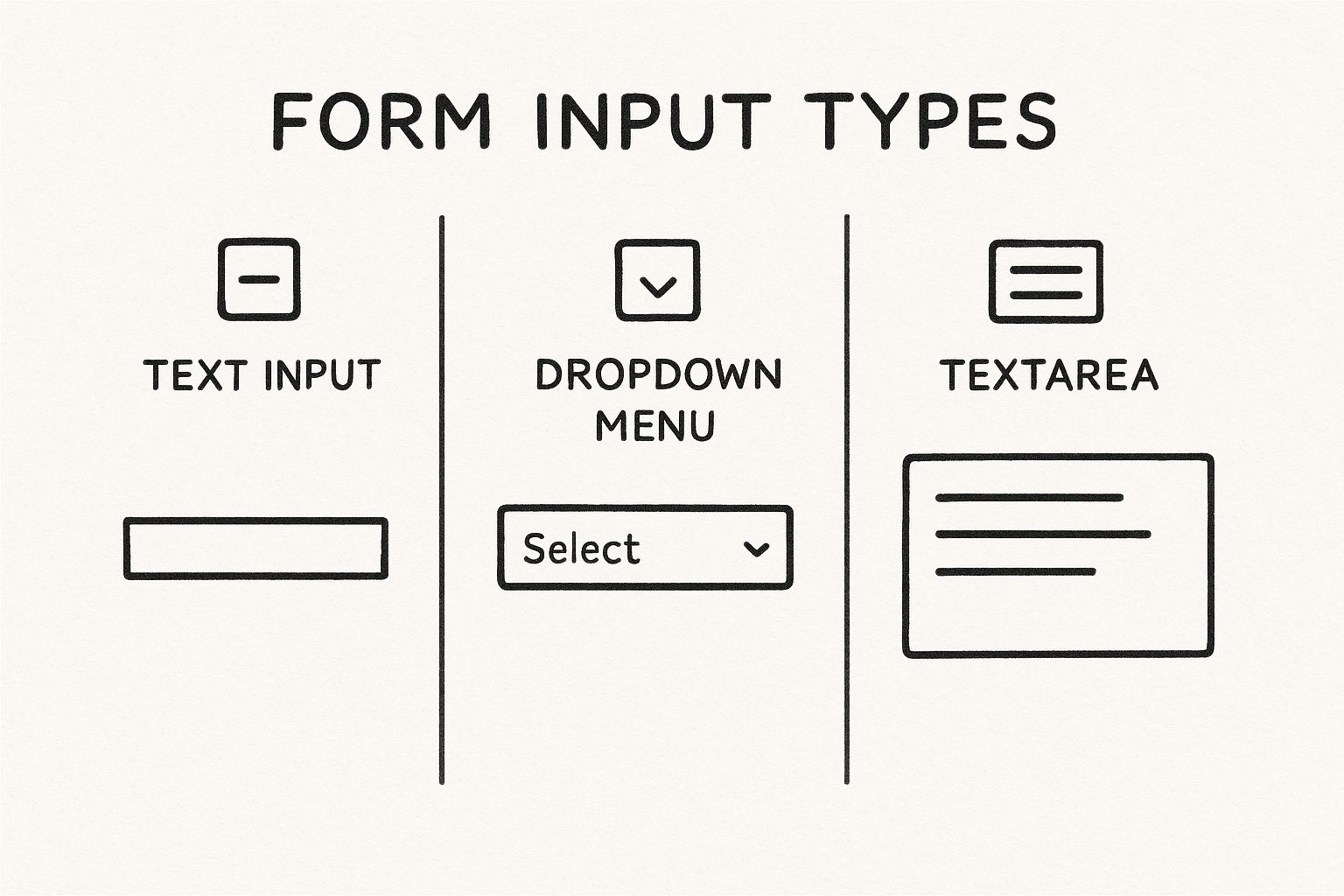
This infographic compares three common input types: text input, dropdown menu, and textarea. It illustrates how each input offers different levels of interaction and complexity. Selecting the appropriate input type for the data simplifies the experience and reduces errors.
Timing of Validation and User Feedback
Real-time validation, offering immediate feedback on user input, is essential. However, intrusive validation can be disruptive and frustrating. Validation should ideally occur after a user completes a field or section. Clear, concise error messages that guide correction are more helpful than generic error notifications. This allows users to focus on completion and reduces anxiety.
Form-based interfaces, while essential, are often seen as tedious. Studies show improved navigation and interactive elements reduce frustration. Well-designed forms can decrease abandonment by up to 30%, improving website conversion rates. Explore this topic further
To further illustrate best practices, let's examine a comparison of traditional and modern form design. The following table highlights the key differences and their impact on the user experience.
Form Design Principles Comparison
Comparison of traditional form design approaches versus modern best practices
| Design Element | Traditional Approach | Modern Best Practice | Impact on User Experience |
|---|---|---|---|
| Input Fields | Many fields on a single page | Grouped fields, multi-step forms | Reduced cognitive load, improved clarity |
| Validation | After form submission | Real-time validation with helpful error messages | Faster error correction, less frustration |
| Labels | Short, sometimes unclear labels | Descriptive labels and helpful tooltips | Improved understanding of required input |
| Layout | Dense, cluttered layout | Use of whitespace and visual hierarchy | Easier navigation, improved readability |
By adopting modern best practices, you can create forms that are not only more efficient but also more user-friendly. This leads to higher completion rates and a better overall experience.
Accessibility and Inclusivity
Accessibility is a core principle. Designing forms usable by everyone, regardless of ability, ensures broader access. This means following accessibility guidelines: providing labels and alternative text for images, sufficient color contrast, and ensuring keyboard navigation. Prioritizing accessibility benefits users and broadens your customer base, enhancing the effectiveness of your form design.
Touch-Optimized Forms That Drive Mobile Conversions
With more web traffic coming from mobile than desktop, user interface form design must prioritize the mobile user. This means designing forms that aren't just responsive, but actually optimized for touch interaction on smaller screens. It's a necessary change to meet the demands of how we interact with our phones.
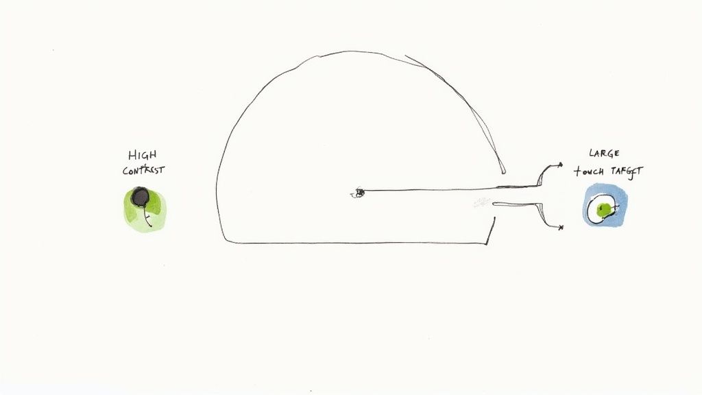
Optimizing for Tap Targets and Finger-Friendly Controls
One important factor is ensuring adequate tap targets. Interactive elements, like buttons and form fields, should be large enough for fingers to tap accurately. Aim for at least 44×44 pixels. Also, good spacing between these elements prevents frustration and allows accurate input.
Cramped checkboxes or radio buttons can lead to incorrect selections and higher form abandonment. Tiny dropdown menus are hard to navigate on touchscreens. Small details have a big impact on user experience. The rise of touchscreens significantly changed how we interact with devices. This technology, emerging in the 1990s and booming in the 2000s, made devices more intuitive and accessible. Learn more about the history of touch interfaces here
Implementing Smart Keyboards and Input Fields
Another element of touch-optimized forms is using smart keyboards. Matching the keyboard type to the expected input – numeric for phone numbers, email for email addresses – streamlines data entry and reduces errors. Also, using input masking guides users and ensures data consistency.
Input fields should be optimized for mobile with larger text and clear labels for better readability. Placeholders within input fields provide context and guidance. Thinking about form completion is vital. For surveys, there are proven strategies for improving survey response rates.
Responsive Design and Mobile-Specific Patterns
Responsive design ensures forms adapt to different screen sizes. Form elements adjust to maintain usability across various devices. Mobile-specific patterns, like steppers for multi-step forms, can further enhance the mobile experience.
This approach balances cross-platform usability with mobile optimizations. The goal is to create enjoyable forms on any device, maximizing completion rates and driving conversions. Tools like BuildForm can be helpful for optimizing forms for different screens and boosting conversion rates.
Error Handling That Guides Rather Than Frustrates
Form errors are unavoidable. But how you handle them within your user interface form design greatly affects user experience and completion rates. Instead of causing frustration, error messages should guide users towards a solution. Turn a potential roadblock into helpful guidance.
The Importance of Timely and Specific Feedback
Effective error handling begins with well-timed feedback. Validating input as the user types can be disruptive. It's better to validate after a field is completed or when the user moves on. This provides feedback without interrupting their workflow.
Generic messages like "Invalid input" are unhelpful. Error messages should pinpoint the problem and offer a solution. For example, if a password needs eight characters, the message could be: "Your password must be at least eight characters long." This clarity helps users quickly understand and fix the issue.
Visual Cues for Enhanced Clarity
Visual cues clearly communicate errors. Highlighting the field in red is common. But relying solely on color can be an accessibility issue for visually impaired users. Adding an error icon next to the field enhances visibility for everyone.
Error message placement is also important. Displaying the message below the field creates a clear visual connection. This guides the user directly to the problem and its solution. For more practical tips, check out this helpful resource: How to master form validation with practical examples.
Preventing Errors Through Smart Design
The best way to handle errors is to prevent them. Smart defaults, pre-filling fields with user data or common choices, minimizes errors. Field constraints, like character limits or input formats, guide users towards correct inputs.
Context-aware suggestions are another useful tool. For example, an address form can offer autocomplete for city and state. This improves accuracy and reduces errors. These proactive strategies create a smoother, more efficient user experience.
Real-World Examples and Implementation
Improved error handling has led to significant improvements in completion rates for many companies. One company saw a 15% increase in form submissions after streamlining their error messages and adding clear visual cues. Another reduced form errors by 20% by implementing smart defaults and field constraints.
These real-world examples show the importance of effective error handling. By implementing these strategies in your own user interface form design, you can build user-friendly and efficient forms.
The Psychology Behind High-Converting Form Design
Effective user interface (UI) form design involves more than just attractive visuals. It's about using psychological principles to guide how users interact with your forms. This means understanding how people perceive and process information, which ultimately impacts completion rates.
Cognitive Load and Perceived Effort
A core principle is the cognitive load theory. This theory posits that our working memory has limited capacity. Long, complex forms can easily overwhelm users. Often, perceived effort matters more than actual effort. A form might be short, but if it feels long because of a confusing layout or complex questions, users are more likely to abandon it.
For example, asking for a user's full address in one long text field can feel daunting. Breaking it into smaller, labeled fields for street address, city, state, and zip code is a small change with a big impact on user perception.
Additionally, the order you ask questions in affects completion rates. Starting with easy, familiar questions builds decision momentum, encouraging users to continue. More challenging or sensitive questions should be placed later, after this momentum has been established.
Visual Grouping and Reducing Abandonment
Visual grouping makes forms easier to scan and process, which reduces abandonment. Grouping related fields together visually – like personal information or payment details – clarifies the form's structure and lowers cognitive load. Think of it like organizing a closet: similar items grouped together are much easier to find. This helps users understand what's required and makes the process less intimidating. Learn more in this article about How to master user interface form design for increased conversions.
The Role of Emotion in Form Completion
Beyond cognitive factors, emotions play a crucial role. User confidence is essential. Clear instructions, helpful tooltips, and progress indicators reassure users and reduce anxiety. A progress bar or a simple "You're almost there!" can significantly boost completion rates.
Positive feedback loops also help. A simple "Thank you" after each section or a visual confirmation of saved progress creates a sense of accomplishment, encouraging users to continue. These small design elements can significantly impact user experience and, ultimately, conversion rates.
Designing for Satisfaction, Not Tedium
UI form design should aim for satisfaction, not tedium. By minimizing cognitive load, establishing clear visual hierarchy, and addressing emotional factors, you can design forms that feel rewarding to complete. This leads to higher completion rates and improved conversions. You might also be interested in How to master form validation with practical examples to further improve the overall form experience. Focusing on these aspects builds trust and encourages users to complete even longer or complex forms, ultimately achieving your business goals.
Measuring What Matters: Form Analytics That Drive Results
Effective form design relies on more than just a good eye. It requires data-driven decisions based on solid form analytics. Leading companies go beyond simple completion rates to truly understand how users interact with their forms. This allows them to identify problem areas and transform underperforming forms into lead-generating machines.
Beyond Completion Rates: Tracking Field-Level Interactions
While completion rates offer a general overview, they only tell part of the story. Tracking how users interact with each field provides a much deeper understanding. Click tracking shows which fields get the most attention, while time-on-field metrics pinpoint areas where users hesitate or struggle. This granular view reveals friction points that might otherwise go unnoticed. For example, if users consistently spend extra time on a particular field, it might signal a confusing label or a complicated input format.
Identifying Abandonment Patterns and Prioritizing Improvements
Understanding why users abandon forms is critical. Knowing where users drop off and which fields trigger the most exits helps pinpoint the biggest obstacles to completion. By addressing these high-friction areas, you can prioritize improvements for maximum impact. Just like well-crafted YouTube descriptions enhance SEO, clear and concise form instructions can significantly improve user experience.
Practical Techniques for Implementing Form Analytics
Several techniques can be used to implement form analytics. Basic tools often provide click tracking and time-on-field measurements. More advanced methods like eye-tracking or heatmaps visualize user attention and can reveal subtle usability issues that other metrics miss. A heatmap, for instance, might show users repeatedly clicking on a non-interactive element, highlighting a design flaw.
A Framework for Continuous Improvement
Form optimization is an ongoing process. To get started, focus on key metrics. The table below, "Form Performance Metrics Dashboard," outlines some of the most important ones to track.
To understand how well your forms are performing, tracking certain key metrics is crucial. The following table summarizes these metrics, their definitions, ideal target ranges, and how they impact conversion rates.
Form Performance Metrics Dashboard
Key metrics to track when evaluating form effectiveness
| Metric | Definition | Target Range | Impact on Conversion |
|---|---|---|---|
| Completion Rate | Percentage of users who complete the form | As high as possible, but industry benchmarks vary | Primary indicator of overall form effectiveness |
| Time to Completion | Average time users take to complete the form | As short as possible while maintaining accuracy | Indicates form efficiency and ease of use |
| Error Rate | Percentage of incorrect entries in form fields | As low as possible | Reveals usability issues and areas for improvement |
| Field-Level Drop-Off Rate | Percentage of users who abandon the form at a specific field | As low as possible | Pinpoints high-friction areas within the form |
| Conversion Rate | Percentage of form completions that lead to a desired outcome (e.g., purchase, signup) | Aligned with business objectives | Measures the effectiveness of the form in achieving its goal |
By tracking these metrics, analyzing user behavior, and implementing iterative changes, you can turn your forms into high-performing conversion engines. Systematic measurement based on real user interactions is the key to data-driven form optimization. This approach leads to higher completion rates, increased user satisfaction, and ultimately, better business results.
The Future of Form Design: Beyond Fields and Buttons
The world of user interface form design is constantly changing. While traditional forms with fields and buttons are still relevant, new technologies are pushing the boundaries of data collection and interaction. This necessitates adaptation and foresight from designers.
Conversational Interfaces and the Rise of Chatbots
A significant shift is toward conversational interfaces. Imagine chatbots and voice assistants guiding users through a form-like experience. Instead of static fields, users interact dynamically with an interface that asks questions and provides feedback conversationally. This can simplify the process and make it more engaging. However, research from the Nielsen Norman Group reveals potential drawbacks. Users might not double-check chatbot-provided information, assuming AI infallibility. Careful design is crucial to maintain accuracy and user trust.
Voice Input and Hands-Free Interactions
Voice input is another growing trend. Users speak their responses instead of typing, allowing for a hands-free experience. This is particularly beneficial for mobile forms, easing data entry on smaller devices. Imagine filling out a delivery address while driving—voice input increases both safety and convenience. As voice recognition technology improves, its integration into form design will likely increase.
The Power of AI-Powered Predictive Forms
Artificial intelligence (AI) is playing an increasingly important role in predictive forms. These forms anticipate user needs and auto-fill information based on past behavior or available data. This can save users time and effort while also improving data accuracy. Think of a form that remembers your shipping address and payment information, streamlining the checkout process.
Adapting to User Behavior for Breakthrough Conversions
Smart forms take this further by adapting to user behavior in real-time. They can adjust question order, provide prompts, or simplify fields based on user interaction. This personalization can significantly improve completion rates. For instance, if a user hesitates on a question, the form might offer extra information or rephrase the question for clarity.
Preparing for the Future of Form Design
How can you prepare for these innovations? First, embrace continuous learning and experimentation. Stay current with emerging trends in UI design. Second, test new technologies and approaches, measuring their impact on your audience. AI-powered tools like BuildForm are increasingly useful for optimizing form design and tracking interactions. Embrace experimentation and iteration. The future of form design is about crafting seamless, intelligent, and engaging experiences that collect information efficiently and effectively.
Ready to create forms that convert? BuildForm, an AI-powered form builder, can help you boost engagement and capture more leads without coding. Start building smarter forms today!