Why Most Forms Kill Conversions (And How To Fix Yours)
You've worked hard to get people to your website. Your content is interesting, and visitors are intrigued. But then they hit your form, and poof, they vanish. What happened? More often than not, it's a clunky form that killed the conversion.
Think of each field on your form as a little hurdle your user has to jump over. The more hurdles you place in their path, the less likely they are to complete the race. To keep users engaged, you need to streamline the process and focus on key areas that directly influence conversions. A great starting point is understanding best practices for improving website conversion rates, which are covered in this article about improving your website's conversion rates.
Cognitive Load: The Silent Conversion Killer
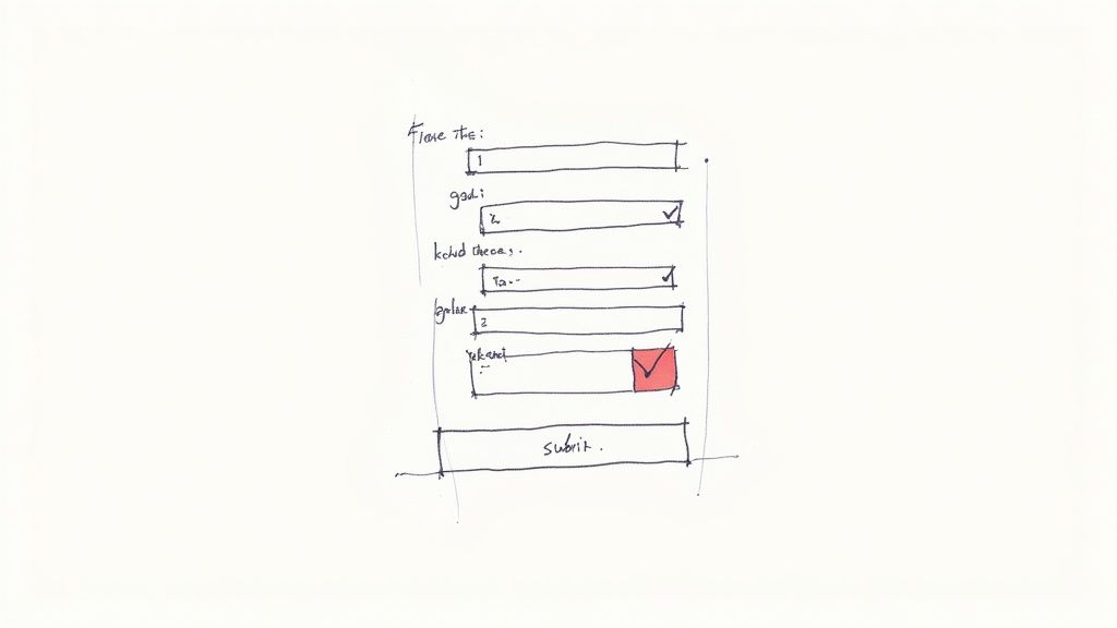
A long, 15-field signup form feels less like an invitation and more like an interrogation. This creates cognitive load, which is simply the mental effort required to complete a task. High cognitive load equals frustration, and frustration equals abandonment. A user's experience can quickly go from curious to annoyed. Even a professional-looking form can fail if it doesn't follow basic form design principles.
Form Design: A Brief History and Its Impact
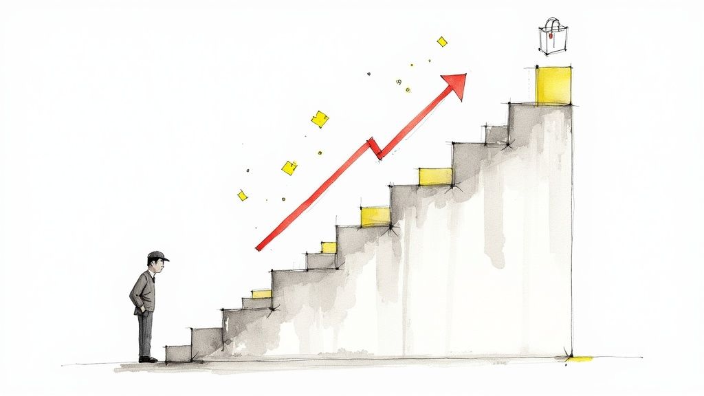
The design of web forms has come a long way. From the simple email sign-up boxes of the early internet to the mobile-responsive designs we see today, forms have gotten much more complex. Between 2004 and 2008, the rise of social media and e-commerce pushed form design to incorporate early UX principles. And for a good reason: optimized forms can boost conversion rates by 25% or more. Want to dive deeper into the history of form design? Check out this insightful article on form design evolution.
So, how do you actually fix your forms? It starts with understanding the psychology of your users and implementing key design principles. In the following sections, we'll explore these essential elements to help you transform your forms from conversion killers into conversion drivers.
The Psychology Behind Every Form Field Decision
Think of each field on your online form as a tiny conversation with your user. Every time you add another field, it's like asking for another favor – and we all know how that can go with a stranger! Understanding the psychology of form completion is crucial for boosting conversions. This means applying cognitive load theory to your signup process.
Even small tweaks, like shifting a single field, can dramatically affect how many people actually finish the form.
For example, eye-tracking studies reveal how easily user attention can wander. These studies underscore the importance of visual cues and smart form design to guide the user's focus. The entire journey, from initial click to that satisfying "submit" button press, is an emotional rollercoaster for the user.
Some fields feel natural; others, like climbing a hill. This is where thoughtful form design truly shines.
This is also where data-driven decisions become essential. Statistical methods are key to refining form design by analyzing user behavior and feedback. For instance, statistical analysis can pinpoint the most important fields for user engagement. Trimming unnecessary fields can increase completion rates, sometimes by as much as 11% per field. Discover more insights about statistical methods here.
A/B testing, another statistical tool, is invaluable for comparing different form versions. It helps identify design elements that lead to better conversions. By grasping and applying these principles, you can build forms that work with human psychology, not against it. Your ultimate aim? A smooth, effortless experience that gently guides users towards conversion.
Mobile-First Forms That Users Actually Complete
Over 60% of form submissions happen on mobile devices. Yet, so many forms are still designed with desktops in mind. This isn't just outdated; it’s a conversion killer. Mobile has changed the game for form design principles, impacting everything from button size to how we organize information.
Thumb-Friendly Design and Progressive Disclosure
Think about using your phone. Thumbs, right? That's why thumb-friendly interaction zones are so important. Buttons and fields need to be big enough to tap easily without mis-clicks. This small detail makes a big difference in how many people complete your forms. Progressive disclosure, revealing information bit by bit, is also key on smaller screens. Instead of one long, overwhelming form, break it into smaller, manageable steps.
Imagine booking a flight on your phone. A good form would ask for your origin and destination first, then your dates, and finally the passenger info. This feels less overwhelming and encourages users to keep going.
The way we design forms has been massively influenced by technology. As of 2020, mobile app design ideas, like micro-interactions and responsive design, are essential for web forms. Mobile-optimized forms can boost submission rates by up to 20%. Discover more insights about this evolution here. Plus, rules like GDPR have made clear consent and transparent data handling even more crucial for forms.
The Mobile Keyboard: Your Secret Weapon
The mobile keyboard isn't just for typing; it gives the user helpful clues. If someone's entering a phone number, the number pad should pop up. For email addresses, the "@" symbol should be readily available. These small cues reduce effort and errors. Similarly, micro-interactions, like a subtle highlight or a progress bar, make complex forms feel easier. Just being responsive isn't enough; you need to be mobile-optimized. Forms should feel like they belong on the device, not like they've been squeezed onto the screen.
Visual Design That Guides Users To Success
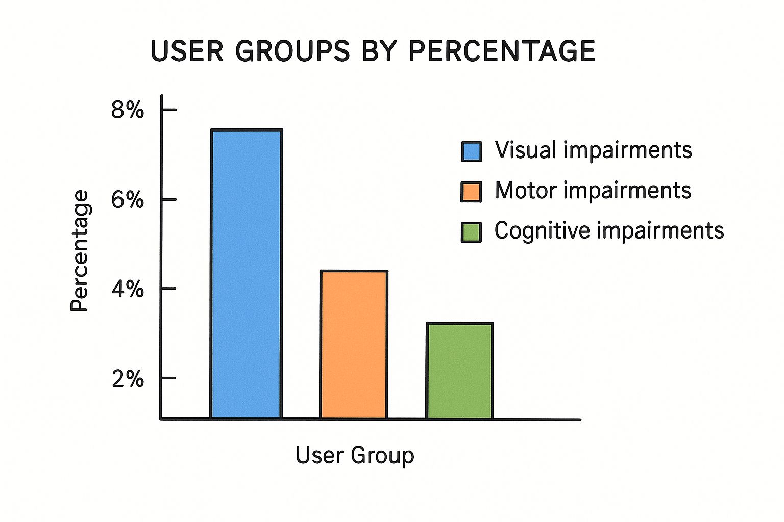
The infographic above highlights some important accessibility statistics. 8% of users experience visual impairments, 4% face motor impairments, and 2% have cognitive impairments. This tells us that inclusive design isn't just a nice-to-have, it's essential for reaching a significant portion of your potential audience. Even small visual improvements can make a big difference in how easily people can use and complete your forms.
Visual design in form design principles goes beyond simply making things look pretty. It's about creating a clear path for your users to follow. Think of it like designing a well-marked trail through a forest. Good visual design leads users smoothly to their destination, while poor design leaves them lost and frustrated.
The Power of Visual Hierarchy
Effective forms use visual hierarchy to guide the user's eye. This means using elements like size, color, and contrast to emphasize key parts of the form. A large, brightly colored submit button, for example, naturally attracts attention and encourages users to complete the form. Think of it like using bold text in a document to highlight the most important points.
Similarly, highlighting required fields helps ensure users don't miss essential information.
Spacing and Typography: Creating Breathing Room
White space, the empty space around elements, is like giving your form room to breathe. It prevents the form from feeling cluttered and overwhelming. Have you ever tried to read a dense paragraph with no breaks? It can be exhausting. Adequate white space makes the form more inviting and easier to scan.
Just as important is clear and legible typography. Choosing a font that is easy to read reduces the cognitive effort required to complete the form. This improves the user experience and makes it more likely they'll finish.
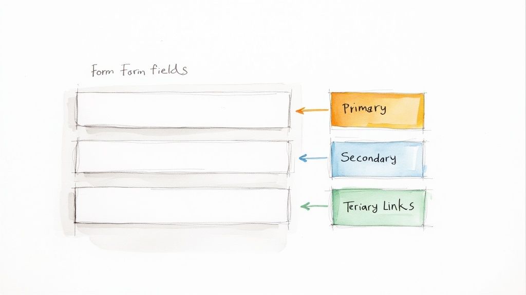
Grouping Related Fields: Simplifying Complexity
Grouping related fields, such as those for address or contact information, brings order to the form. Imagine trying to find a specific item in a messy drawer. It's much easier when similar items are grouped together. The same principle applies to forms.
Let's look at a practical comparison:
To better illustrate the impact of visual design choices, consider the following table:
"Visual Design Elements Impact on Form Completion"
Comparison of key visual design elements and their effect on user completion rates
| Design Element | Poor Implementation | Good Implementation | Completion Rate Impact |
|---|---|---|---|
| Visual Hierarchy | Submit button is small and blends in with other elements. Required fields are not clearly marked. | Submit button is large, brightly colored, and prominent. Required fields are clearly indicated with asterisks and/or color. | Can increase completion rates by up to 20% |
| Spacing and Typography | Form is cramped with little white space. Font is small and difficult to read. | Ample white space between fields. Font is large, clear, and easy to read. | Can improve completion rates by 10-15% |
| Grouping Related Fields | Fields are scattered randomly throughout the form. | Related fields are grouped together logically. | Can boost completion rates by 5-10% |
This table highlights how seemingly small design choices can have a significant impact on form completion. By focusing on these key elements, you can create a smoother, more user-friendly experience.
For a deeper dive into optimizing forms, check out this article on form UX design.
By applying these principles, you can create forms that feel intuitive and welcoming, ultimately leading to happier users and higher conversion rates. The best forms are the ones that users barely notice – they simply work.
Error Handling That Helps Instead Of Hurts
Imagine spending time carefully filling out a long form, only to be greeted by a vague "Invalid Input" message. Frustrating, right? Thoughtful error handling is key to good form design. It can literally make the difference between a user abandoning the form and a successful submission.
It's like the difference between a friendly shop assistant gently guiding you to the right item, and one who just shrugs and says "it's not here."
Real-Time Validation: A Double-Edged Sword
Real-time validation – that helpful feedback that appears as you type – is a powerful tool. It catches mistakes early, preventing users from continuing with bad data. Think of it as a spellchecker for forms.
But like a spellchecker, it can be annoying if it's too aggressive. Being bombarded with error messages before you've even finished typing a word can be disruptive. The key is finding the right balance.
The Art of Helpful Error Messages
Error messages shouldn't just point out problems; they should offer solutions. Think of them as mini-guides. Instead of a generic "Invalid Email," a message like "Please enter a valid email address, like yourname@example.com" is much more helpful. It clearly explains the problem and offers a solution. For some visual design inspiration, consider resources on testimonial website design.
This clear guidance empowers users to correct the mistake easily, turning a potential roadblock into a smooth detour.
Preventing Errors Before They Happen
The best way to handle errors? Stop them before they start! If a field needs a specific format (like a phone number), offer clear instructions and input masks. These act like templates, guiding users to enter information correctly.
Think of it like pre-filled tax forms. They guide you through the process and minimize the chance of mistakes.
Inline Validation and Success States
Inline validation, where error messages appear right next to the field, is usually the best approach. It makes it easy to spot and fix problems quickly.
Equally important are success states. These are visual cues that confirm a field has been filled in correctly. Think of that satisfying green checkmark. This positive reinforcement contributes to a smoother and more enjoyable form experience. Especially for long or complex forms, effective validation is crucial for user engagement and reducing friction.
Building Trust That Converts Browsers Into Buyers
Trust. It's the invisible glue that holds the buyer-seller relationship together, especially online. When a potential customer lands on your site, they're not just looking at products or services – they’re evaluating your trustworthiness. In the context of forms, trust is the difference between a completed purchase and an abandoned cart. So, how do you build that crucial sense of security that encourages conversions? It's all about integrating smart form design principles that whisper "safety" and "respect" to your users.
Security Badges and Progress Indicators: Small Details, Big Difference
Think about the last time you bought something online. You probably noticed a little padlock icon or a security badge near the payment section, right? These seemingly minor visual cues are surprisingly powerful. They’re like a virtual reassurance, a silent nod that says, "Your information is safe with us."
Similarly, progress indicators in longer forms are essential for keeping users engaged. Imagine driving across the country without mile markers – you'd quickly lose motivation. Progress indicators provide that sense of accomplishment and forward momentum, especially in complex forms that demand more time and user effort.
Transparency and Privacy: The Cornerstones of Trust
Flashy marketing might get attention, but genuine transparency is what builds long-term trust. Clearly displaying your privacy policy isn't enough. You need to explain why you're requesting specific information. It’s about having an open dialogue with your users, not hiding behind legal jargon.
Addressing privacy concerns proactively, before they become roadblocks, is key. It's a sign of respect and lays the groundwork for a strong, positive user-customer relationship. This builds confidence and encourages users to complete the form without hesitation.
Social Proof: The Power of the Crowd
Ever noticed how a bustling restaurant seems more appealing than an empty one? This same principle—social proof—applies to online forms. Think customer testimonials, security guarantees, or even just displaying the number of satisfied users. These elements act like digital word-of-mouth referrals, subtly reassuring hesitant users that others have successfully (and securely) completed the form.
Strategically placing these trust signals can significantly reduce form abandonment and nudge potential customers towards becoming buyers. It creates a sense of community and reinforces the idea that they're making a safe and smart decision.
Let's take a closer look at how effective various trust signals are in different industries. The table below, "Trust Signal Effectiveness by Industry," provides some valuable insights:
| Trust Signal | E-commerce | B2B Services | Healthcare | Financial Services |
|---|---|---|---|---|
| Security Badges (e.g., Norton, McAfee) | High | Medium | High | High |
| Testimonials | High | High | Medium | Medium |
| Clear Privacy Policy | High | High | High | High |
| Progress Indicators | Medium | Low | Medium | Low |
| Money-Back Guarantee | High | Medium | Low | Low |
| Client Logos | Low | High | Medium | Medium |
| Secure Payment Gateway Icons (e.g., Visa, Mastercard) | High | Medium | Medium | High |
As the table shows, certain trust signals resonate more strongly in specific sectors. While security badges and clear privacy policies are universally important, the impact of testimonials and money-back guarantees varies across different industries. Understanding these nuances allows you to tailor your form design to maximize its effectiveness and build trust with your target audience. Focusing on the most impactful trust signals for your specific industry will result in higher conversion rates and a stronger sense of security for your users.
Testing and Optimizing For Continuous Growth
Creating a high-converting form isn't a one-time project. It's more like tending a garden. You plant the seeds (your form design principles), water them (implement best practices), and then constantly monitor their growth (track key metrics). This ongoing nurturing ensures your forms flourish and consistently deliver results. Let's explore how data and testing can refine your forms for sustainable growth.
A/B Testing: Beyond Button Colors
A/B testing is essential for form optimization. Imagine presenting two slightly different versions of a form to different groups of users. This allows you to see which performs better. Don't get stuck on small changes like button colors. Think bigger! Experiment with different field arrangements, how you phrase questions, and even the overall length of the form.
The screenshot below shows a simple A/B testing setup.
The image illustrates how traffic is split between two webpage versions, allowing direct performance comparison. Analyzing metrics like conversion rates helps pinpoint what resonates with your audience and enables data-driven improvements. For more insights into optimizing forms, check out these form design best practices.
Key Metrics for Long-Term Success
Focus on metrics that truly matter. Completion rate (the percentage of users who finish the form) and conversion rate (the percentage of users who complete the desired action after filling out the form) are crucial. These offer valuable insight into user behavior and your form's effectiveness.
Also, track time to completion. This can reveal where users might be struggling or getting lost in the process. Interpreting this data helps you iterate and improve your form's performance over time. Maintaining trust and content originality is also key. For strategies on creating authentic content, see this article on how to bypass AI detection.
Building a Culture of Continuous Improvement
Form optimization is a journey, not a destination. Establish a system for regularly analyzing form performance and making adjustments based on the data. Consider multivariate testing, where you test multiple variations simultaneously to speed up the optimization process.
Understanding statistical significance helps you avoid making incorrect conclusions from your test results. By fostering a culture of constant testing and refinement, you can ensure your forms continuously drive growth.