
Visualizing Success: Survey Dashboards that Inspire Action
This listicle showcases eight impactful survey dashboard examples, providing actionable insights to transform your data into a compelling narrative. We'll analyze diverse platforms, from user-friendly options like Google Data Studio to robust solutions like Tableau and specialized tools like Qualtrics Stats iQ. We'll also delve into custom-built solutions using React and D3.js, offering a comprehensive view of the survey dashboard landscape.
Understanding how to present survey data effectively is crucial for impactful communication. Visualizations enable you to identify trends, pinpoint areas for improvement, and communicate findings with clarity. Whether you're tracking customer satisfaction, measuring campaign performance, or gathering employee feedback, a well-designed dashboard can be transformative. Effective data presentation often goes hand-in-hand with your overall marketing strategy. Understanding the basics of digital marketing can help in creating a successful dashboard. Read more about digital marketing from The Digital Marketing Toolbox.
This deep dive into survey dashboard examples will equip you with the knowledge to:
- Choose the Right Platform: Discover which dashboard solution aligns with your needs and technical skills.
- Design for Impact: Learn the principles of effective data visualization and dashboard design.
- Extract Actionable Insights: Translate data into meaningful conclusions and strategic decisions.
- Boost Engagement: Create dashboards that captivate your audience and drive action.
We'll uncover the strategies behind successful dashboards, exploring what makes them effective and providing you with replicable tactics. This isn't just about showcasing examples; it's about empowering you to build dashboards that tell your data's story.
1. SurveyMonkey Analyze Dashboard
SurveyMonkey Analyze is a powerful survey dashboard example that transforms raw survey data into actionable insights. Its intuitive interface offers real-time data visualization, automated insights, and customizable reporting, making it suitable for diverse applications. From understanding customer feedback to measuring employee engagement, SurveyMonkey Analyze empowers users to make data-driven decisions. Its key strength lies in its ability to quickly process large datasets and present them in easily digestible formats, like interactive charts and graphs. This allows users to identify trends, spot outliers, and uncover hidden patterns within their data.
Examples of SurveyMonkey Analyze in Action
Several organizations leverage SurveyMonkey Analyze to gain valuable insights:
- HR Departments: Tracking employee satisfaction and identifying areas for improvement.
- Marketing Teams: Analyzing customer feedback on campaigns and refining messaging.
- Educational Institutions: Measuring student experience and optimizing teaching strategies.
- Healthcare Organizations: Monitoring patient satisfaction and improving service quality.
When striving to improve key performance indicators, tracking them effectively is crucial. To effectively visualize success, consider how you can use a comprehensive sales KPI dashboard. Read more in our guide on Sales KPI Dashboard Mastery.
Actionable Tips for Using SurveyMonkey Analyze
- Segment Your Data: Use filters to segment responses by demographics, location, or other relevant criteria to uncover deeper insights within specific groups.
- Automate Reporting: Set up automated reports for regular stakeholder updates, saving time and ensuring consistent communication.
- Leverage Sentiment Analysis: Utilize sentiment analysis to understand the emotional tone behind responses, gaining qualitative insights alongside quantitative data.
- Customize Visualizations: Create custom charts and graphs that align with your brand's visual identity and highlight the most important metrics.
Visualizing Key Features
The following infographic visualizes key data about SurveyMonkey Analyze Dashboard, specifically the utilization rates of three key features.
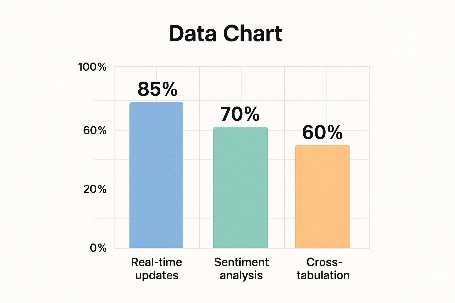
This bar chart illustrates the high utilization of real-time updates (85%), followed by sentiment analysis (70%), and cross-tabulation (60%). This emphasizes the platform's strength in providing timely data and extracting deeper meaning from responses.
Why Choose SurveyMonkey Analyze?
SurveyMonkey Analyze deserves its place on this list of survey dashboard examples due to its accessibility, comprehensive features, and intuitive design. It offers a powerful yet user-friendly platform for anyone looking to extract meaningful insights from their survey data. Whether you're a seasoned researcher or a small business owner, SurveyMonkey Analyze provides the tools you need to understand your audience and make informed decisions. Its strength lies in its ability to bridge the gap between raw data and actionable strategies, making it an invaluable asset for any organization conducting surveys.
2. Tableau Survey Data Dashboard
Tableau's powerful data visualization platform enables the creation of sophisticated survey dashboards with advanced analytics capabilities. Its flexibility allows users to connect to various data sources, from spreadsheets to databases, and transform raw survey results into compelling visual stories. The drag-and-drop interface simplifies the process of building interactive charts, graphs, and maps, making it accessible even to users without coding experience. This empowers organizations to explore survey data in depth, uncover hidden patterns, and communicate insights effectively.
Examples of Tableau Survey Data Dashboard in Action
Tableau's versatility makes it suitable for diverse survey dashboard examples across various sectors. Fortune 500 companies use it to analyze employee engagement surveys, identifying trends and areas for improvement in workplace culture. Government agencies leverage Tableau to track citizen satisfaction with public services, informing policy decisions and resource allocation. Research institutions utilize its robust analytical capabilities to present academic survey findings, while consulting firms employ it to deliver compelling client survey insights. To ensure your surveys are effective before analyzing the results in Tableau, consider reviewing best practices for survey design. Learn more about…
Actionable Tips for Using Tableau
- Start with Pre-built Templates: Tableau offers a range of pre-built survey dashboard templates that can accelerate the development process. Customize these templates to match your specific needs and branding.
- Use Calculated Fields: Create custom metrics tailored to your survey objectives using calculated fields. This allows you to go beyond basic analysis and derive more meaningful insights from your data.
- Implement Hierarchical Filters: Enhance user experience by implementing hierarchical filters. This allows for easy navigation and exploration of data across different levels of detail.
- Leverage Storytelling Features: Use Tableau's storytelling features to create compelling presentations that effectively communicate your survey findings to stakeholders.
Why Choose Tableau?
Tableau stands out among survey dashboard examples due to its powerful data visualization and analytical capabilities. Its ability to connect to diverse data sources, coupled with its intuitive drag-and-drop interface, makes it a valuable tool for organizations of all sizes. The platform's flexibility enables the creation of highly customized and interactive dashboards that can cater to a wide range of survey data analysis needs. Its strength lies in its ability to transform complex data into visually appealing and easily understandable insights, empowering users to make data-driven decisions.
3. Microsoft Power BI Survey Dashboard
Microsoft Power BI offers robust survey dashboard capabilities, seamlessly integrating into the Microsoft ecosystem. Its self-service business intelligence tools empower users to create interactive survey dashboards with natural language queries and AI-powered insights. This makes data exploration and analysis accessible to users with varying technical expertise. Power BI’s strength lies in its ability to connect to various data sources, including Microsoft Forms, Excel, and SQL databases, offering a centralized platform for survey data management and visualization.
Examples of Microsoft Power BI Survey Dashboard in Action
Several organizations leverage Power BI's survey dashboard capabilities to gain valuable insights:
- Corporate Teams: Integrating Microsoft Forms surveys for streamlined employee feedback collection and analysis.
- Small to Medium Businesses: Analyzing customer feedback to understand satisfaction levels and identify areas for improvement.
- Educational Institutions: Leveraging Office 365 subscriptions to create interactive dashboards for student surveys and academic performance tracking.
- Non-profits: Tracking program effectiveness through surveys and visualizing data to demonstrate impact to stakeholders.
Actionable Tips for Using Microsoft Power BI Survey Dashboard
- Use Microsoft Forms Connector: Ensure seamless data flow from surveys created in Microsoft Forms directly into Power BI for efficient analysis.
- Leverage the Q&A Feature: Empower executives to explore data independently by using natural language queries to obtain instant insights during presentations.
- Create Drill-Through Pages: Allow users to delve deeper into specific data points by creating interactive drill-through pages for detailed analysis.
- Utilize the Mobile App: Monitor survey responses and dashboard performance on the go with Power BI's mobile app, enabling real-time data access and decision-making.
Why Choose Microsoft Power BI Survey Dashboard?
Microsoft Power BI deserves its place on this list of survey dashboard examples because of its robust features, seamless Microsoft integration, and accessibility. Its user-friendly interface combined with advanced analytics capabilities empowers organizations of all sizes to extract meaningful insights from their survey data. Whether tracking customer satisfaction, measuring employee engagement, or monitoring program effectiveness, Power BI provides the tools to transform raw data into actionable strategies. Its strength lies in its ability to democratize data analysis, putting powerful insights into the hands of everyone.
4. Google Data Studio Survey Dashboard
Google Data Studio (now Looker Studio) provides a free, web-based platform for creating survey dashboards. Its seamless integration with Google Forms and other Google Workspace tools makes it a powerful option for visualizing survey data. Data Studio offers collaborative dashboard building with real-time data connections and easy sharing capabilities, making it ideal for teams working together on survey projects. This platform empowers users to transform raw survey results into easily understandable and visually appealing reports.
Examples of Google Data Studio in Action
Several organizations leverage Google Data Studio's survey dashboard capabilities to gain valuable insights:
- Small Businesses: Analyzing customer satisfaction surveys created with Google Forms to understand customer needs and preferences.
- Educational Institutions: Tracking student feedback on courses and programs to identify areas for improvement in curriculum and teaching methods.
- Non-profit Organizations: Monitoring program surveys to assess impact and identify areas where adjustments are needed.
- Marketing Agencies: Creating visually appealing client survey reports to showcase campaign effectiveness and demonstrate ROI.
When seeking valuable insights from survey data, presenting it effectively is paramount. Consider how a customer analytics dashboard can help you visualize and understand your customer base more comprehensively.
Actionable Tips for Using Google Data Studio
- Use Calculated Fields: Create custom metrics and calculations within Data Studio to derive deeper insights from your survey responses. This allows you to go beyond basic survey questions and create more complex analyses.
- Apply Consistent Branding: Maintain a professional look by applying consistent branding elements, such as logos and color schemes, across your dashboard. This ensures a cohesive and recognizable presentation of your survey data.
- Set up Automated Data Refresh Schedules: Automate the data refresh process to ensure your dashboard always displays the most up-to-date information. This saves time and ensures that stakeholders are always viewing the latest insights.
- Create Separate Pages for Different Stakeholder Views: Tailor your dashboard to different audiences by creating separate pages with specific metrics and visualizations relevant to their needs. This helps ensure clarity and focus for each stakeholder group.
Why Choose Google Data Studio?
Google Data Studio earns its spot on this list of survey dashboard examples due to its accessibility, integration with the Google ecosystem, and powerful visualization capabilities. It's a particularly attractive option for organizations already utilizing Google Workspace tools. The platform's collaborative features and real-time data connections make it an efficient choice for teams working together on survey analysis and reporting. Data Studio offers a powerful yet free solution for turning survey data into actionable insights, benefiting organizations of all sizes. Its strength lies in its ability to connect data, visualize it effectively, and empower data-driven decision-making based on survey results.
5. Qualtrics Stats iQ Dashboard
Qualtrics Stats iQ is a powerful survey dashboard example that leverages AI to transform raw survey data into actionable insights. Its intelligent platform automatically analyzes responses, surfacing key patterns and correlations without requiring advanced statistical expertise. From identifying drivers of satisfaction to uncovering hidden trends, Stats iQ empowers users to make data-driven decisions quickly and efficiently. Its key strength lies in its ability to simplify complex statistical analysis, making sophisticated insights accessible to a broader audience.
Examples of Qualtrics Stats iQ in Action
Several organizations leverage Qualtrics Stats iQ to gain a competitive edge:
- Enterprise Companies: Measuring employee engagement and identifying factors influencing productivity.
- Market Research Firms: Analyzing consumer behavior and understanding market trends.
- Academic Researchers: Studying complex datasets and uncovering significant correlations.
- Customer Experience Teams: Tracking satisfaction metrics and identifying areas for service improvement.
When working with large datasets, ensuring the accuracy and reliability of your analysis is paramount. Qualtrics Stats iQ handles the heavy lifting, providing robust insights that drive impactful strategies. Google Data Studio can be integrated with various data sources including Google Sheets. For more information on how to use Google Sheets, read more here.
Actionable Tips for Using Qualtrics Stats iQ
- Ensure Adequate Sample Sizes: Larger sample sizes enhance the reliability and generalizability of AI-generated insights.
- Review Insights for Business Context: While Stats iQ automates analysis, human interpretation remains essential for applying insights within specific business contexts.
- Use Driver Analysis: Identify key factors influencing outcomes and prioritize areas for improvement.
- Combine with Traditional Analysis: Integrate AI-powered insights with traditional statistical methods for a more comprehensive understanding of your data. Learn more about analyzing qualitative data.
Why Choose Qualtrics Stats iQ?
Qualtrics Stats iQ earns its place on this list of survey dashboard examples due to its innovative use of AI and its ability to democratize advanced statistical analysis. It offers a robust yet user-friendly platform for anyone looking to extract meaningful insights from survey data without requiring extensive statistical expertise. Whether you're a seasoned researcher or a business professional, Stats iQ provides the tools you need to understand your audience and make informed decisions. Its power lies in its ability to bridge the gap between complex data and actionable strategies, making it an invaluable resource for any organization leveraging surveys for strategic decision-making.
6. Looker Survey Analytics Dashboard
Looker (now part of Google Cloud) provides enterprise-grade survey dashboard capabilities with a modern data platform approach. Unlike traditional survey tools, Looker leverages its LookML modeling language. This allows for the creation of reusable and governed survey analytics, ensuring data consistency and promoting collaboration. These analytics can then be embedded into applications and shared across organizations, breaking down data silos and fostering a data-driven culture.
Examples of Looker Survey Analytics in Action
Looker's robust capabilities make it ideal for complex survey analysis scenarios:
- Large Enterprises: Organizations with intricate survey data requirements can leverage Looker to centralize and standardize analysis across multiple departments and teams.
- Software Companies: Embedding survey analytics directly into applications provides users with real-time feedback and usage data, enabling iterative product development and improved user experience.
- Multi-Brand Organizations: Maintaining consistent survey metrics across various brands becomes simplified with Looker’s centralized data platform, facilitating comparative analysis and informed decision-making.
- Data-Driven Companies: Looker's advanced governance features meet the rigorous data control and compliance needs of organizations prioritizing data security and accuracy.
When aiming for high-performing surveys, ensuring reliable data is crucial. Explore our article on Data Validation Techniques for High-Quality Surveys for more on maintaining data integrity.
Actionable Tips for Using Looker Survey Analytics
- Invest in LookML Training: Ensure team members have the skills to leverage the full power of LookML for creating sophisticated and reusable survey analytics.
- Establish Data Governance: Define clear data governance policies from the outset to maintain data accuracy, consistency, and security throughout the survey process.
- Leverage Embedded Capabilities: Embed survey dashboards within relevant applications to provide stakeholders with direct access to key insights, facilitating timely action.
- Utilize Version Control: Implement version control for LookML models to track changes, collaborate effectively, and maintain a clear history of modifications.
Why Choose Looker Survey Analytics?
Looker earns its place among survey dashboard examples due to its enterprise-grade features and focus on data governance. It goes beyond basic visualization by offering a robust platform for building, managing, and sharing complex survey analytics. This makes it an ideal choice for organizations requiring scalable, consistent, and secure survey insights. Looker’s strength lies in its ability to transform raw survey data into actionable intelligence that drives informed business decisions across the organization.
7. Sisense Survey Dashboard
Sisense provides AI-driven survey dashboard capabilities designed to handle complex data from multiple sources. Its focus is on simplifying the process of creating interactive survey dashboards while maintaining powerful analytics capabilities for business users. This platform allows organizations to connect survey data with other operational data sources for a more comprehensive view of performance. Its strength lies in its ability to combine robust analytics with a user-friendly interface, empowering even non-technical users to gain actionable insights from their survey data.
Examples of Sisense Survey Dashboard in Action
Several organizations utilize Sisense to effectively analyze and visualize survey data:
- Healthcare Organizations: Analyzing patient survey data to understand satisfaction levels and identify areas for improvement in patient care.
- Retail Companies: Tracking customer experience metrics through surveys to optimize store operations and enhance customer loyalty.
- Financial Services: Monitoring client satisfaction to identify service gaps and personalize financial offerings.
- Manufacturing Firms: Measuring employee engagement through surveys to improve workplace culture and boost productivity.
When collecting customer feedback, consider how Sisense can enhance your survey dashboard examples and provide actionable insights into the customer experience.
Actionable Tips for Using Sisense Survey Dashboard
- Take Advantage of AI-Powered Data Preparation Features: Automate data cleaning and transformation processes to save time and ensure data accuracy.
- Use the Mobile-First Design for Field Survey Monitoring: Access and analyze real-time survey data from any location using mobile devices.
- Leverage Embedding Capabilities for Stakeholder Portals: Share interactive dashboards with stakeholders through embedded portals, fostering data transparency and collaboration.
- Implement Proper User Training for Adoption Success: Ensure users are adequately trained to maximize the platform's capabilities and drive successful adoption.
Why Choose Sisense Survey Dashboard?
Sisense earns its place among these survey dashboard examples because of its powerful AI-driven analytics, user-friendly interface, and ability to connect multiple data sources. This allows organizations to move beyond simple survey analysis and gain deeper, more comprehensive insights into their business performance. Its focus on data visualization and interactive dashboards allows users to explore data dynamically and uncover hidden trends. Sisense empowers organizations to transform their survey data into a strategic asset, enabling data-driven decision-making across various departments.
8. Custom React/D3.js Survey Dashboard
Custom-built survey dashboards using the React.js framework combined with the D3.js visualization library offer maximum flexibility and control. These dashboards are developed specifically for unique survey analysis requirements and can be tailored to exact business needs and branding. This approach empowers developers to create highly interactive and visually appealing dashboards that precisely address the nuances of specific data sets.

Examples of Custom React/D3.js Dashboards in Action
Several organizations leverage this powerful combination for bespoke survey analysis:
- Tech Companies: Building internal tools for product feedback analysis.
- Research Institutions: Visualizing complex survey data for academic studies.
- Consulting Firms: Creating client-specific portals for market research.
- Startups: Developing survey-based products with unique data visualization needs.
Actionable Tips for Using React/D3.js
- Start Small: Begin with a minimum viable product (MVP) and iterate based on user feedback.
- Component Libraries: Leverage existing React component libraries for faster development.
- Optimize Performance: Implement efficient data handling and rendering techniques.
- Testing and Documentation: Ensure code quality and maintainability through rigorous testing and clear documentation.
Why Choose Custom React/D3.js?
Custom React/D3.js dashboards earn a spot on this list of survey dashboard examples due to their unmatched flexibility and customization potential. This approach offers granular control over every aspect of the dashboard, from data visualization to user interface design. This makes it ideal for complex survey projects requiring tailored solutions. The combination of React's component-based architecture and D3.js's powerful visualization capabilities provides a robust foundation for building truly bespoke survey dashboards. While requiring more technical expertise, the payoff is a highly effective tool perfectly aligned with specific research objectives and branding guidelines. This makes it a powerful choice for organizations prioritizing customization and control over their survey data analysis.
Top 8 Survey Dashboard Features Comparison
| Survey Dashboard | Implementation Complexity 🔄 | Resource Requirements 🔄 | Expected Outcomes 📊 | Ideal Use Cases 💡 | Key Advantages ⭐ |
|---|---|---|---|---|---|
| SurveyMonkey Analyze Dashboard | Low – user-friendly, minimal technical skill needed | Moderate – dependent on SurveyMonkey platform, paid tiers | Automated insights, real-time tracking, sentiment analysis | HR, Marketing, Education, Healthcare surveys | Easy to use; automated insights; professional visualizations |
| Tableau Survey Data Dashboard | High – steep learning curve, technical expertise required | High – expensive licensing, powerful hardware recommended | Advanced analytics, predictive forecasting, interactive UX | Large enterprises, researchers, government, consulting | Highly customizable; handles big data; advanced analytics |
| Microsoft Power BI Survey Dashboard | Medium – some technical skills needed for advanced features | Moderate – cost-effective, benefits from Microsoft ecosystem | AI insights, natural language Q&A, real-time streaming | Corporate, SMBs, Edu institutions, non-profits | Seamless MS integration; cost-effective; familiar interface |
| Google Data Studio Survey Dashboard | Low – simple drag-and-drop, no installation | Low – free with Google account | Real-time collaboration, basic analytics | Small businesses, education, non-profits, marketing | Free; easy integration; collaborative; no install required |
| Qualtrics Stats iQ Dashboard | Medium – no stats expertise needed but Qualtrics platform dependent | High – enterprise pricing, Qualtrics ecosystem | AI-driven automated stats, driver analysis, summaries | Enterprise, market research, academia, customer experience | Automated stats; saves time; integrated with survey tool |
| Looker Survey Analytics Dashboard | High – requires technical expertise, LookML training | High – implementation & maintenance intensive | Scalable, governed analytics, embedded sharing | Large enterprises, software firms, multi-brand orgs | Enterprise-grade; strong governance; flexible embedding |
| Sisense Survey Dashboard | Medium – user-friendly but some setup required | Moderate to High – comparatively costly, resource intensive | AI-driven prep, multi-source data integration, mobile-ready | Healthcare, retail, finance, manufacturing | AI-powered; strong performance; flexible deployment |
| Custom React/D3.js Survey Dashboard | Very High – significant dev expertise, long build time | High – development costs, ongoing maintenance | Fully customized, optimized performance, branded UI | Tech, research, consulting, startups with niche needs | Unlimited customization; no licensing fees; full control |
Elevate Your Insights: Choosing the Right Survey Dashboard
This exploration of survey dashboard examples has highlighted the power of visualizing data to unlock actionable insights. From user-friendly platforms like SurveyMonkey and Google Data Studio to robust analytics powerhouses such as Tableau and Power BI, each tool offers unique strengths tailored to specific needs. We've dissected the "why" behind effective dashboard design, emphasizing strategic data presentation and clear communication of key findings. Remember, the goal isn't just to display data, but to transform it into a compelling narrative that drives informed decision-making.
Key Takeaways for Effective Dashboard Design
- Prioritize Clarity: Keep your dashboards clean, concise, and focused on the most crucial metrics. Avoid overwhelming users with excessive data points. Focus on telling a story with the data.
- Target Your Audience: Tailor the dashboard's design and content to the specific needs and understanding of your audience. A marketing team will require different insights than a research team.
- Leverage Interactivity: Interactive features like filtering, drilling down, and dynamic charts empower users to explore the data at their own pace and uncover deeper insights.
- Choose the Right Tool: Select a platform that aligns with your technical skills, budget, and analytical requirements. Consider the learning curve and available resources.
From Data to Action: The Importance of Strategic Visualization
Mastering survey dashboard design is more than just a technical skill; it's a strategic advantage. It empowers you to communicate complex data effectively, influence stakeholders, and drive data-driven decisions. Effective dashboards can reveal hidden trends, highlight opportunities for improvement, and ultimately, lead to better outcomes across various fields, from marketing and sales to research and education.
The Future of Survey Dashboards
As AI continues to evolve, expect even more sophisticated integrations within survey dashboards. Imagine automated insights, predictive analytics, and even more personalized data experiences. Tools like BuildForm are streamlining data collection, creating a seamless pipeline for richer and more actionable dashboard integrations. This evolution empowers us to move beyond simply collecting data to truly understanding and leveraging its potential.
By embracing these principles and strategically choosing the right tools, you can transform your survey data from raw numbers into compelling narratives that drive impactful decisions. Ready to streamline your data collection and create more powerful survey integrations? Explore BuildForm and discover how it can revolutionize your survey workflows.