If you're handling clothing orders through a mix of DMs, emailed spreadsheets, PDF attachments, and a checkout form that feels bolted on, you're probably seeing the same pattern most apparel teams hit. Buyers hesitate, staff rekey the same details twice, and fulfillment problems show up days later when they're more expensive to fix.
A strong order form for clothes isn't just an admin tool. It's the point where product selection, buyer confidence, payment, and operational accuracy all meet. When the form is built well, it shortens the path to purchase and gives your team cleaner data to fulfill from the start.
Table of Contents
- Why Your Current Clothing Order Form Is Losing Sales
- Building the Foundation with Essential Form Fields
- Using Conditional Logic to Guide and Convert Shoppers
- Designing for Mobile to Eliminate Checkout Friction
- Integrating Payments Shipping and Post-Purchase Flows
- Tracking Performance and Implementing Your Form Template
Why Your Current Clothing Order Form Is Losing Sales
Most apparel brands treat the form like a receipt generator. That's the first mistake.
The form is part of the selling experience. If it asks confusing questions, forces buyers to scroll through irrelevant options, or sends them to a separate payment page with mismatched branding, it creates doubt at the exact point you need confidence. That doubt turns into abandoned orders, support tickets, and preventable fulfillment mistakes.
Digital forms changed expectations years ago. In the early 2010s, drag-and-drop form builders made it much easier for non-technical teams to build apparel ordering workflows without custom development. Since then, buyers have gotten used to cleaner, faster online experiences. That means a rough form no longer feels normal. It feels broken.
Industry benchmarks cited on Jotform's apparel size and quantity form page note that digital order forms have cut order processing time by 50-70% for small businesses and nonprofits, while reducing manual errors by up to 40% compared with paper or email-based methods. That gap matters because every manual handoff creates another place for a wrong size, wrong color, or missed customization request to slip in.
Friction doesn't stay in the form
The cost of a weak clothing form doesn't stop at checkout. It shows up in three places:
- Lost conversions: Buyers start the process, hit too many fields, and leave.
- Bad fulfillment data: Staff guess what the customer meant because the form didn't force clarity.
- Operational drag: Teams spend time fixing preventable errors instead of shipping or selling.
A clothing form that "collects enough info" is often the same form that creates rework downstream.
This is why the best apparel operators don't separate conversion from operations. They build the form as part of the product page and checkout experience. If you're already thinking about optimizing fashion product pages and UX, the order form belongs in that same conversation because it's where interest either becomes revenue or disappears.
The old assumption no longer holds
A lot of teams still think, "If the customer really wants it, they'll fill it out."
Sometimes they will. Many won't.
That mindset came from a paper-order era where friction was expected. Online, friction feels optional because it is. Buyers compare your ordering flow against the easiest experience they've had anywhere, not just against other print shops, merch sellers, or uniform programs.
A high-performing order form for clothes should do more than capture size and quantity. It should reduce hesitation, shape better choices, and make the next step obvious. That's what turns it from a passive form into a conversion engine.
Building the Foundation with Essential Form Fields
Good conversion starts with precise inputs. If your form collects vague apparel data, your team pays for it later in picking, packing, support, and returns.
Apparel businesses feel this gap fast because every item has variants. One hoodie style can branch into multiple sizes, colors, fits, decoration methods, and shipping timelines. If the form structure is loose, the buyer can still submit. Your ops team is the one left trying to interpret it.
According to Fabrik's guide to vetting clothing manufacturers on order accuracy and fill rates, elite manufacturers achieve 98-99% order fill rates, while the industry average sits at 92-95%, and poor data capture on order forms is a key cause of size and style discrepancies. That's why field design isn't cosmetic. It's operational control.
Start with buyer identity and fulfillment basics
The first field group should answer a simple question. Can your team fulfill and contact this buyer without chasing details later?
Include the basics, but don't bury them in clutter:
- Customer name: Keep this separate from business or team name.
- Email and phone: Use validation so you aren't storing broken contact details.
- Delivery method: Shipping, local pickup, event handoff, or bulk distribution.
- Shipping address: Show only when shipping is selected.
- Order contact vs recipient contact: Useful for school, team, or corporate apparel orders.
One practical rule is to separate payer, organizer, and recipient when those roles differ. In team stores and fundraiser merch, they often do.
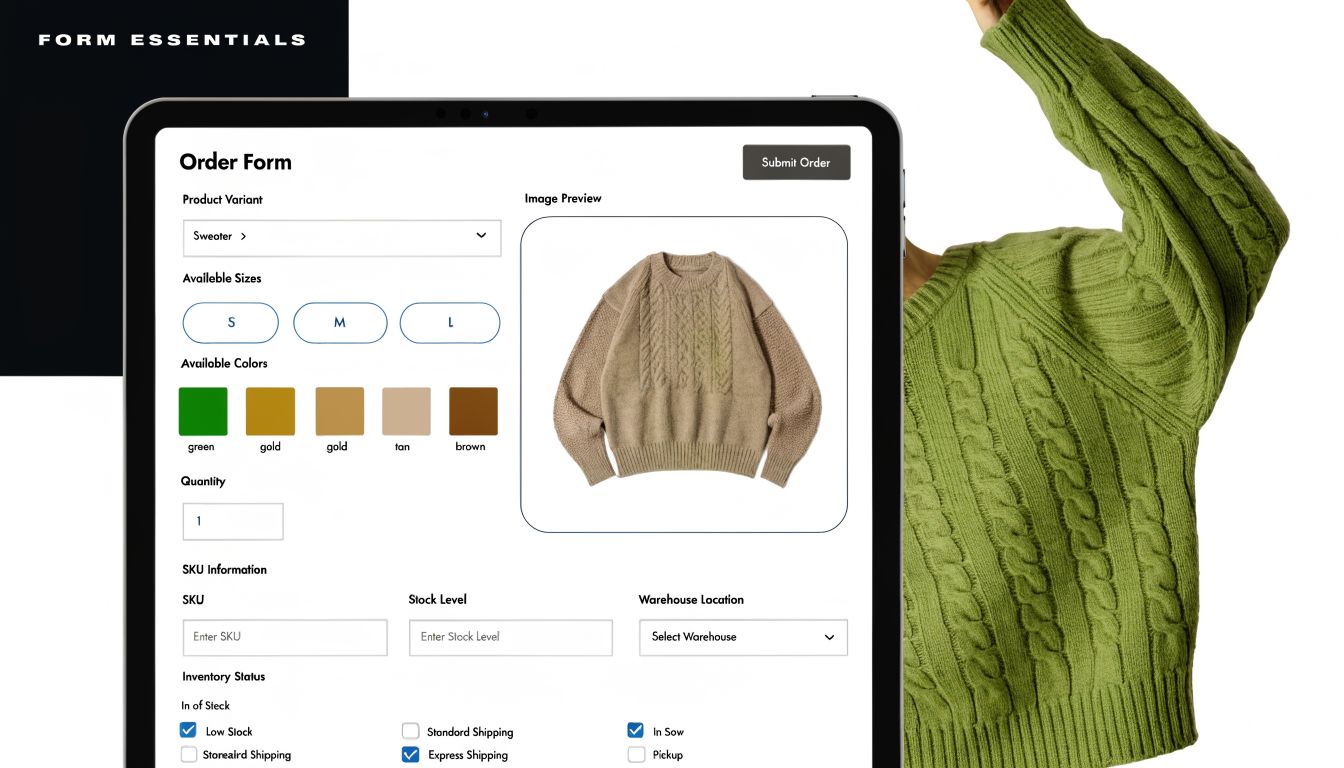
Capture product detail the way operations need it
Many teams stop at "item, size, color, quantity." That's enough for simple merch drops, but it's not enough for complex apparel orders.
Build the product area around how inventory and production work:
- Item type or SKU family: T-shirt, hoodie, polo, hat.
- Variant fields: Size, color, fit, sleeve style, cut, fabric option.
- Quantity controls: Per variant, not just one total quantity box.
- Personalization inputs: Name, number, monogram, logo placement.
- Proof uploads: For artwork, branding guides, or size references when relevant.
- Special instructions: Keep this constrained. Open text should support edge cases, not replace structured fields.
If your team wants to refine how each input behaves, this guide to types of form fields for better data capture is useful because field type selection affects both completion rate and data cleanliness.
Practical rule: Never ask buyers to type a size, color, or style manually when a controlled choice will do the job better.
Manual text entry creates avoidable variation. "Heather gray," "grey," "dark grey," and "graphite" might all refer to one actual variant in your inventory. Structured fields remove interpretation.
Clothing Order Form Field Checklist
| Field Category | Essential Fields | Optional (but Recommended) Fields |
|---|---|---|
| Customer details | Full name, email, phone | Company, team, department |
| Product selection | Item type, size, color, quantity | SKU, fit, sleeve length, fabric |
| Customization | Personalization text | Logo upload, placement choice, approval checkbox |
| Fulfillment | Delivery method, shipping address or pickup selection | Delivery notes, preferred delivery date |
| Payment | Order total, payment method | Coupon code, PO reference |
| Compliance and preferences | Consent checkbox | Sustainability preference, material origin request, allergy or fabric sensitivity note |
| Support fields | Order notes | Internal reference number, proof approval status |
A few field design choices make a real difference:
- Use dropdowns for controlled lists such as standard sizes.
- Use visual swatches for colors when possible.
- Use repeatable item groups for multi-line orders rather than one giant comment box.
- Use checkboxes carefully for add-ons. They work well for packaging upgrades or rush handling.
- Use date fields sparingly. Don't ask for a preferred delivery date if your team won't honor or route by it.
The best foundation is boring in a good way. Buyers know what to do, and your team receives data that's ready to fulfill.
Using Conditional Logic to Guide and Convert Shoppers
Static forms are lazy design. They make every shopper do the work of filtering what's relevant.
For clothing orders, that creates needless effort because apparel catalogs branch quickly. A buyer choosing a basic tee shouldn't see embroidery file upload prompts. Someone ordering a custom varsity jacket shouldn't get the same path as someone buying one stock tote.
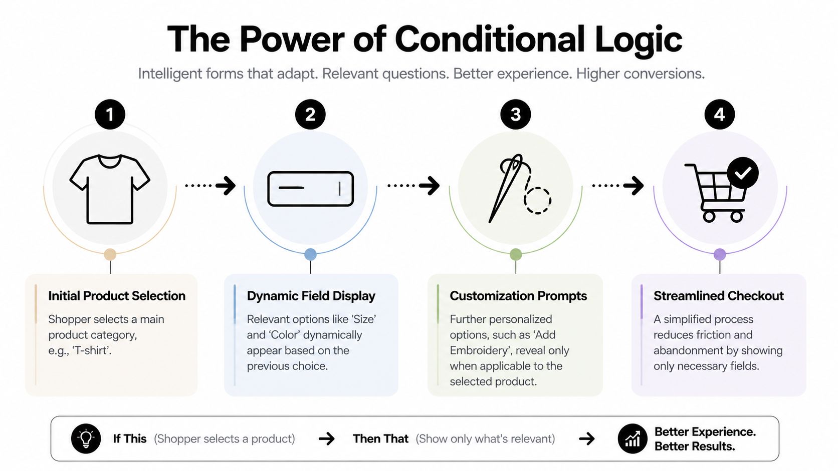
Static forms ask everyone everything
Many order form templates fall short in this regard. They dump every possible field onto one screen because it is easier to build. It isn't easier to buy through.
Conditional logic fixes that by changing the form in real time based on previous answers. In plain terms, it's "if this, then show that." Buyers only see the next relevant decision, which lowers cognitive load and keeps momentum moving.
A solid walkthrough on how to create interactive forms is helpful here because the jump from static form to guided flow is what usually separates a functional order form from one that converts well.
Where conditional logic helps most
Conditional logic earns its keep in apparel when the product line has variants, personalization, or mixed fulfillment methods.
Here are common examples that work:
- Product-specific fields: If the shopper selects "hoodie," show hoodie colors, sizes, and fabric weights. If they select "hat," hide apparel size fields entirely.
- Customization branching: If they choose embroidery, reveal thread color, placement, and file upload. If they skip customization, keep the path short.
- Delivery logic: Show shipping fields only when shipping is selected. Show pickup location details only for pickup.
- Bulk order routing: If quantity suggests a team or organizational order, show coordinator details and approval fields.
- Payment path changes: If a buyer chooses invoice or purchase order, present the right business fields instead of a card form.
The buyer shouldn't have to decode your catalog structure. The form should do that work for them.
Conditional logic also helps with upsells, but teams often overdo it. Don't interrupt the core purchase just to push extras. The best upsell moments feel like assistance, not a popup trapped inside a form.
For example, if someone orders team jerseys, then offering matching warm-up tops or name-number personalization is relevant. Showing six unrelated accessories is not.
Guided selling beats long-form interrogation
A good order form for clothes feels closer to guided selling than data entry. It narrows choices in the right sequence:
- Pick the product.
- Choose the relevant variant.
- Add customization only if needed.
- Confirm fulfillment.
- Pay.
That order matters. Ask difficult questions too early and buyers hesitate. Ask obvious questions too late and the form feels disorganized.
There's also a trust benefit. When the form responds intelligently, buyers assume the business behind it is organized. That's useful for schools, corporate merch buyers, sports teams, and event organizers who may be placing larger or more custom orders.
The simplest test is this. If two different buyers should have two different ordering paths, your form shouldn't force them through the same one.
Designing for Mobile to Eliminate Checkout Friction
A desktop-first clothing form usually fails in the same way. It looks acceptable on a laptop and irritating on a phone.
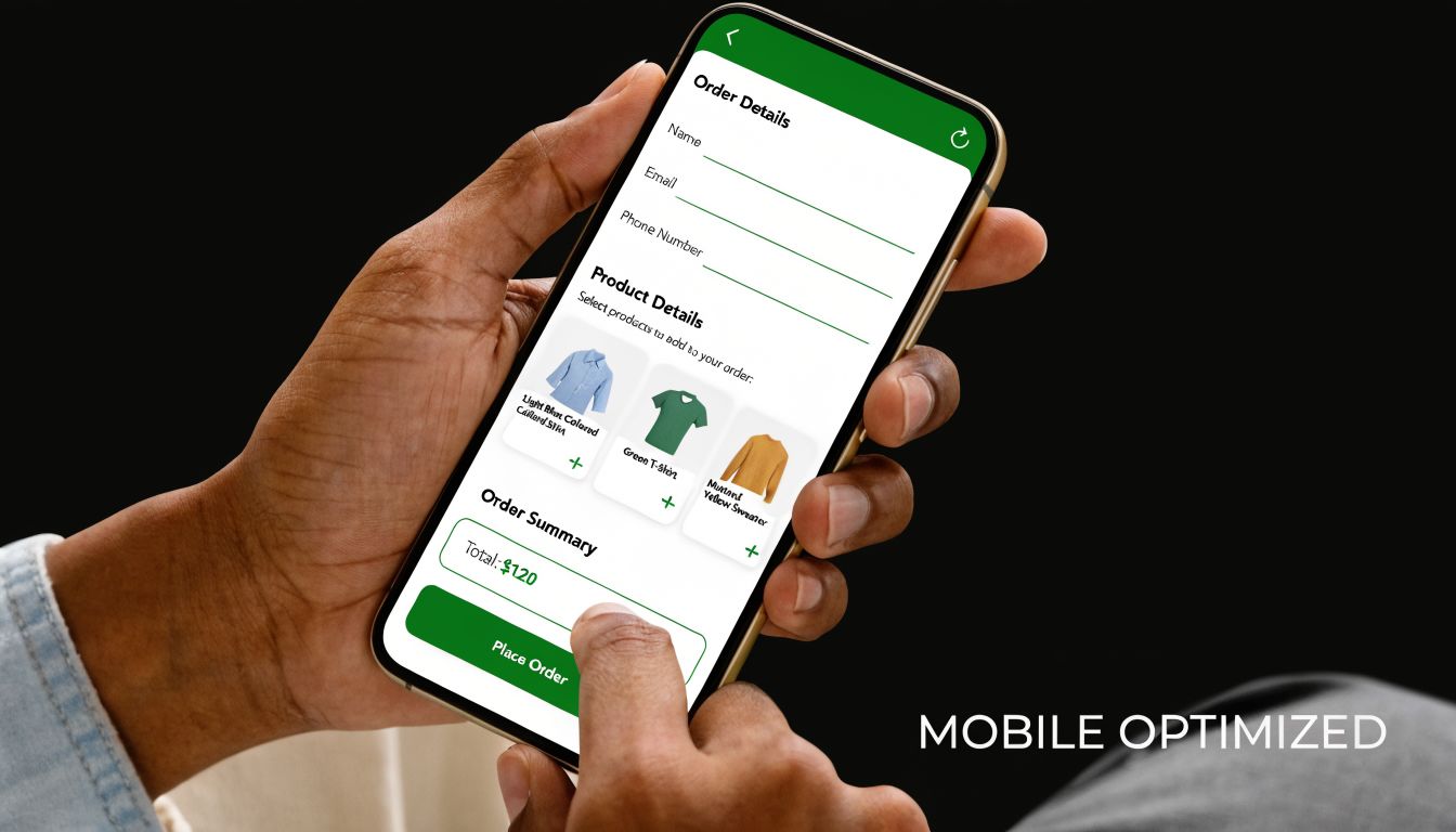
That matters because 53% of global e-commerce visits are mobile, and form friction contributes to 67% of cart abandonments, while adaptive or conversational designs can cut completion time by 40%, according to the source material summarized on AidaForm's clothing order form page. If your order form for clothes isn't built for thumbs, small screens, and interrupted sessions, you're putting your highest-friction experience in front of a large share of buyers.
Most clothing forms still behave like desktop paperwork
The classic failures are easy to spot:
- Tiny tap targets for size and color choices
- Long pages with no progress indicator
- Side-by-side fields that collapse awkwardly
- File uploads that are hard to use on mobile
- Coupon, shipping, and payment sections stacked in one dense block
None of these issues are dramatic on their own. Together, they create fatigue. Buyers stop because the process feels bigger than the purchase.
Mobile friction gets worse with apparel because the user often needs to compare size, fit, and style while moving between product context and the order form. If the form resets, loses progress, or asks for too much at once, the sale gets fragile.
A mobile form shouldn't feel like a shrunk-down desktop page. It should feel native to the device.
What mobile-first form design looks like in practice
Start with layout. A single-column form is the safest default for clothing orders. It keeps the reading path clean and avoids broken alignments across devices.
Then tighten interaction design:
- Use large selection controls: Size chips, swatches, and buttons work better than small dropdowns when the option set is limited.
- Break long flows into steps: Product, customization, shipping, payment. That pacing feels manageable on a phone.
- Turn on autofill where appropriate: Especially for contact and address fields.
- Keep labels persistent: Don't rely only on placeholder text that disappears once typing starts.
- Put error messages next to the field: Don't make users hunt for what went wrong.
One more issue gets overlooked. Mobile users are interrupted. They get texts, switch apps, lose signal, and come back later. A form experience that preserves progress is far more forgiving than one that assumes uninterrupted attention.
This short demo is worth watching if you're evaluating how mobile interactions affect form completion in practice:
Don't force mobile users to process your whole catalog at once
On desktop, a broad matrix of sizes, colors, and add-ons can sometimes work. On mobile, it usually doesn't.
A better pattern is progressive disclosure. Show one decision at a time, but make the next step obvious. If the user selects a non-sized item, skip sizing entirely. If the item doesn't support personalization, don't mention it. That sounds simple, but many template-based forms still don't do it.
The best mobile clothing forms reduce taps, reduce scroll depth, and reduce decision clutter. Those three changes matter more than decorative styling.
Integrating Payments Shipping and Post-Purchase Flows
A lot of clothing forms break at the last moment. The product selection is done, the buyer is ready, then the flow jumps to a separate payment page, asks for shipping details again, or leaves the customer unsure what happens after purchase.
That's where conversion leaks.
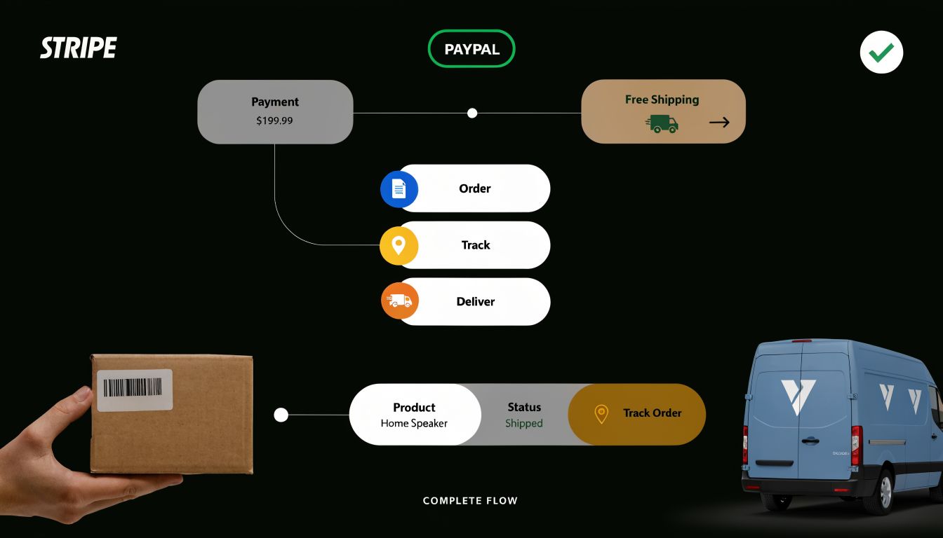
Keep payment inside the form when possible
For most apparel orders, the cleanest path is one continuous flow. The buyer selects products, confirms details, pays, and gets a clear confirmation without a jarring redirect.
Integrated payments help because they reduce uncertainty and keep the transaction tied to the same structured order data. They also lower the chance that a customer finishes the hard part, then drops off before payment because the experience suddenly feels different.
When you're comparing providers, this breakdown of payment gateways and fees is a useful companion because gateway choice affects both checkout UX and margin.
Practical setup choices include:
- Match payment methods to buyer type: Card payments for direct consumers, invoice or PO support for schools and businesses when needed.
- Show totals clearly: Item cost, shipping, and any add-ons should be visible before payment.
- Keep payment near the end, not hidden: Buyers should know they're finishing, not entering another process.
- Confirm what was ordered immediately: Especially for custom garments and personalized merch.
Treat shipping and returns as part of conversion
Shipping isn't just logistics. It's part of the buying decision.
If your form handles shipping poorly, buyers hesitate because they can't answer basic questions. When will it arrive? Where will it go? What happens if sizing is wrong? For apparel, those questions are common enough that the form should support them directly.
The source material tied to SurveyMonkey's t-shirt order form template notes that 35% of apparel returns stem from fit mismatches and 62% of consumers demand sustainability data. It also notes that the EU Green Deal, scheduled for Jan 2026, will mandate digital product passports, requiring material-origin logging for covered clothing workflows. For brands selling across markets, that means post-purchase and compliance fields are moving closer to the order experience itself.
Useful form additions include:
- Fit support fields: Size chart acknowledgment, fit preference, or notes when an item runs slim or oversized
- Return-routing inputs: Return reason selectors and exchange preference options for post-purchase forms
- Proof approval fields: For monograms, logos, or custom placement confirmation
- Material and sourcing data: If sustainability claims or product-origin tracking matter to your buyers
- Delivery confirmation and status handoff: So the order doesn't disappear after payment
Buyers don't separate "checkout" from "what happens next." They judge the whole path as one experience.
The strongest apparel workflows treat the order form as the start of a customer lifecycle, not the end of a cart. Payment, shipping choice, customization approval, returns handling, and transparency requests all belong to the same operational thread.
Tracking Performance and Implementing Your Form Template
Once the form is live, many organizations stop too early. They watch completed orders and ignore the behavior that happens before submission.
That's a mistake because the biggest improvements usually come from what people almost did.
According to Ryder's explanation of Perfect Order Rate, top-performing apparel companies reach a Perfect Order Rate of 90-95%, while industry averages sit at 75-85% due to sizing inaccuracies and documentation errors from incomplete forms. The same source notes that real-time form validation can boost POR by 15-20%. That makes tracking form quality just as important as tracking form volume.
Measure what happens before submission
Completion rate matters, but it isn't enough on its own. You also need to know where friction appears.
A good analytics setup should tell you:
- Which field causes drop-off: Often customization, shipping, or payment transitions
- Which device struggles most: Mobile issues usually show up fast
- Which products create the messiest submissions: Usually the ones with variant or personalization complexity
- Which partial entries signal buying intent: Useful for recovering interested but interrupted shoppers
If you want a framework for this, form analytics for conversion-focused teams lays out the practical side of spotting field-level bottlenecks and improving completion behavior.
In apparel, a partial submission often contains the exact clue you need. The buyer wanted the product but hit friction in the process.
Real-time validation also matters more than teams expect. Catch invalid emails, missing required variant selections, or incomplete address details before submission. It's easier to prevent a bad order than to clean one up after it's been paid and routed.
Launch fast but don't leave it static
A strong template gives you a head start, but it should still be adapted to your catalog, buyer type, and fulfillment model.
The implementation checklist is straightforward:
- Embed the form where purchase intent already exists. Product pages, campaign landing pages, fundraiser pages, and team ordering portals all work.
- Match the visual design to your storefront. If the form looks imported from somewhere else, trust drops.
- Use a confirmation page that keeps momentum going. Reinforce order details, set next-step expectations, and offer relevant follow-up actions.
- Review live submission data quickly after launch. The first wave of completions and partial entries usually reveals where the friction is.
The best order form for clothes doesn't try to be universal. It fits the buying journey you run. A school uniform form should feel different from a DTC merch drop. A custom embroidery workflow should feel different from a stock basics reorder.
When the form is treated as a living conversion asset, not a static admin document, it starts doing two jobs at once. It sells better, and it gives operations better data to fulfill from.
If you want a faster way to build an order form for clothes that improves conversions, BuildForm is worth a look. It lets teams create adaptive, conversational forms with no-code logic, built-in analytics, partial submission tracking, payment integrations, and branded embeds. That combination is useful when you need one form to do both jobs well. Collect clean order data and move more buyers through checkout with less friction.