
Poor survey design distorts results long before anyone opens the dashboard. Long forms increase drop-off, mobile users are less forgiving of friction, and weak question design pushes respondents toward rushed or incomplete answers. The result is familiar: teams question traffic quality, audience fit, or campaign targeting when the survey itself is creating the bias.
This shows up in three places at once. You get lower completion rates, weaker data, and fewer usable leads or research insights. A survey can look polished and still fail at all three if it asks too much, too early, or in the wrong format for the device in someone’s hand.
That is the trade-off. Collecting more fields can give you richer context, but every extra question increases effort and raises the chance of abandonment. Asking for precision can improve analysis later, but if the wording is hard to parse, the answers get worse before they ever reach your spreadsheet.
Modern builders help, but only if you use their features intentionally. BuildForm gives teams practical ways to apply good survey design through conditional logic, conversational steps, mobile-friendly layouts, validation rules, and completion analytics. Paired with strong question writing, these features help you reduce friction without giving up the inputs you need. If you need a refresher on the fundamentals, start with this guide on how to write good survey questions.
The 10 practices below focus on execution, not theory alone. Each one connects a survey design principle to a concrete implementation choice, so you can improve completion rates and data quality inside the builder, not just agree with the advice in the abstract.
Table of Contents
- 1. Keep Questions Clear and Concise
- 2. Minimize Cognitive Load with Progressive Disclosure
- 3. Optimize for Mobile-First Design
- 4. Use Strategic Question Ordering and Funnel Logic
- 5. Design Effective Answer Options and Response Scales
- 6. Implement Real-Time Validation and Error Prevention
- 7. Reduce Form Length Through Strategic Field Selection
- 8. Create Compelling Copy and Visual Hierarchy
- 9. Leverage Analytics and A-B Testing for Continuous Improvement
- 10. Build Trust, Transparency, and Personalization
- 10-Point Survey Design Best Practices Comparison
- Turn Your Surveys Into Conversion Engines
1. Keep Questions Clear and Concise
Most survey problems start at the sentence level. If a respondent has to stop and decode what you mean, you’ve already introduced noise into the data. Clarity isn’t just a writing preference. It’s how you protect validity.
One of the most common mistakes is the double-barreled question. “How satisfied are you with our product’s features and support?” sounds efficient, but it asks two things at once. Kantar notes that avoiding double-barreled questions cuts confusion by 40% in its survey design guidance, which is why splitting those topics is a simple win when you want cleaner answers and cleaner follow-up analysis.

Write for one interpretation
BuildForm is useful here because it lets you tighten wording before launch and pair questions with conditional logic so people only see what applies to them. That matters because even a perfectly written question can fail if it appears in the wrong context. If someone hasn’t used a feature, they shouldn’t be asked to rate it.
A practical editing standard works well:
- Use plain language: Replace internal product terms with words customers already use.
- Ask one thing at a time: If you can split a question into two cleaner questions, do it.
- Read it aloud: Awkward phrasing shows up faster when spoken than when skimmed.
- Pilot with real users: Small tests often reveal where wording sounds obvious to your team but not to respondents.
Practical rule: If two respondents could reasonably interpret a question in different ways, rewrite it.
If you need a concrete framework for stronger wording, BuildForm’s guide to writing good survey questions is a useful starting point. The implementation point is simple. Better wording plus conditional visibility beats clever phrasing every time.
2. Minimize Cognitive Load with Progressive Disclosure
Long surveys feel longer when everything appears at once. A dense page full of grids, instructions, and branching options tells respondents they’re about to work. Many leave before they even start.
Progressive disclosure lowers that perceived effort. Instead of presenting the entire questionnaire upfront, you reveal one question or one small group at a time. BuildForm’s conversational form style is built for this approach, and it maps well to how people answer on the web. Focus improves when the interface gives them one decision, not ten.
Show less to learn more
This isn’t just a visual design trick. It changes behavior. Sawtooth Software recommends structuring surveys by themes, such as habits first and then more detailed mapping, and reports that this kind of organization boosts completion by 25% in its discussion of survey design best practices at Sawtooth Software.
That doesn’t mean every survey should become a one-question chat flow. Sometimes grouped questions are more efficient, especially when respondents need to compare related items. The better rule is to keep each screen tightly focused. One topic per step usually works. Two or three closely related questions can also work when context matters.
Use progressive disclosure well by keeping these trade-offs in mind:
- Group related prompts: Don’t split tightly connected questions so much that the survey feels fragmented.
- Hide irrelevant paths: Conditional logic should remove clutter, not create surprise.
- Show progress clearly: “Step 2 of 5” reassures people that the finish line exists.
- Match pacing to intent: Lead-gen surveys benefit from lighter steps. Research surveys can support slightly denser screens if the respondent is motivated.
Show only what helps the respondent answer the current question. Everything else is friction.
BuildForm users often pair this pattern with progressive profiling examples to collect more over time instead of forcing everything into one session. That’s usually the better choice.
3. Optimize for Mobile-First Design
A survey that works on desktop but struggles on mobile is broken for most respondents. Industry benchmarks cited by Kantar put smartphone usage for surveys at 70% to 80% in key markets, and non-responsive designs can cause 30% to 40% higher drop-off in the same guidance. If your layout still depends on wide grids, small tap targets, or side-by-side fields, people will leave.
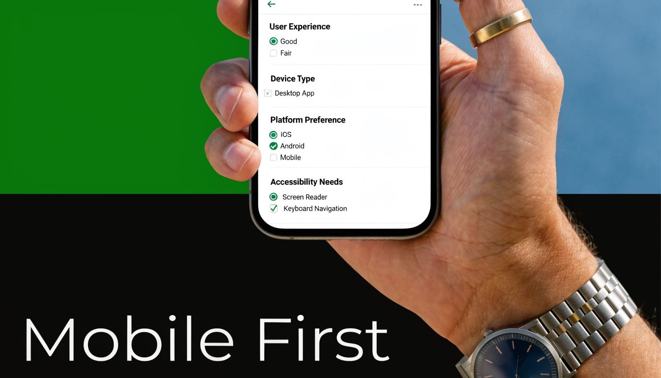
Design for thumbs, not desktops
Mobile-first design changes both content and structure. You need shorter prompts, simpler input types, and more disciplined hierarchy. BuildForm’s single-column presentation helps because it keeps users moving vertically instead of forcing pinching, zooming, or horizontal scanning.
The common failure mode is copying a desktop survey into a responsive shell and calling it mobile-ready. That usually preserves the hardest parts. A matrix question that is barely acceptable on a laptop becomes miserable on a phone. Open-text prompts also become more expensive on mobile because typing effort rises fast.
A stronger mobile survey usually follows a few rules:
- Prefer taps over typing: Use radios, buttons, and short selectors where possible.
- Keep screens uncluttered: Dense instruction text pushes the actual question below the fold.
- Test on real devices: Browser resizing won’t tell you how the survey feels in a hand.
- Assume interruptions: Mobile users pause, switch apps, and return later. Your form should handle that gracefully.
The practical advantage of a modern builder is speed. You can launch, test on actual phones, and refine fast. That matters because mobile survey design is less about theory and more about noticing where fingers hesitate, where text wraps badly, and where attention drops.
4. Use Strategic Question Ordering and Funnel Logic
Question order changes answers. It changes who finishes. It changes how candid people are. Yet teams often treat ordering like housekeeping instead of design.
A strong survey usually starts broad, warms people up with easy prompts, then narrows into specifics. Sensitive or high-friction questions belong later, once respondents understand the value of finishing. BuildForm’s visual logic builder makes this practical because you can create branching paths without turning the survey into a maintenance nightmare.
Sequence shapes honesty
Think about a SaaS onboarding survey. If you ask for company size, budget, and implementation timeline before asking why the user signed up, the form feels extractive. Start with motivation or use case, and the respondent has a reason to continue. Netflix-style preference collection works because it begins with accessible choices before getting more granular.
AAPOR best practices also emphasize quota controls for balance, and guidance summarized in the Sawtooth source notes that these controls can yield 15% to 25% better representativeness in diverse markets when managed carefully. In practice, that means ordering and routing aren’t just convenience features. They help you protect sample balance while avoiding unnecessary prompts for people who don’t fit a branch.
A useful funnel often looks like this:
- Warm-up first: Easy, relevant questions build momentum.
- Specifics second: Product details, feature usage, or behavior questions fit here.
- Sensitive prompts later: Demographics, salary, or purchase intent usually perform better near the end.
- Use skips aggressively: If a branch doesn’t apply, remove it immediately.
The best logic feels invisible. Respondents shouldn’t notice branching. They should just feel that the survey “gets” them.
No-code logic proves its worth. You can make the path feel personal without making the survey feel nosy.
5. Design Effective Answer Options and Response Scales
Good survey design best practices aren’t just about the questions. The answer options can create just as much bias as the wording. Overlapping ranges, unbalanced scales, and inconsistent labels all make analysis messier than it should be.
The easiest place to get this right is with standard formats. BuildForm templates for NPS and Likert-style questions reduce inconsistency because they give teams a stable structure to start from. That matters when multiple people build surveys over time and each one has a different instinct for scales.
Good scales make analysis easier later
Balanced scales are especially useful when you need nuance. Kantar notes that balanced scales in the 5-point to 7-point range improve accuracy over binary yes or no choices for more nuanced insights in its survey guidance. In practice, that means agreement, satisfaction, and confidence questions usually deserve more than a forced yes-or-no answer.
There’s a trade-off, though. More options aren’t always better. If labels become subtle to the point of confusion, respondents stop distinguishing between them. Five clear points often outperform a cluttered scale with too many barely different steps.
A few rules hold up well:
- Make options mutually exclusive: Ranges shouldn’t overlap.
- Make options collectively complete: Include a logical out, such as “not applicable,” when needed.
- Keep labels consistent: Don’t switch from agreement language to satisfaction language midstream without a reason.
- Use “Other” carefully: It helps when your list can’t be exhaustive, but too many open “Other” fields create coding work and fuzzy data.
Amazon’s star ratings and classic product feedback scales work because people understand them instantly. Familiarity lowers effort. That’s often more valuable than inventing a custom response model that looks clever but slows everyone down.
6. Implement Real-Time Validation and Error Prevention
Validation is one of the few survey features that improves both respondent experience and data quality at the same time. If someone enters an invalid email, incomplete phone number, or impossible date, catching it immediately is kinder than rejecting the whole submission later.
BuildForm supports real-time validation on common field types, which is where this becomes operational rather than aspirational. Slack and Stripe use similar patterns well. They flag the issue near the field, explain what needs fixing, and let the user keep moving.

Prevent bad data before submission
Validation fails when it becomes punishment. If the form fires red warnings too early or uses vague messages like “invalid input,” people get stuck and blame the form. The point is to prevent mistakes, not police them.
Sawtooth’s survey planning guidance also points to visual consistency across modes and notes that this can cut errors by 20% when the survey experience stays coherent between web and mobile. Validation is part of that consistency. A field should behave predictably no matter where someone opens it.
Use validation with restraint:
- Place errors beside the field: Don’t force respondents to hunt for what went wrong.
- Explain the fix: “Enter a work email” is better than “Invalid.”
- Allow common valid formats: Strict formatting rules often reject legitimate data.
- Validate at sensible moments: Waiting until the input is complete usually feels better than interrupting mid-entry.
If you want examples worth modeling, BuildForm’s library of form validation examples is a practical reference. The broader lesson is simple. Clean data starts at entry, not in a spreadsheet cleanup session later.
7. Reduce Form Length Through Strategic Field Selection
Teams rarely ship surveys that fail because the questions are badly written. They fail because too many stakeholders add one more field until the survey starts doing five jobs at once.
That trade-off shows up everywhere. Product wants context. Sales wants lead qualification. Marketing wants attribution. Research wants segmentation. If you do not force prioritization, the survey turns into a backlog instead of a decision-making tool. As noted earlier, shorter surveys generally produce better completion and cleaner data. The practical rule is simple. Cut first. Polish what remains.
Cut fields before you optimize them
Every field should earn its place. Ask one question about each item: what decision changes based on this answer? If the team cannot answer that clearly, remove it. If the data already exists in your CRM, warehouse, or product analytics, prefill it or skip it. If it matters later, collect it later.
Modern form builders make the principle usable, not just aspirational. In BuildForm, partial submission tracking lets you see where people drop off before they finish. That gives you a way to audit form length with actual behavior instead of opinions. Progressive profiling supports a second step many teams skip. Collect the minimum needed now, then ask for richer context in a follow-up form, onboarding step, or lifecycle survey.
A lean survey usually comes from four decisions:
- Separate need-to-know from nice-to-have: Tie each question to a specific decision, workflow, or segment.
- Stage data collection over time: Capture intent first, then add profile detail in later touchpoints.
- Use conditional logic to hide irrelevant questions: A respondent should only see fields that apply to their path.
- Label optional fields clearly: People move faster when the required effort is obvious.
I have seen teams spend a full review cycle rewriting labels on a form that still asked for too much information. Cutting six weak questions usually improves completion more than tweaking copy on all six. The hard part is not writing better fields. It is saying no to fields that never should have made it in.
8. Create Compelling Copy and Visual Hierarchy
People decide how much effort a survey deserves before they answer the first question. They read the title, scan the first screen, and look for signs of trust or confusion. That first impression comes from copy and visual hierarchy working together.
Mailchimp and Slack both do this well in their signup experiences. The wording explains the benefit quickly, and the layout keeps the eye moving in the intended order. BuildForm gives you enough control over branding, fonts, colors, and spacing to bring that same discipline into your own survey flow.
Design trust into the experience
Strong copy doesn’t mean persuasive fluff. It means every line earns its place. The title should tell respondents what they’re doing and why it matters. Helper text should answer likely objections. CTA text should describe the next step clearly.
There’s also a direct usability angle. Sawtooth’s guidance notes that opt-out options can lift trust and response rates by 10% to 15% when privacy is respected. Copy is where that respect becomes visible. If you tell people why you’re asking, what happens next, and what’s optional, they’re more willing to continue.
A few high-impact changes often help:
- Write benefit-led titles: “Help us improve onboarding” works better than “Customer Survey.”
- Use supportive microcopy: Clarify response time, privacy handling, or next steps.
- Keep visual hierarchy obvious: Headline, question, answer area, action button.
- Use whitespace intentionally: Spacing reduces crowding and makes forms feel easier.
A survey can be short and still feel heavy if the page looks busy.
That’s why visual hierarchy isn’t decoration. It tells respondents where to look, what matters, and how much work remains.
9. Leverage Analytics and A-B Testing for Continuous Improvement
Survey efforts often conclude at launch. Strong teams treat launch as the first reliable source of feedback. If respondents drop at the same question, skip an option repeatedly, or hesitate at one screen longer than expected, the survey is telling you what to fix.
BuildForm’s analytics and partial submission tracking are well suited to this kind of iteration because they let you inspect behavior at the question level instead of judging the whole form by one top-line completion number. That’s the bridge between survey design best practices and everyday execution.
Measure friction at the question level
Testing works best when you isolate one meaningful variable. Change the order of two sections. Rewrite one high-friction question. Replace a large open-text prompt with a structured choice. Then compare what changed in completion behavior and answer quality.
This is also where planning matters. Sawtooth emphasizes sample size planning, noting that around 385 respondents are needed for a 95% confidence interval with a 5% margin for large populations in its survey research guidance. You don’t need to quote significance formulas in a weekly growth meeting, but you do need enough responses before declaring one version better.
Useful optimization habits include:
- Track drop-off by question: This usually reveals friction faster than overall completion rate.
- Review partial submissions: They often expose where respondents lost momentum.
- Test one major variable at a time: Otherwise you won’t know what caused the shift.
- Document every change: Teams forget why a form looks the way it does.
If your work overlaps with workflow optimization and growth systems, an AI automation agency perspective can also be useful for thinking about how survey data should move into downstream processes after collection. The key point remains simple. Measure behavior, then improve the form based on what respondents do.
10. Build Trust, Transparency, and Personalization
Personalization only helps when it feels earned. If a survey pre-fills the right fields, remembers context, and asks relevant follow-ups, it saves time. If it seems to know too much without explanation, respondents get cautious fast.
That trade-off matters even more as accessibility and inclusive design get more attention. The survey design material from Penn State highlights an underserved gap in practical guidance for diverse audiences, including users with disabilities and multilingual needs, in Penn State survey design resources. That’s a useful reminder that trust isn’t only about privacy language. It’s also about making the experience usable for more people.
Relevance works when people understand it
BuildForm supports privacy policy links, consent checkboxes, and integrations that can pre-fill known fields from first-party systems like a CRM. Used well, that shortens forms and reduces redundant work. Used poorly, it creates that “how did they get this?” moment that hurts completion.
Good implementation usually follows a few rules:
- Explain why you’re asking: This matters most for sensitive fields.
- Disclose prefilled context: If a name or company is inserted, let the respondent edit it.
- Keep consent visible: Don’t bury privacy language below the fold.
- Design inclusively: Clear labels, strong contrast, and straightforward interaction patterns help more people complete the survey successfully.
Surveys also benefit from restraint here. Personalization should remove effort, not add creepiness. If the respondent can understand the source of the information and control it easily, trust usually holds. If not, relevance turns into suspicion.
10-Point Survey Design Best Practices Comparison
| Practice | 🔄 Implementation Complexity | ⚡ Resource Requirements | 📊 Expected Outcomes | ⭐ Effectiveness / Quality | 💡 Ideal Use Cases |
|---|---|---|---|---|---|
| Keep Questions Clear and Concise | Low, copy edits and review | Low, time from researcher/editor | Higher completion and more accurate responses | ⭐⭐⭐⭐ | Short surveys, broad audiences, lead qualification |
| Minimize Cognitive Load (Progressive Disclosure) | Medium–High, conditional flows & pacing | Medium, design/dev and testing effort | Reduced mobile drop-off; perceived shorter surveys | ⭐⭐⭐⭐⭐ | Long surveys, mobile-first forms, conversational UX |
| Optimize for Mobile‑First Design | Medium, responsive layout and touch UX | Medium, design, QA on devices | Lower mobile abandonment; higher mobile conversions | ⭐⭐⭐⭐ | Mobile-heavy traffic, ecommerce, on-the-go users |
| Use Strategic Question Ordering & Funnel Logic | Medium, planning + conditional branching | Medium, mapping and testing logic | Higher completion; better-targeted insights | ⭐⭐⭐⭐ | Qualification funnels, segmentation, complex surveys |
| Design Effective Answer Options & Scales | Medium, scale selection and pre-testing | Low–Medium, pilot testing with audience | Cleaner, more analyzable data; fewer ambiguous answers | ⭐⭐⭐⭐ | Quantitative research, NPS/CSAT, statistical analysis |
| Implement Real‑Time Validation & Error Prevention | Medium, validation rules and UX | Medium, dev effort and maintenance | Fewer bad submissions; less post-cleaning work | ⭐⭐⭐⭐ | Lead capture, checkout forms, critical contact fields |
| Reduce Form Length Through Strategic Field Selection | Low–Medium, audit + progressive profiling | Low, field prioritization & integrations | Higher completion rates; faster conversions | ⭐⭐⭐⭐ | Signup flows, lead gen, mobile checkouts |
| Create Compelling Copy & Visual Hierarchy | Medium, copywriting + visual design | Medium, designer and writer time | Increased trust and engagement; better CTAs | ⭐⭐⭐⭐ | Brand-facing forms, onboarding, high-trust signups |
| Leverage Analytics & A/B Testing for CI | High, tracking, analysis, experiment design | High, analytics tools, sample size/time | Continuous uplift; data-driven prioritization | ⭐⭐⭐⭐⭐ | Performance optimization, CRO programs, enterprise forms |
| Build Trust, Transparency & Personalization | Medium–High, privacy, prefill, consent flows | Medium–High, legal, CRM integrations | Higher trust, compliance, and relevant responses | ⭐⭐⭐⭐ | Regulated markets, B2B lead gen, repeat visitors |
Turn Your Surveys Into Conversion Engines
Good survey design isn’t just about collecting answers. It’s about respecting time, reducing friction, and earning enough trust that respondents stay engaged long enough to give you useful data. That’s why the best survey design best practices are both methodological and practical. You need clear objectives, careful wording, disciplined length, mobile-first execution, strong logic, and enough measurement to keep improving after launch.
The through-line across all 10 practices is simple. Every extra decision, extra field, unclear label, or irrelevant branch asks the respondent to do more work. When that work feels unnecessary, people leave or rush. When the experience feels focused and fair, they finish with better attention. That improves not just completion, but the quality of the data you use for product decisions, campaign targeting, hiring workflows, or academic research.
Some trade-offs never go away. A shorter survey may leave some stakeholders wanting more information. More personalization may raise privacy concerns if you don’t explain it well. Richer branching can improve relevance, but it also raises the risk of logic mistakes if you skip testing. Those aren’t reasons to avoid modern survey design. They’re reasons to be intentional about it.
Pretesting is one of the best examples. Sawtooth notes that checking existing data first can reduce redundancy, and the broader guidance across survey research consistently points to testing as the moment where wording, order, and logic problems become visible before they affect your full sample. Kantar also notes that pretesting with small samples of 20 to 50 respondents can reduce response errors by 25% to 35% when randomization and skip patterns prevent misinterpretation in its survey guidance. That’s not glamorous work, but it’s often where quality is won.
If you’re building surveys in a fast-moving environment, tooling matters because it turns principles into repeatable workflows. A builder like BuildForm can support conversational forms, conditional logic, analytics, integrations, and branded experiences, which makes it easier to apply these practices without rebuilding the process each time. The tool won’t supply the judgment. It will make good judgment easier to implement.
One more practical point. Strong surveys often improve adjacent systems too. Cleaner qualification data helps sales routes leads correctly. Better segmentation improves lifecycle messaging. More thoughtful copy can strengthen the same communication habits behind strategies for compelling arguments. Survey design sits closer to persuasion, trust, and UX than many teams realize.
Build the survey people can finish. That’s usually the same survey that gives you data you can use.
If you’re ready to put these survey design best practices into practice, try BuildForm to create shorter, adaptive, mobile-friendly forms with conditional logic, analytics, and workflows that help you improve completion without sacrificing data quality.