Understanding What Makes Forms Actually Work
Effective form UX design is the cornerstone of a positive user experience. It’s the difference between a user effortlessly completing a task and abandoning it in frustration. But what separates the forms users breeze through from those that cause users to give up? The answer lies in understanding the psychology of form completion.
This means looking beyond traditional form design, which often prioritizes aesthetics over usability. We need to consider the cognitive processes users undergo when interacting with a form. A long, cluttered form, for example, increases the cognitive load. This makes it more difficult for users to process information and complete the task, often leading to higher abandonment rates and lower user satisfaction.
The Impact of Form UX Design
Good UX design significantly impacts business success. Every $1 invested in UX can yield a return of $100, an ROI of 9,900%. This underscores the economic benefits of prioritizing UX. Companies that implement good design practices grow twice as fast as the industry benchmark. For more statistics on the impact of UX, check out this resource: Learn more about UX Statistics Good form UX design also directly improves conversion rates and boosts lead generation.
Key Principles of Effective Form Design
Several key principles contribute to a form's effectiveness. These influence user behavior and contribute to a smoother, more enjoyable experience:
-
Clarity and Conciseness: Forms should be easy to understand and free of jargon or technical terms that might confuse users. Keep it simple and straightforward.
-
Visual Hierarchy: Use visual cues like headings, subheadings, and white space to guide users through the form. This establishes a natural flow and clarifies the information being requested.
-
Input Field Optimization: Select the right input type for each field. For example, use dropdown menus for multiple choices and date pickers for dates. This simplifies user input and reduces errors.
-
Effective Validation and Error Handling: Clear and helpful error messages are essential. Guide users towards correcting mistakes without using overly technical or confusing language.
-
Mobile-First Approach: With the rise of mobile usage, forms must function seamlessly on smaller screens. Prioritize touch-friendly elements and optimize for different screen sizes.
By understanding and implementing these principles, you can transform your forms from frustrating obstacles into streamlined, user-friendly tools. This not only drives conversions and improves user satisfaction, but also contributes to better overall business outcomes.
Essential Form UX Design Principles That Drive Results
Ready to transform your forms from obstacles to opportunities? This section explores the fundamental principles of exceptional form UX design, supported by data and user research. We'll discuss minimizing cognitive load for improved completion rates and explore strategies for visual hierarchy, progressive disclosure, and smart defaults to streamline the user experience.
Cognitive Load: The Enemy of Completion
Cognitive load theory explains our working memory's limited capacity. In the context of form design, shorter forms with fewer fields reduce cognitive load, making completion easier. Conversely, long, complex forms increase cognitive load, resulting in higher abandonment rates. For a deeper dive into form design best practices, check out this helpful resource: How to master form design best practices. The key takeaway? Request only essential information.
The following infographic illustrates the correlation between form length and completion rates. It compares average completion rates based on the number of form fields.
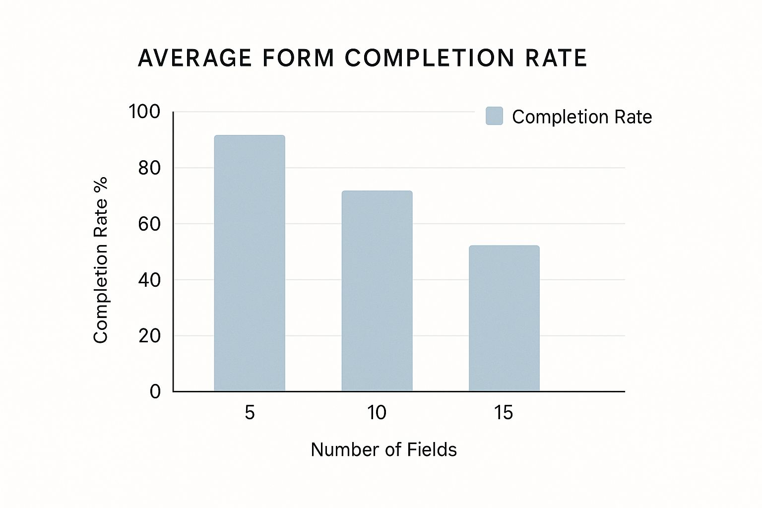
Forms with only 5 fields achieve an 80% completion rate, while those with 15 fields drop to 45%. This underscores the importance of brevity in form design. Each unnecessary field is a potential barrier to conversion.
Visual Hierarchy and Progressive Disclosure
Clear visual hierarchy guides users through your form. Effective use of headings, subheadings, and white space creates a roadmap, making the experience less daunting and more intuitive.
Progressive disclosure reveals information gradually, preventing users from feeling overwhelmed. Instead of presenting a long list of options, start with broader categories and reveal specific choices as users make selections. This simplifies complex forms and maintains user focus.
Smart Defaults and Input Field Optimization
Smart defaults, pre-filled fields based on user data or common choices, significantly reduce user effort. However, defaults should be carefully chosen and easily editable. Incorrect defaults create extra work, negatively impacting the user experience.
Choosing the correct input type for each field is equally important. Input masking, visually enforcing the input format (like a phone number field), helps prevent errors and improves data quality. Utilize date pickers, dropdown menus, and checkboxes to further streamline the input process. These elements contribute to a seamless and efficient form experience.
To understand the impact of different form design elements, consider the comparison below:
The following table provides a comparison of various form design elements and their impact on completion rates and user satisfaction.
Form Design Elements Impact Comparison
A comparison of different form design elements and their impact on user completion rates and satisfaction scores
| Design Element | Completion Rate Impact | User Satisfaction Score | Implementation Difficulty |
|---|---|---|---|
| Minimizing Number of Fields | High (Positive) | High (Positive) | Easy |
| Clear Visual Hierarchy | Medium (Positive) | High (Positive) | Medium |
| Progressive Disclosure | High (Positive) | Medium (Positive) | Medium |
| Smart Defaults | Medium (Positive) | High (Positive) | Medium |
| Input Masking | High (Positive) | Medium (Positive) | Easy |
As you can see, minimizing the number of fields and employing input masking have a significant positive impact on completion rates and are relatively easy to implement. While other elements like visual hierarchy, progressive disclosure, and smart defaults may be slightly more challenging to implement, they still offer substantial benefits to both completion rates and user satisfaction. Prioritizing these elements in your form design can lead to significant improvements in overall form performance.
Optimizing Form Fields for Maximum Usability
Optimizing individual form fields is crucial for creating a user-friendly experience that boosts conversions. This involves carefully selecting input types, incorporating intelligent assistance features, and implementing helpful validation techniques. Think of it like selecting the right tool for the job: a hammer for nails, a screwdriver for screws. Choosing the appropriate input type for each field significantly reduces user effort and minimizes errors.
Streamlining Input With the Right Tools
For example, providing a date picker for birthdate fields is far more efficient than requiring users to manually type the date. Similarly, dropdown menus for country selection eliminate typos and ensure data consistency. These small details make a big difference in the overall user experience.
Additionally, consider using input masking, which guides users by visually enforcing the correct input format. For phone numbers, this might involve displaying parentheses and hyphens in the field itself. This small change can drastically reduce input errors, particularly on mobile devices.
Enhancing Usability With Intelligent Assistance
Features like predictive auto-completion, such as suggesting addresses as users type, can make forms feel almost intuitive. This feature not only saves time but also reduces the cognitive load on the user. For more information on form best practices, check out our article on How to master form validation examples. This kind of intelligent assistance significantly improves the user experience, especially for longer or more complex forms.
Another powerful technique is progressive enhancement, where fields adapt based on user input. Imagine a form that asks for a "shipping address" only if the user selects "delivery" as their preferred shipping method. This dynamic behavior keeps the form focused and relevant, minimizing cognitive overload.
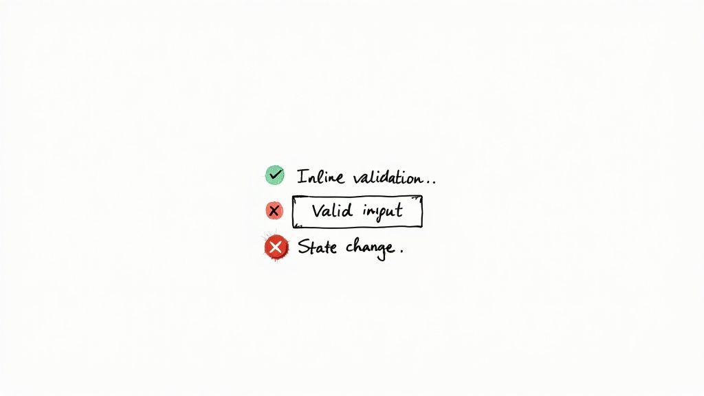
Validation That Helps, Not Hinders
Form validation should be helpful, not frustrating. Instead of simply displaying generic error messages like "Invalid input," provide specific guidance. For example, if a password field requires a minimum length, the error message could say, "Password must be at least 8 characters long." This clear feedback empowers users to correct their mistakes quickly.
Moreover, the placement and timing of validation messages matter. Displaying real-time feedback as users type can be helpful, but avoid overwhelming them with too many messages at once. Consider highlighting fields with errors using a subtle color change and displaying detailed error messages only after the user attempts to submit the form.
Finally, optimizing field lengths and providing helpful helper text are small changes that can yield significant improvements in completion rates. A field for a user's name, for instance, shouldn’t be the same length as a field for a short answer. Concise helper text, placed strategically near the field, can provide additional context and reduce user confusion. These seemingly minor details are essential for creating a smooth and intuitive form experience.
Advanced Form UX Design Strategies for Complex Requirements
When business requirements become complex, your form UX design needs to adapt. This section addresses common challenges in form UX design, such as multi-step forms, conditional logic, and dynamic fields. We'll explore patterns for handling lengthy forms without overwhelming users and delve into intelligent sectioning and intuitive navigation.
Taming the Beast: Multi-Step Forms
Long forms can be intimidating. Breaking them down into smaller, digestible steps dramatically improves the user experience. Think of it as planning a long journey: a cross-country trip is less daunting when broken into smaller, manageable daily drives. This approach, frequently used in e-commerce checkouts, reduces cognitive load and makes the overall process feel less overwhelming.
-
Chunking Information: Group related fields together into logical steps. This creates a sense of progress and helps users maintain focus.
-
Clear Navigation: Provide clear "Next" and "Previous" buttons, along with a visual progress indicator. This gives users a sense of control and context.
-
Step Summaries: On review steps, summarize the information entered in previous steps. This reinforces progress and allows for easy error correction.
Conditional Logic: Smart Forms That Adapt
Conditional logic, where fields appear or disappear based on user input, simplifies complex forms. For example, if a form asks about pet ownership and the user selects "No," subsequent fields about pet type and name become irrelevant and should be hidden. This dynamic experience is tailored to the individual user.
-
Clear Relationships: Ensure the relationship between user input and the appearance or disappearance of fields is clear and predictable.
-
Avoid Excessive Branching: While conditional logic is powerful, too much can be confusing. Balance flexibility and simplicity.
-
Test Thoroughly: Complex conditional logic requires thorough testing to ensure proper function and avoid unexpected errors.
Dynamic Field Generation: Maintaining Clarity
Sometimes, the number of required fields depends on user input. For instance, a form might ask how many children a user has, then dynamically generate corresponding fields for each child.
-
Clear Instructions: Provide clear instructions on adding or removing dynamic fields.
-
Visual Cues: Use visual cues, like "+" and "-" buttons, for intuitive field addition and removal.
-
Limitless Possibilities: Consider platforms like BuildForm, which offers AI-powered dynamic field generation, helping create intelligent, adaptable forms with minimal manual setup.
Handling Complex Validation and File Uploads
Complex validation rules, especially across multiple steps, need careful design. Display error messages clearly, ideally next to the relevant fields. For file uploads, provide clear instructions on accepted file types and sizes. A real-time progress bar reassures users during uploads.
Implementing these strategies manages complexity without overwhelming users, creating a seamless experience. A well-designed multi-step form with clear navigation, concise validation, and dynamic fields leads to a smoother user journey and greater satisfaction. While building such forms with traditional methods can be time-consuming, AI-powered platforms like BuildForm help streamline the process, enabling you to create exceptional form UX designs for complex business needs.
Mobile-First Form UX Design That Actually Works
Mobile form design isn't about shrinking desktop forms. It's about reimagining the experience for touch-first interactions. This means addressing mobile's unique challenges and using its capabilities to create thumb-friendly interfaces. These interfaces need to work seamlessly on various screen sizes.
Touch-Friendly Design: Beyond Button Sizing
Touch targets should be large enough for comfortable tapping. A general recommendation is around 44×44 pixels. This minimizes accidental taps and user frustration. But touch-friendly design goes beyond button size. Consider the spacing between elements. This helps avoid accidental touches on neighboring items. Also, provide clear visual feedback when a touch registers, such as highlighting the touched element. This confirms the user's action and enhances control.
Optimizing the Mobile Keyboard
Keyboard optimization is crucial for a smooth user experience. Match the keyboard type to the input field. For example, show a numeric keypad for number inputs and an email keyboard for email fields. This simplifies data entry.
- Minimize Typing: Use auto-suggestions and auto-completion. This reduces typing, which is especially helpful on mobile.
- Input Masking: Use input masking for phone numbers and credit card details. This guides users and improves data quality.
- Smart Defaults: Use smart defaults for common fields to speed up form completion.
Responsive Design: Forms That Flow
Responsive design ensures forms adapt to different screen sizes. Desktop forms can be overwhelming on mobile. Use a single-column layout for mobile forms. This ensures a comfortable vertical flow.
For long forms, consider progressive disclosure. This shows sections as the user progresses, keeping the interface clean and focused.
Leveraging Mobile Device Features
Mobile devices offer unique ways to enhance form UX design. Consider these options:
- Camera Integration: Let users scan documents or take pictures to fill in information.
- Location Services: Auto-fill location fields using location services.
- Biometric Authentication: Use fingerprint or facial recognition for logins and secure transactions.
By using these strategies, mobile forms become seamless and less tedious. These techniques, when implemented well, can significantly improve completion rates and user satisfaction. This leads to better conversion and a more positive overall experience. A well-designed mobile form builds user trust and encourages platform engagement. This, in turn, drives business growth and helps achieve business objectives.
Testing and Iterating Your Form UX Design
Stop guessing and start knowing. This section explains how to build a data-driven form UX design process that continuously improves based on real user behavior and feedback. We'll explore various testing approaches, from quick guerrilla usability testing to more robust A/B testing frameworks. These tests will reveal what truly drives conversions for your audience.
Gathering User Feedback: Qualitative and Quantitative Approaches
Effective form UX design depends on understanding how real users interact with your forms. Qualitative feedback helps uncover the why behind user behavior. Methods like user interviews and think-aloud protocols, where users verbalize their thoughts while completing a form, offer valuable insights into their motivations and pain points. This lets you understand not only what users are doing, but also why.
Quantitative data, such as form completion rates, time spent on each field, and error rates, pinpoint specific areas for improvement. Tools like heatmaps and click tracking visualize user behavior, revealing where users struggle or get confused.
Usability Testing: From Guerrilla to Formal
Usability testing provides valuable feedback on your form's effectiveness. Guerrilla testing, involving asking colleagues or friends for feedback, offers quick insights early in the design process.
For more structured testing, consider remote usability testing tools. These tools allow observation of user interaction in their natural environment, providing a realistic view of form performance. Platforms like UserTesting can facilitate this type of research.
A/B Testing: Optimizing for Conversions
A/B testing compares different form versions to determine which performs better. By testing variations of elements like button placement, field labels, or helper text, you can identify impactful changes for conversion rates. A/B testing offers a data-driven approach, eliminating guesswork and ensuring design decisions are based on proven results. Tools like Optimizely can be helpful for running these tests.
Iterative Improvement: The Key to Ongoing Success
The UX design field is currently transforming. In 2023, UX job postings dropped to about 70% of their 2021 levels, indicating a competitive market. This shift underscores the importance of efficiency and data-driven design. Learn more: Find more detailed statistics here.
Platforms like BuildForm can streamline the iterative process with real-time analytics and optimization features. This allows quick identification and resolution of issues, continually improving form performance. By embracing an iterative approach, you can ensure forms are optimized for maximum conversion and user satisfaction, effectively meeting user needs and driving business goals.
Future-Proofing Your Form UX Design Strategy
The future of form UX design is constantly changing. This exploration delves into how emerging technologies are reshaping form interactions, focusing on accessibility, innovative design patterns, and adapting to evolving user expectations. We'll examine creating forms that not only function effectively today but also remain relevant and engaging as technology advances.
Accessibility: Designing Forms for Everyone
Accessibility in form design is crucial for inclusivity, ensuring your forms work for everyone, including users with disabilities. This means adhering to standards like WCAG (Web Content Accessibility Guidelines), which provide criteria for making web content, including forms, accessible to people with a wide range of disabilities. For instance, proper label placement and keyboard navigation are essential for users with visual impairments or limited mobility.
Emerging Technologies and Form UX Design
Emerging technologies like artificial intelligence (AI) are transforming how we interact with forms. AI-powered features, such as intelligent chatbots and predictive input, create more conversational and personalized form experiences. While these technologies offer potential, thoughtful implementation is crucial, prioritizing user needs and avoiding unnecessary complexity.
Progressive Web Apps (PWAs) and Form UX Design
Progressive web apps (PWAs) offer a seamless mobile experience, blending the best of web and native apps. When designing forms for PWAs, consider offline functionality to enable form completion even without internet access. This is particularly important for mobile users in areas with unreliable network coverage.
Emerging Interaction Models: Beyond the Keyboard and Mouse
Voice interfaces and conversational design are changing how users interact with technology. Imagine completing a form simply by speaking to a voice assistant. While these interaction models are still developing, they have the potential to drastically simplify form completion.
Building Adaptable Forms
User expectations are constantly evolving. To future-proof your form UX design, prioritize fundamental usability principles:
-
Clarity: Ensure forms are easy to understand and use.
-
Efficiency: Minimize the number of fields and streamline the input process.
-
Flexibility: Design forms that adapt to different devices and contexts.
By focusing on these core principles, you can create forms that meet current user needs and remain effective as those expectations change. The following table provides a snapshot of emerging trends in form UX design.
To help visualize the current state and potential impact of these trends, we've compiled the following table:
Form UX Design Trends and Implementation Timeline
Overview of emerging form design trends, their adoption rates, and recommended implementation priorities for different business contexts
| Trend | Current Adoption Rate | Implementation Complexity | Business Impact | Recommended Priority |
|---|---|---|---|---|
| AI-Powered Features | Low | High | Medium | Medium |
| Voice Interfaces | Low | High | Low | Low |
| Conversational Design | Medium | Medium | Medium | Medium |
| PWA Optimization | Medium | Medium | High | High |
| Accessibility Compliance | High | Low | High | High |
As the table highlights, prioritizing accessibility compliance and PWA optimization yields significant business impact with comparatively lower implementation complexity.
Ready to build forms that convert and delight? BuildForm, an AI-powered form builder, helps teams boost engagement and capture more leads without coding. Create unlimited conversational forms, surveys, and more with built-in optimization and real-time analytics. Learn more about BuildForm and start building today!