Forms are often still treated like a storage problem. Add fields, collect data, hope conversion holds.
That framing overlooks the core problem. Formstack benchmark data, cited by IvyForms, found 13.9% completion for multi-page forms versus 4.5% for single-page forms, a 208% relative uplift for step-based flows (IvyForms on multi-step vs single-step forms). The takeaway isn't just that longer forms can be broken up. It's that users respond better when the path feels manageable.
Step by step forms work because they reduce visible effort, sequence decisions, and let teams ask better questions without forcing every visitor through the same experience. Done well, they raise conversion quality at the same time they improve completion rates. Done poorly, they become a prettier version of the same old friction.
Marketing teams usually notice the upside first in lead gen. Sales notices it later in lead quality. Ops notices it when the data lands where it should, in a usable format, without manual cleanup.
Table of Contents
- The Undeniable Case for Step by Step Forms
- Designing a Form That Builds Momentum
- Building a Dynamic Form with Conditional Logic
- Integrating Forms into Your Business Workflow
- Analyzing Performance and Optimizing for Growth
- Real-World Templates for Every Use Case
- Frequently Asked Questions About Step by Step Forms
The Undeniable Case for Step by Step Forms
Analysts and form platforms have reported meaningful completion lifts for multi-step flows compared with long single-page forms. The exact gain varies by audience, traffic source, and offer, but the pattern is consistent enough to treat this as a conversion and data-quality decision, not a visual refresh.
The reason is straightforward. Users judge effort before they begin. A long page full of required fields asks them to calculate cost up front. A shorter first step lowers that initial estimate and gives the team a chance to earn the next answer.
This matters well before someone starts typing. On high-intent landing pages, abandonment often begins at the scan stage. Visitors look at the form, decide it will take too long or ask for too much, and leave. A step-by-step flow reduces that first impression of effort and lets you collect useful intent signals earlier.
Practical rule: Ask, "What is the lightest path to a useful answer?"
There is a second advantage, and it comes from behavior research, not design fashion. In behavioral psychology, the commitment and consistency principle helps explain why users who complete a small first action are more likely to continue with related actions. In practice, that means an easy opening step can improve completion rates and reduce junk submissions, because people are responding to a guided sequence instead of reacting to one large wall of fields.
Single-page versus step-based design
| Attribute | Single-Page Form | Step-by-Step Form |
|---|---|---|
| First impression | Large visual load | Smaller visible task |
| User effort perception | High upfront | Distributed across steps |
| Question flow | Often static | Can feel sequential and guided |
| Relevance | Same fields for everyone | Easier to tailor by path |
| Mobile experience | More scrolling, more overwhelm | More focused screens |
| Error handling | Often shown all at once | Easier to validate step by step |
| Optimization | Harder to isolate friction | Easier to spot drop-off by step |
| Data quality | More rushed completions | Better context for each answer |
The trade-off is real. A step-based form takes more planning, more UX discipline, and usually more implementation work. Teams have to define step order, save partial progress where it matters, map conditional paths, and decide how submissions should sync with CRM and automation tools. That extra effort is usually worthwhile because it forces sharper decisions early. Weak questions, duplicate fields, and internal-only requests become much easier to spot before launch.
This is why experienced teams redesign the form as a system, not just a page.
What works and what fails
A step-by-step flow works when each screen has a job. It fails when a long form is chopped into smaller screens with no logic behind the sequence.
Many first redesigns go wrong here. Teams spread unrelated questions across multiple steps and expect the interface alone to improve performance. Users still feel the same friction. They just meet it in installments. Better results come from aligning each step to a decision in the journey, such as identity, qualification, need, budget, or timing, then using conditional logic to remove questions that do not apply.
That structure has downstream value too. Sales gets cleaner lead context. Operations gets fewer malformed submissions. Marketing gets clearer drop-off data by step, which makes testing much easier than trying to diagnose one overloaded page. Teams working through form design best practices for conversion and usability usually find that the biggest gains come from better sequencing, not from cosmetic polish alone.
Visual polish still matters, especially on branded demand capture forms. If your team is cleaning up Pardot experiences, Pardot form aesthetic improvement can help tighten presentation without changing the strategy underneath.
If a user cannot explain why the next step exists, the flow is not ready.
The strongest step-by-step forms carry the user from first click to qualified submission with a clear sequence, relevant branching, and clean handoff into the business systems that handle follow-up. That lifecycle view is what turns a form redesign into measurable pipeline impact.
Designing a Form That Builds Momentum
Strong form performance is usually decided before the build starts. The structure, question order, and visual cues shape whether users feel guided or inspected.

VBOUT notes that progress bars can boost completion rates by 20-30%, and that starting with simpler questions first helps build momentum, with some tests showing UX-driven conversion gains of up to 400% (VBOUT on improving conversion rate with multi-step forms). Those numbers don't mean every form needs a flashy wizard. They do show that sequencing and feedback matter.
Group questions by decision, not by database field
The fastest way to weaken a form is to organize it around internal systems. Users don't care that Salesforce wants one field order and your CRM enrichment process prefers another.
Group steps around natural topics. A B2B lead form might look like this:
- Step one starts with low-friction identity fields. Name, work email, maybe company name. These are familiar, fast, and low-risk.
- Step two moves into business context. Team size, industry, or current tools. Qualification begins at this stage.
- Step three asks about need and timing. Pain point, use case, urgency, or budget range if it's necessary.
- ** step confirms intent.** Demo request, trial preference, or consent to follow-up.
That ordering works because it mirrors how people disclose information. They usually don't want to start with budget, implementation complexity, or procurement details.
For teams working on visual polish, small changes to layout and field styling can improve trust before you touch logic. If you're updating older Pardot embeds, a tool like Pardot form aesthetic improvement can help modernize the presentation so the form doesn't feel disconnected from the site experience.
Use design cues that lower uncertainty
Users keep moving when they know three things. Where they are, what's expected next, and whether the form is behaving correctly.
A few design choices do heavy lifting:
- Progress indication matters. A progress bar, step counter, or simple label like "Step 2 of 4" reduces uncertainty.
- Single-column layouts are easier to scan. This is especially true on mobile, where multi-column forms often create missed fields and awkward focus jumps.
- Inline validation prevents pileups. Catching an email typo immediately is better than rejecting the whole submission at the end.
- Button labels should match intent. "Next" works for progression. "Get pricing" or "Request demo" works when the action has a clear outcome.
A progress bar doesn't just show status. It reassures the user that the form has an end.
Teams also overestimate how much information belongs above the fold. Long helper text usually adds noise. If a field needs a paragraph to explain, either the field is too complex for that moment or it belongs later in the flow.
For a deeper review of practical UX choices, form design best practices is a useful reference when you're refining labels, layout, and mobile behavior.
Building a Dynamic Form with Conditional Logic
A static multi-step form is better than a single long page. The bigger gains usually come when the form adapts to the user's answers.
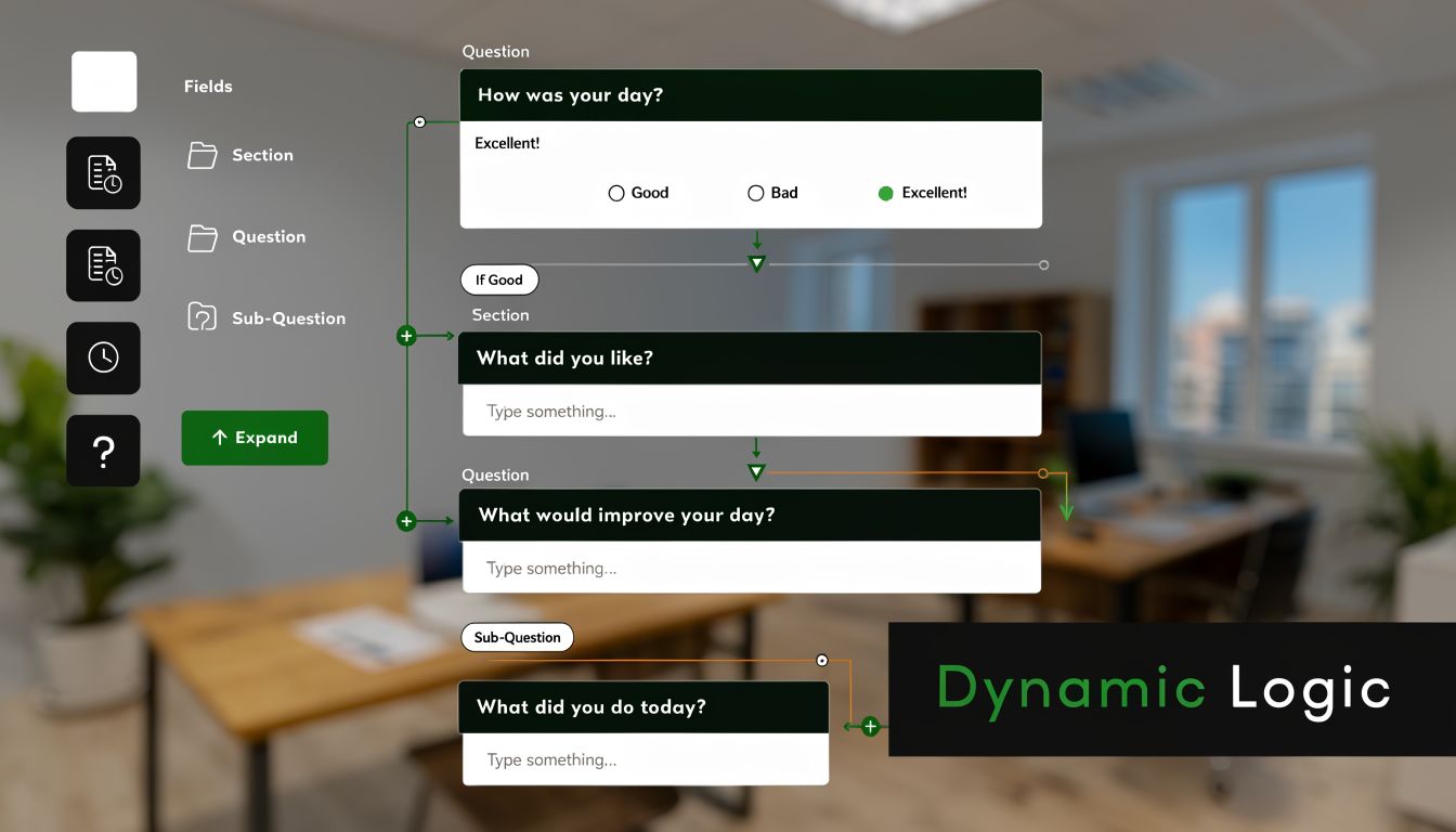
This is a common point where many teams stall. They know a student, a sales-qualified buyer, and a casual researcher should not all see the same path, but they try to solve branching inside the form builder before they define the actual decision rules. That usually leads to messy logic, duplicate fields, and reporting that no one trusts after launch.
Start with the logic map before touching the tool.
Conditional logic is just a set of business rules translated into the form flow:
- If the user selects a category, show the questions tied to that category
- If the answer signals low intent, shorten the path and offer a lighter next step
- If the answer signals high intent, ask the extra questions needed for routing or qualification
- If a response makes another field irrelevant, hide that field and remove its validation
The goal is relevance. Every question should earn its place.
A SaaS company and an ecommerce brand can both submit a "tell us about your business" form, but the useful follow-up questions are different. For SaaS, the sales team may need product-led growth motion, trial volume, or CRM stack. For ecommerce, order volume, storefront platform, and retention priorities matter more. Good branching cuts questions for both audiences while improving the context attached to the lead.
Map the branch logic around decisions, not fields
Teams often build conditional forms one field at a time. That is the slowest way to do it. Build around decision points instead. Ask which answers change the next action, the next owner, or the next data requirement.
For a demo request form, a practical flow might look like this:
Step one collects name, work email, and company. Step two asks for industry. That answer changes the rest of the path.
If industry equals SaaS:
- show acquisition model, team size, and funnel stage
If industry equals ecommerce:
- show catalog size, checkout setup, and retention focus
If team size suggests a larger buying group:
- add a question about stakeholders or approval process
If the user says they are only researching:
- skip scheduling and send them to a lower-friction follow-up path
That structure does two jobs. It reduces friction for the user, and it gives sales or ops cleaner intake data. It also sets up downstream automation more cleanly, because the branch itself becomes a useful signal for routing and follow-up. Teams planning those handoffs can borrow ideas from these workflow automation examples for form submissions.
The best conditional logic feels obvious to the user and deliberate to the business.
A no-code builder is usually enough for branching, skip logic, hidden fields, and routed outcomes. The hard part is not the software. The hard part is agreeing on the rules, naming fields consistently, and testing every branch before traffic hits the form.
Later in the flow, a walkthrough can help teams visualize how branching is assembled in practice:
Validation and fallback rules matter
Conditional forms break in predictable ways. A hidden required field blocks submission. A branch loops users into an irrelevant step. A mobile layout hides context that seemed clear on desktop. These are implementation problems, but they show up as conversion problems.
A few rules prevent most of them:
- Never keep hidden fields required. If the field disappears, the validation has to disappear too.
- Give every branch a clear end state. Each path should still lead to a usable submission outcome.
- Test branch behavior on mobile early. Taps, dropdowns, and step transitions often fail there first.
- Store branch context with the submission. The receiving team needs to know which path the user completed.
- Review reporting before launch. If marketing cannot segment by path, the form will be harder to optimize later.
That last point gets missed often. Conditional logic is not just a UX feature. It is also part of your measurement setup. If branch data is captured correctly, post-launch analysis gets much sharper. You can see which paths convert, which segments abandon, and where qualification rules create unnecessary friction. That turns the form from a one-time redesign project into a system you can keep improving.
Integrating Forms into Your Business Workflow
A form submission isn't the end of the process. It's the handoff point.
Many redesigns underperform due to the subsequent manual data handling. The front-end experience improves, completion rates rise, and then the data lands in an inbox where someone manually copies it into Slack, a CRM, a spreadsheet, or an email platform. That lag erodes the value of the conversion.
What should happen right after submission
Think of the form as the first trigger in an operational chain. The exact workflow depends on the use case, but the principle stays the same. Every meaningful submission should kick off the next action automatically.
For a demo request, sales might need an alert in Slack, a new contact in HubSpot, and a task for follow-up. For an event registration, the business may need payment confirmation, a CRM update, and a welcome email. For an application form, recruiting may need routing by department and status.
The step-by-step format helps here because the data tends to be cleaner. Questions are grouped more logically, validation catches more issues as users move through the flow, and conditional paths reduce junk fields that don't apply.
Examples that remove manual work
A few common patterns show the value quickly:
- Sales handoff through Slack. A qualified lead submits the form. The sales channel gets a message with key answers, including selected use case and urgency, so the team doesn't have to open a dashboard first.
- CRM creation for pipeline continuity. The form creates or updates a contact in Salesforce or HubSpot, then opens an opportunity or attaches the submission to an existing account.
- Email nurture for softer intent. If a visitor isn't ready for sales, the form can route them into a product education sequence instead of forcing a calendar booking.
- Payments and registrations. Event forms can collect registration details, trigger payment through Stripe, then push attendance data into the rest of the stack.
- Internal ticketing or project intake. Operations or creative teams can send structured requests into Notion, Airtable, or project tools without back-and-forth clarification.
Good integration design prevents a second bottleneck from replacing the first one.
The practical lesson for marketing teams is simple. Map the post-submit journey before launch. Decide who needs the data, where it needs to land, and what should happen automatically versus what deserves human review.
If your team is still handling this with ad hoc zaps and inbox rules, it helps to review broader workflow automation examples and compare them against your current lead routing process.
One more trade-off deserves attention. Not every field needs to sync everywhere. Over-sharing data creates clutter fast. Sales needs qualification context. Finance needs billing details. Marketing needs attribution and consent. Keep each destination focused on the decisions it supports.
The operational benefit of cleaner routing
When teams first move to step by step forms, they often expect the visible benefit to be conversion. That's only half the improvement.
The less visible win is consistency. Forms become easier to standardize across campaigns because you can reuse patterns such as qualification steps, routing logic, and handoff actions. That consistency reduces manual correction and makes reporting more believable. It also makes campaign launches faster because the workflow already exists. Teams just adjust the questions and routing rules for the new offer.
Analyzing Performance and Optimizing for Growth
Small form changes can move revenue faster than many channel tests. A single high-friction step can suppress completions, distort lead quality, and hide demand that marketing already paid to attract.
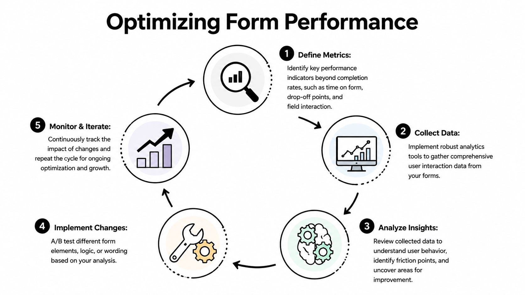
That is why post-launch analysis needs to look beyond final submission rate. Completion rate is useful, but it is a lagging summary. It does not show which step creates hesitation, which audience segments struggle, or whether a conditional branch is helping qualification or undermining momentum.
Track behavior, not just completions
The right measurement model follows the actual experience step by step.
Start with the points that change decisions:
- Step-level drop-off. Repeated exits on one step usually mean the ask is too early, too vague, or too demanding for the intent level.
- Field-level friction. Phone number, budget, employee count, and timeline fields often create resistance, especially on mobile or early in the flow.
- Time to complete by step. Long pauses often signal confusion, weak microcopy, or unclear validation rules.
- Partial submissions. These help teams separate low intent visitors from people who showed real interest but hit friction before the end.
- Branch performance. Conditional logic should improve relevance. If one branch converts far worse than another, the issue may be in the question sequence, not the traffic source.
Many first redesigns frequently falter. Teams build conditional logic, route data correctly, and then evaluate success with one top-line number. That misses the full lifecycle. The structure of the form, the branch rules, the implementation details, and the follow-up process all need their own measurement layer.
If your team is setting this up for the first time, this guide to form analytics and measurement for multi-step forms is a useful starting point.
Build a testing loop your team can actually maintain
Optimization works best when the process is simple enough to run every month, not just during a redesign sprint.
A practical loop looks like this:
- Find the constraint. Look for the step with the sharpest drop-off, longest completion time, or biggest gap between device types.
- Write one hypothesis. Example: users abandon the phone field because it appears before value is clear.
- Change one meaningful variable. Move the field later, make it optional, add a short reason, or ask it only on sales-led paths.
- Review results by segment. Paid social traffic, branded search, existing customers, and partner referrals often behave differently.
- Keep the improvement and document it. The win matters, but the record of why it worked matters too.
The trade-off is real. A shorter form often raises completions. It can also reduce qualification quality if teams remove questions that sales or onboarding need. The better approach is usually sequencing, not deletion. Ask for easier information first, delay high-friction questions until intent is stronger, and show tougher fields only when the answer changes routing or follow-up.
What good analysis usually reveals
The first problems are rarely technical failures. They are usually design decisions that made sense internally but create unnecessary effort for the user.
Common examples include:
- Early steps that ask for too much context before trust is established
- Labels that make sense to the business but not to the prospect
- Required fields that are useful for reporting but irrelevant to the user's goal
- Mobile step layouts with crowded inputs, weak tap targets, or distracting validation
- Conditional branches that repeat questions users believe they already answered
- Thank-you flows that stop at submission instead of capturing the next action or handoff signal
I have seen teams improve performance without changing traffic volume at all. They identified one step where intent and effort were out of balance, then fixed the sequence, wording, or branch logic. Conversion rate improved, and data quality improved with it because users understood why they were being asked.
That is the growth opportunity in step by step forms. Analysis should not sit at the end as a reporting task. It should feed back into strategy, UX, logic rules, and implementation decisions so the form gets easier to complete and more useful to the business over time.
Real-World Templates for Every Use Case
A strong step-by-step form isn't one universal template. The structure should reflect the job the form needs to do.
For research and survey work, that structure matters even more because the data has to remain valid. A structured approach to data collection, such as a seven-step framework, is critical for form-based research studies to prevent mobile drop-off and protect data quality (seven-step framework for statistical studies). The same discipline helps commercial forms too. Better sequence leads to better answers.
SaaS trial qualification
The job here is to balance conversion with qualification.
A typical flow starts with identity fields, then moves into role, team context, and intended use case. Conditional logic can branch based on company type, team size, or whether the user wants a self-serve trial versus a sales-led demo.
The key is restraint. Ask only what changes onboarding, routing, or follow-up. If a field doesn't affect what happens next, it probably doesn't belong.
Ecommerce checkout or quote request
For ecommerce, mobile handling matters as much as field count. The best flows separate contact details, shipping or project specifics, and payment or confirmation.
A quote request form benefits from product-specific branching. A customer selecting one product line shouldn't see the questions for another. The same rule applies to service businesses using quote forms for installations, repairs, or bookings.
Marketing quiz and segmentation
Quizzes work well as step by step forms because users expect progression. Each answer can shape the next question and improve audience segmentation without making the interaction feel like a long form.
This format works best when each step feels like part of a guided diagnosis. Ask about goals first, then obstacles, then preferences, then recommended next action. The answers should feed a real follow-up path, such as content personalization or a customized sales message.
When a quiz collects data without changing the outcome, users notice. Relevance has to be earned.
HR application flow
Recruiting teams need enough detail to screen applicants without creating unnecessary abandonment.
A clean application flow often starts with contact details and role selection, then moves to work history, portfolio or resume upload, and screening questions. Conditional logic can show different questions for engineering, sales, or support roles. It can also route applicants internally based on location or department.
This makes review faster because every applicant arrives with the right set of answers rather than a generic pile of fields.
Research and academic surveys
Research forms need more than good UX. They need methodological discipline.
That means clear problem definition, careful participant selection, deliberate question design, and a sequence that reduces incomplete responses without biasing answers. A multi-page survey can help respondents stay oriented, but the logic should remain faithful to the study design. Convenience for the respondent should support validity, not distort it.
Frequently Asked Questions About Step by Step Forms
How many steps is too many
Too many steps isn't a fixed number. It's the point where the user feels the flow is dragging or repeating itself. A longer form can still work if each step has a clear purpose, the progress indicator is honest, and the user only sees relevant questions.
If you're debating step count, focus on decision moments per step rather than page count. One focused question group is usually better than several thin screens with no real purpose.
Do step-by-step forms hurt SEO
Usually, no. Most lead forms and checkout flows aren't intended to rank on their own anyway. The larger SEO concern is whether the page around the form still contains indexable content, clear messaging, and a strong user experience.
If the form is embedded on a landing page, keep the surrounding copy useful and accessible. Don't hide the entire value proposition behind interaction.
What's the best way to handle address fields in a multi-step form
Keep address collection as late as possible, unless it's required to determine eligibility, shipping, or pricing. Address fields are high-friction because they are longer and more error-prone than simple identity fields.
When you do need them, keep the layout simple. Use clear labels, sensible validation, and only ask for the fields required for the transaction or process.
Can I save a user's progress if they leave and come back
Yes, many form platforms support saved progress, session persistence, or partial submission capture. This is especially useful for applications, registrations, and longer B2B qualification flows.
The important operational question is what happens after recovery. If a user returns, make sure the form restores context cleanly and doesn't force them through irrelevant steps again.
Should every business use conditional logic
No. Conditional logic helps when audience paths are different. If your form is short and every field applies to every user, a simple linear flow may be better.
Use branching when it removes irrelevant questions, improves routing, or changes the follow-up. Skip it when it adds complexity without improving relevance.
What's the most common mistake in a redesign
Teams keep too many internal-only questions. They redesign the interface but not the information strategy.
Start by removing fields that don't affect qualification, routing, compliance, or delivery. Then build the form around the user journey, not around stakeholder requests.
If you're ready to turn static forms into adaptive ones, BuildForm gives teams a way to create step-by-step flows with no-code logic, partial submission tracking, analytics, and integrations that connect form data to the rest of the workflow.