
Your survey just closed. You open the export, see hundreds or thousands of rows, and the first instinct is to build charts fast.
That's usually where bad analysis starts.
Good analysis of survey data isn't the same as making a dashboard from a CSV. It's the discipline of checking what your survey was meant to answer, confirming what the dataset can support, cleaning the mess that every real survey contains, and only then moving into summaries, segmentation, and decisions. If you skip that order, you can end up presenting confident conclusions from flawed inputs.
Modern survey work adds one more layer that older guides often miss. A finished response isn't the only useful signal. Partial submissions, abandoned fields, and drop-off points often tell you just as much about user intent and friction as the completed answers do. That matters a lot for marketers, product teams, and researchers using adaptive forms instead of static questionnaires.
Table of Contents
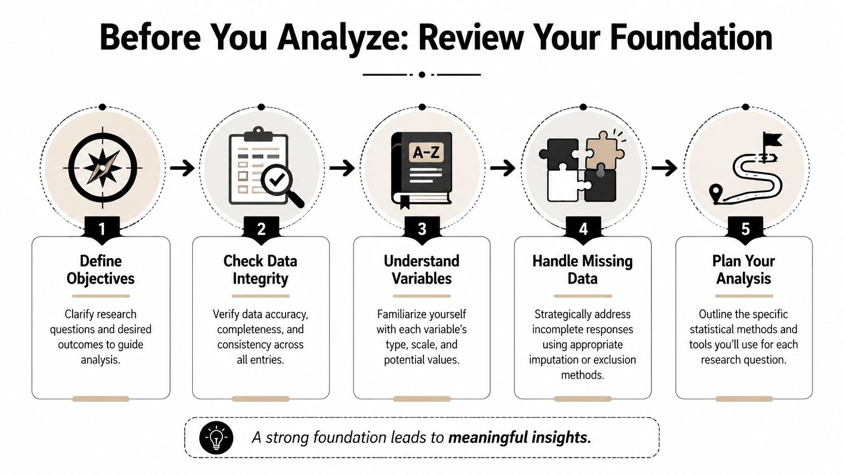
- Before You Analyze Anything Review Your Foundation
- The Critical First Step Data Cleaning and Preparation
- Finding the What With Descriptive Analysis and Cross-Tabs
- Uncovering the Why With Inferential Analysis and Segmentation
- Bringing Data to Life With Visualizations and Dashboards
- Turning Analysis Into Action With Interpretation and Reporting
Before You Analyze Anything Review Your Foundation
The common failure point is easy to miss. A team runs a survey because demo requests dropped, exports the responses, and jumps straight into charts. Two hours later, they have polished slides and no clear answer because the survey measured satisfaction, not purchase friction, and nobody checked where partial submissions dropped off.
Good survey analysis starts earlier than the spreadsheet. It starts with whether the survey still fits the decision in front of you.
Start with the decision, then test the survey against it
Write the business question in plain language. Then rewrite it so it can be answered with the data you collected.
“What do people think?” is too broad to guide analysis. “Which barriers show up most often among trial users who reached pricing but did not book a call?” gives you a workable frame. It tells you which respondents belong in scope, which questions matter, and which comparisons will lead to an action instead of a summary.
That framing also helps you spot a gap many teams miss. Completed responses show what people said after they finished. Partial submissions show where intent weakened, where the form created friction, or where the wrong audience entered the survey in the first place. If your platform captures partials cleanly, as BuildForm does, that data belongs in the foundation review, not as an afterthought.
Use a short check before any analysis work begins:
- Decision: What specific action should this survey support?
- Audience: Which respondent group matters for that action?
- Signal: Which questions directly help answer the decision?
- Behavior: What do partial submissions reveal about drop-off or hesitation?
- Noise: Which fields are interesting but not tied to the decision?
That filter saves time later. It also keeps teams from spending half the project analyzing side questions that will not change a campaign, form, or follow-up process.
Separate response rate from sample quality
Response rate belongs near the top of any survey readout because stakeholders will ask for it immediately. Wake Forest University's Office of Institutional Research includes it among the first items to report and defines it with the standard formula of responses divided by people invited in its survey analysis reporting guidance.
Report that number. Then put it in context.
A higher response rate helps, but it does not prove the sample reflects the audience you care about. The harder question is whether the right people answered in enough numbers to support the breakdowns you plan to show. That matters more than a headline percentage if your marketing team wants to compare paid traffic vs. organic traffic, enterprise vs. SMB, or users who started the form vs. users who completed it.
I usually review three things together: who was invited, who responded, and who dropped out before completion. That third group often explains more than teams expect. If half of mobile respondents abandon the survey at an open-text pricing question, the issue may be survey design rather than market sentiment.
The same logic applies outside marketing research. Teams looking for practical guidance for modern hiring face the same constraint. Results only help when the respondent mix is credible and the subgroup cuts can hold up under scrutiny.
Audit the design choices that shaped the data
Survey results reflect the instrument that produced them. Wording, reading level, device experience, invite channel, and page length all affect who starts, who finishes, and how people interpret the questions.
Research on engaging under-served groups found that language and literacy skills had the biggest impact on being under-served, and only 13% of survey professionals felt equipped to meet these needs (study on engaging under-served groups). That should change how confidently you present findings, especially if your audience includes respondents with mixed language ability or uneven digital access.
Review the survey like an analyst, not just a researcher:
- Accessibility: Did the wording require specialist knowledge or high reading fluency?
- Language fit: Were translations or simpler versions needed?
- Device experience: Did mobile users hit longer fields, confusing layouts, or slower pages?
- Recruitment path: Did the invite channel skew the audience before the first question appeared?
- Drop-off pattern: Do partial submissions cluster around one confusing screen or one sensitive question?
If you find bias, friction, or unclear wording, state it directly in the report. Clear limits improve credibility because they tell decision-makers how far they can trust the findings and where the next survey should improve.
For teams revising future questionnaires, survey design best practices should be part of the analysis workflow, because design decisions shape the quality of every conclusion that comes after.
The Critical First Step Data Cleaning and Preparation
Most survey datasets are messy in ordinary, predictable ways. There are duplicate entries, internal tests, people who opened the form twice, skipped logic that didn't behave as expected, and text answers that mean the same thing but use different wording.
If you analyze before fixing that, you're not moving fast. You're just hiding errors under charts.

Use a cleaning checklist before any testing
A rigorous workflow should begin with data cleaning before inferential statistics. The Association of Research Libraries describes this sequence as removing duplicates, enforcing skip logic, verifying completion metrics, and finalizing the dataset before moving into exploratory work in its quantitative analysis in survey research guide.
Use a practical checklist:
- Remove duplicate records: Keep one valid response per respondent or per intended unit of analysis.
- Strip test submissions: Internal QA responses often look real unless you tag them clearly.
- Check skip logic paths: Confirm that respondents only saw the questions they were supposed to see.
- Verify completion status: Separate complete, partial, and disqualified records intentionally.
- Lock the analysis file: Once rules are set, don't keep changing them mid-analysis.
Jumping straight to hypothesis testing without these checks is a technical mistake. It often produces clean-looking output from a broken dataset.
One useful operational habit is to maintain two files. Keep a raw export untouched, then create a working analysis file where every edit is documented. That gives you an audit trail when someone asks why a count changed between drafts.
Treat partial submissions as behavioral data
Traditional survey workflows often discard partial responses or keep them only for completion-rate reporting. That misses an important signal.
Partial submissions can reveal intent, hesitation, and friction. If many respondents abandon the survey at a pricing question, a required upload field, or a demographic item, you've learned something important about the respondent experience. That insight matters even when the survey goal is feedback collection rather than pure conversion.
For marketers, form analytics integrates directly into the analysis of survey data. Tools that capture field-level behavior can show whether people pause, edit repeatedly, or leave after a certain prompt. In practice, that helps you separate two very different problems: people who don't want to answer, and people who wanted to answer but hit unnecessary friction. Teams comparing options for this workflow can also review different research data collection tools before deciding how to capture those signals.
A sensible rule is to classify partials into groups:
- Early exits: likely weak intent or poor initial framing
- Mid-form drop-offs: often signal friction, confusion, or effort mismatch
- Late exits: usually indicate one sensitive or badly designed question near the end
That classification gives product and growth teams something operational to fix.
Standardize text before you summarize it
Open-ended responses need coding before they become analyzable. Even small surveys benefit from this.
If one answer says “very satisfied,” another says “extremely happy,” and another says “pretty good,” you need a coding scheme before comparing themes. The same applies to job titles, country names, lead sources, or plan names entered manually.
A lightweight coding process works well:
- Read a sample first: Don't invent categories before seeing how people answer.
- Create a codebook: Define the label and what belongs in it.
- Apply consistently: Recode similar answers into the same category.
- Keep original text: Never delete raw language. You may need it later.
This is tedious work. It's also where a lot of the actual quality in survey analysis gets decided.
Finding the What With Descriptive Analysis and Cross-Tabs
A clean dataset can still hide the true story.
A marketing manager might see an average satisfaction score that looks healthy and assume the survey confirmed demand, message fit, or campaign quality. Then the team looks one level deeper and finds something else. Paid social respondents are far less positive than referral traffic. Mobile users pick neutral answers more often. Partial submissions cluster around one pricing question. That is the point of descriptive analysis. It shows what happened before anyone tries to explain why.
Read the full response pattern, not just the average
Start with the simplest summaries first. Count each response option. Check percentages. Review the middle of the distribution with a mean or median when that fits the question type. Then look at spread, because two questions with the same average can reflect very different respondent behavior.
That matters in survey work because averages compress disagreement.
If a satisfaction item averages 7 out of 10, that could mean respondents felt consistently positive. It could also mean one group loved the experience while another group had a bad one. The average alone cannot separate those cases. A frequency table can.
For a first pass, these are the descriptive measures that carry most of the workload:
| Statistic | What It Is | When to Use It |
|---|---|---|
| Frequency distribution | Count of responses in each category | Use for multiple-choice, rating, and yes/no items |
| Proportion | Share of responses in each category | Use when you need to compare groups of different sizes |
| Mean | Average value | Use for numeric or scale-based items when averaging is appropriate |
| Median | Middle value | Use when responses are skewed or outliers may distort the mean |
| Mode | Most common answer | Use when you want to know the single most frequent response |
| Range | Spread from lowest to highest value | Use for a quick view of variability |
| Standard deviation | How dispersed values are around the mean | Use when analyzing consistency or spread in numeric responses |
In practice, I also review completion status beside the main question summaries. Full responses tell you what people answered. Partial responses often tell you what they hesitated on, skipped, or abandoned. That is especially useful in marketing surveys, lead forms, and onboarding research, where drop-off itself is behavior worth analyzing.
BuildForm makes that easier because partial submissions are available as analyzable records instead of getting treated like survey waste. If one audience segment exits after the qualification block and another exits after an open-text prompt, those are different signals. One points to weak intent or poor targeting. The other points to friction in the form experience.
Use cross-tabs to compare the groups that matter
Cross-tabs turn summary stats into something a team can act on. Instead of one rolled-up result, you compare answers by source, campaign, customer type, device, region, lifecycle stage, or any other segment tied to a business decision.
This is often where the survey stops being a reporting exercise and starts helping a marketing team choose what to fix.
An overall satisfaction result might look acceptable. A cross-tab can show that existing customers are positive while trial users are confused, or that desktop respondents complete a pricing survey at a much higher rate than mobile respondents. That distinction changes the next action. The problem may not be the offer. It may be the audience, the channel promise, or the form experience.
A useful cross-tab setup stays close to real decisions:
- Start with operational segments: acquisition channel, campaign, customer type, plan, device, geography
- Use segments with enough responses: tiny groups create unstable percentages
- Compare one important variable at a time: too many cuts at once produce noise
- Include completion status where relevant: full and partial submissions often behave differently
- Check question wording and timing: a segment difference may come from context, not preference
One trade-off matters here. More segmentation gives you more chances to find a pattern, but it also raises the odds of chasing noise. Early in the analysis, I would rather see five business-relevant cross-tabs than twenty random slices no one will use.
A simple example makes the point. Say a lead-gen survey asks whether the offer matched expectations. The topline result is mixed. Cross-tabs by campaign reveal that branded search respondents are mostly positive, paid social respondents are split, and affiliate traffic exits early before finishing the form. Now the team has a sharper view of the problem. Messaging may be aligned for high-intent traffic, misaligned for colder audiences, and confusing enough in one channel that respondents leave before explaining themselves.
That is the value of descriptive analysis done well. It gives the team a reliable picture of response patterns, segment differences, and drop-off behavior before anyone starts testing which relationships are likely to hold up.
Uncovering the Why With Inferential Analysis and Segmentation
A pattern is only useful if it can survive scrutiny.
A marketing manager might see that paid social respondents rate message clarity lower than branded search respondents and want to rewrite the campaign immediately. That instinct is understandable. It is also where bad decisions start. Before changing budget, copy, or onboarding, test whether the difference is likely to hold up beyond this sample and whether it points to a real business cause.

Test relationships, not just averages
Inferential analysis answers a practical question. Is the pattern strong enough to guide action, or is it more likely to be random variation?
That usually means using a small set of methods that fit the decision in front of you:
- T-tests: compare average scores between two groups
- Correlation analysis: check whether two numeric measures tend to rise or fall together
- Regression models: estimate which variables still matter after controlling for others
- Cross-tabs with significance testing: check whether subgroup differences are likely to be meaningful rather than accidental
The method matters less than the interpretation. If younger respondents report higher satisfaction, the useful takeaway is not “the result is significant.” The useful takeaway is whether age appears to matter enough to change targeting, messaging, onboarding, or support.
Regression is often the point where survey analysis starts helping a real team. A simple model can show whether satisfaction is more closely tied to device type, acquisition source, account type, or completion behavior. That matters because visible differences between segments often overlap. Mobile users may look less satisfied, for example, but the actual issue may be that mobile traffic comes disproportionately from a campaign with weaker intent.
Include partial submissions in the analysis
This is one of the biggest gaps in traditional survey analysis. Teams analyze completed responses, skip partials, and miss the behavior that explains why completion and sentiment break apart.
Partial submissions are not broken records. They are evidence.
If respondents answer early intent questions, hesitate at pricing, and then leave before the open-text field, that drop-off pattern says something different from a completed survey with a low score. One signals friction in the flow or offer. The other may reflect a settled opinion after full exposure. Treating those cases as interchangeable hides the reason people disengaged.
BuildForm makes this easier because partial response data, field progression, and abandonment points are available in the same workflow as the completed submissions. That lets analysts test questions such as:
- Do respondents from one channel abandon at the same step more often?
- Are lower-intent visitors more likely to exit after a qualifying question?
- Does device type still predict drop-off after controlling for source and campaign?
- Do partial respondents choose different early answers than completers?
Those findings often shape better decisions than a final satisfaction score alone. They help teams fix the point of confusion before asking whether the overall survey average improved.
Segment around decisions you might actually make
Good segmentation starts with a decision, not curiosity.
Trial users and paying customers may deserve different onboarding. New donors and repeat donors may need different asks. Mobile respondents who abandon on a long matrix question may need a shorter form, while desktop respondents may be fine. In nonprofit work, the same logic helps teams optimize nonprofit donor tracking by separating intent, completion behavior, and follow-up readiness instead of treating all responses as one pool.
A practical workflow looks like this:
- Identify a pattern that could change a business decision.
- Form a plain-language explanation for that pattern.
- Test whether the relationship holds after accounting for other variables.
- Separate completed and partial submissions if abandonment could affect the result.
- Recommend one action the team can take if the finding is credible.
That fourth step is easy to skip and expensive to ignore. If affiliate traffic drops before the question about trust, you cannot assume those respondents would have answered like the people who stayed. In that case, abandonment is part of the finding.
One caution matters here. Statistical testing can create false confidence when subgroup sizes are thin, the sample is biased, or the survey flow itself changes who makes it to later questions. A neat output from a model does not fix a weak input. It only gives weak input a more technical label.
Once you have a few findings worth sharing, present them in a format stakeholders can read quickly. For instance, clear survey dashboards for response trends, segment cuts, and drop-off patterns help guide the way. The goal is not to impress people with methods. The goal is to show which patterns are credible, why they matter, and what the team should change next.
Bringing Data to Life With Visualizations and Dashboards
A survey report fails when the audience can't see the point fast enough. That's usually a visualization problem, not an analysis problem.
A spreadsheet with ten columns of percentages may contain the right answer. But if the chart choice is wrong, the meeting still goes sideways. People argue about formatting instead of acting on the finding.

Choose the chart for the decision
Use visuals that match the question being asked.
Bar charts work well for comparing categories. Line charts help when you're showing the same measure over time. Stacked bars can work for survey scales if the goal is composition. Pie charts rarely help unless the composition is extremely simple and the audience already knows what to look for.
The easiest upgrade you can make is to strip out visual clutter. Remove unnecessary colors, heavy gridlines, and labels that repeat what the title already says. A clear title should carry the takeaway. If the core point is that mobile respondents drop out after a certain section, write that in the chart title instead of labeling it “Survey Completion by Device.”
A better “before and after” mindset looks like this:
- Before: dense table, default colors, no segment context
- After: one chart per decision, plain labels, subgroup notes, short interpretation beneath
Build dashboards that keep context visible
Dashboards are useful when they reduce the distance between collection and interpretation. They're dangerous when they encourage people to scan headline metrics without checking sample composition.
That risk matters because overall completion can look healthy while important groups remain underrepresented. HCAHPS protocol testing found that adding a web mode and extending fielding lifted response rates to 36.5% versus 22.1% to 24.3% for single-mode protocols, but it also showed differences in who responds. The takeaway from the HCAHPS protocol testing study is that subgroup analysis by age, service line, sex, and race or ethnicity matters more than relying on one top-line rate.
That same discipline applies in marketing and donor analytics. Teams working to optimize nonprofit donor tracking face the same challenge. The dashboard has to show who is and isn't represented, not just how many records came in.
For teams building live survey reporting, examples of survey dashboard layouts and reporting patterns can help clarify what belongs on the first screen and what should stay in drill-down views.
A short walkthrough helps make the point:
When you review a survey dashboard, keep these elements visible:
- Sample context: invited, responded, partial, completed
- Segment filters: audience groups relevant to actual decisions
- Drop-off view: where respondents leave and which fields cause friction
- Interpretation notes: short text explaining what a chart means and what it does not mean
A dashboard should shorten decisions. If it creates more ambiguity, simplify it.
Turning Analysis Into Action With Interpretation and Reporting
A survey analysis project is only finished when someone can act on it. That means your report has to do more than summarize. It has to translate evidence into a decision path.
Most weak reports fail in one of two ways. They either dump charts with no recommendation, or they jump to recommendations without showing how the data supports them. The fix is a simple structure that keeps both evidence and action in view.
Use observation implication action
This format works well for most stakeholder groups:
- Observation: What the data says
- Implication: Why it matters for the business
- Action: What the team should do next
Here's a simple example.
Survey respondents who reached the pricing section often left before submitting, and late-stage partials clustered around questions requiring extra effort. That suggests motivation existed, but friction rose at the point where the survey asked for more commitment. Simplify those fields, test alternate wording, and monitor whether completion patterns improve.
That structure keeps the analysis grounded. You're not saying “change this because it feels right.” You're saying “change this because the response pattern points to a likely barrier.”
Tailor the report to the audience
Different teams need different levels of detail.
A product team often wants question-level findings, drop-off locations, and verbatim comments that explain confusion. A marketing leader usually wants segment differences, conversion friction, and message implications. Executives want the short version. What changed, why it matters, and what decision needs approval.
A practical reporting stack often looks like this:
- Executive summary: a few findings, a few actions
- Core findings deck: descriptive results, segments, key charts
- Technical appendix: cleaning rules, exclusions, coding logic, test details
- Operational handoff: tasks for product, marketing, support, or research
One tool mention is enough here because it fits the workflow. If you're collecting surveys in a system that captures partial submissions and field-level behavior, BuildForm can help teams connect response analysis with drop-off analysis in the same reporting loop. That's useful when the question isn't only what respondents said, but where the form experience itself shaped who finished.
A strong survey report doesn't answer every possible question. It answers the questions required for the next decision.
Keep the ending tight. State the limitation, state the confidence level qualitatively, and state the action owner. If the survey had sample bias, say that. If some subgroups were too small for firm conclusions, say that too. Clarity builds trust faster than polished overclaiming.
If your team wants to analyze not just completed responses but also partial submissions, field friction, and drop-off behavior inside the same workflow, BuildForm is worth a look. It lets teams collect survey data with adaptive forms, review real-time analytics, and use partial submission tracking to see where respondents hesitate or abandon, which makes the analysis of survey data much more actionable.