
A registration form can be a strong conversion asset, not just a gate. When teams treat it like a simple admin task, they usually end up collecting too much, asking it in the wrong order, and losing people who were ready to sign up a minute earlier.
That’s a costly mistake because registration forms already have a strong benchmark. Users who start them complete them at a 63.37% rate, and the average completion time is 1 minute and 35 seconds when the form is designed well, according to online form benchmarks summarized from Zuko Analytics. That number should change how you think about this project. The question isn’t just how to create registration form fields. The question is how to build an experience that keeps intent alive all the way to submit.
Table of Contents
- Your Guide to Creating a High-Performing Registration Form
- Planning Your Registration Form for Maximum Impact
- Designing a User-Friendly Form Experience
- Building an Intelligent Form with Conditional Logic
- Ensuring Security Validation and Compliance
- Connecting Your Form to Your Workflow
- Tracking Analyzing and Improving Completion Rates
Your Guide to Creating a High-Performing Registration Form
Most registration forms fail for a simple reason. The team building them starts with internal curiosity instead of user intent. They ask what sales wants, what marketing might want later, what operations might need someday, and they pile it all into one moment.
That approach works against how people sign up. A good registration form feels quick, obvious, and relevant. A weak one feels like paperwork.
The easiest way to create registration form flows that convert is to treat them like a funnel step with real stakes. Every field adds effort. Every confusing label adds hesitation. Every unnecessary branch makes mobile completion harder. If the form is the first meaningful interaction with your brand, it has to do more than collect data. It has to preserve momentum.
Practical rule: Ask only for what you can act on immediately after submission.
There’s another reason to take this seriously. Across all online forms, the average conversion rate is 10%, based on Formstack figures cited in this registration conversion overview. Registration forms can outperform that baseline, but only when teams remove friction and build around the user’s immediate goal.
A high-performing form usually does four things well:
- It narrows the ask: The first step captures only essential information.
- It explains itself: Labels, button copy, and error states leave little room for confusion.
- It adapts: The form shows relevant questions and hides the rest.
- It feeds operations: Submission data moves into CRM, email, payments, and reporting without manual cleanup.
That’s the difference between a form that merely stores responses and one that helps generate qualified pipeline.
Planning Your Registration Form for Maximum Impact
A strong form starts before any builder opens. The planning work decides whether the finished version feels focused or bloated.
Start with the business outcome
Before you create registration form fields, define what counts as a successful submission. An event team may need confirmed attendance and payment status. A SaaS team may need enough detail to route leads by segment. A hiring team may need contact data first and supporting material later.
Use a simple checkpoint: what must your team know immediately after someone registers?
If the answer includes a long list, separate it into three buckets:
- Essential now: Information required to process, route, or confirm the registration.
- Useful later: Data that improves follow-up but doesn’t block the first conversion.
- Internal wish list: Information that would be nice to have but won’t change the next action.
That exercise sounds basic, but it prevents the most common form problem. Teams confuse downstream enrichment with first-touch conversion.
Run a field audit before you build
Baymard Institute studies, cited in this registration form best practices summary, note that forms with fewer than 5 fields can achieve 20% to 50% higher conversion rates than forms with 10 or more fields. That’s why field audits matter more than visual polish.
Here’s the practical version of that audit:
- List every proposed field from marketing, sales, legal, product, and operations.
- Mark the trigger for action beside each one. If no action depends on it right away, it probably doesn’t belong in the first step.
- Spot duplicates such as “company name” and “organization,” or “phone” when email already handles confirmation.
- Move delayed questions into follow-up emails, onboarding, account settings, or later in the user journey.
A lot of teams benefit from grounding this process in actual user evidence. If you need a cleaner way to decide what users will tolerate and what they’ll skip, these user research methods are useful for validating field choices before launch.
If a field doesn’t change routing, qualification, compliance, or fulfillment, it probably belongs after registration.
A short planning table can keep everyone aligned:
| Field type | Keep in form | Move later |
|---|---|---|
| Contact details | Yes, if needed for confirmation | No |
| Lead qualification | Only if it changes follow-up | Often |
| Preferences | If they personalize the next step | Usually |
| Deep profile data | Rarely | Yes |
Good planning creates a form that respects the user’s time and gives your team data it can use.
Designing a User-Friendly Form Experience
The design layer decides whether a well-planned form feels effortless or irritating. Here, many teams lose conversions without realizing why. The fields may be correct, but the experience still feels heavier than it needs to.
Choose the right layout for the job
Single-page forms work when the ask is short and obvious. If you only need a name, email, and one qualifying answer, a single view usually wins because it minimizes transitions and keeps the call to action in sight.
Multi-step forms work better when the registration has distinct chunks. Personal details, company context, payment, and confirmation are easier to process when they’re grouped. People can handle more information when it’s presented in smaller decisions.
A useful decision rule:
- Use single-page when the form is very short and low-risk.
- Use multi-step when the form includes multiple categories of information.
- Avoid fake simplicity where one long page pretends to be easy but still overwhelms mobile users.
If you want a broader UX reference point, this guide to form design best practices is a helpful companion for reviewing layout, hierarchy, and interaction details.
Small UX choices decide whether people finish
Most form abandonment comes from tiny moments of friction. Users hit a field they don’t understand, aren’t sure about the expected format, or wonder why you need the information. That uncertainty breaks momentum.
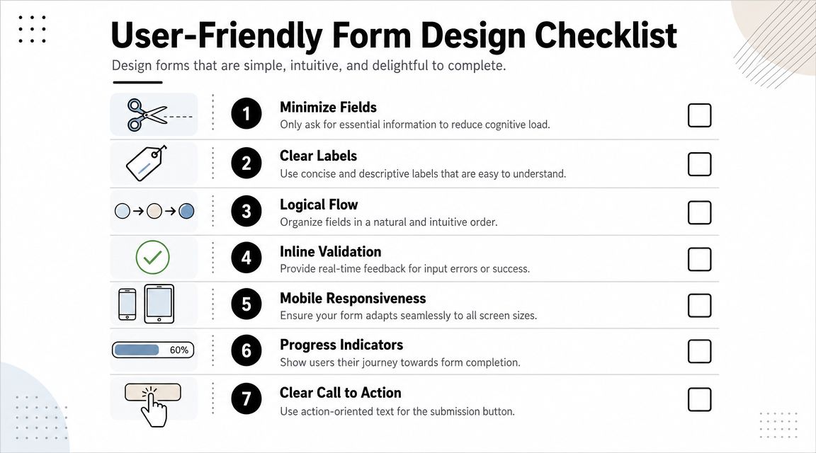
A well-designed registration form usually includes the following:
- Top-aligned labels: They’re easier to scan than placeholder-only designs, especially on mobile.
- Helpful placeholders: Use them as examples, not as replacements for labels.
- Specific button copy: “Create account,” “Reserve my spot,” or “Continue to payment” tells people what happens next.
- Inline validation: Catch errors while users type, not after they submit.
- Progress indicators: When the form has steps, users should know where they are.
“Clear labels beat clever labels every time.”
One trade-off comes up often. Teams want visually minimal forms, so they hide instructions and rely on clean aesthetics. That usually backfires. Minimal styling is good. Minimal clarity is not.
Here’s a quick comparison:
| Design choice | Usually works | Usually hurts |
|---|---|---|
| Labels | Plain, direct field names | Vague or branded language |
| Errors | Inline and specific | Generic message after submit |
| Mobile spacing | Large tap targets and short groups | Dense stacked fields |
| CTA text | Describes next step | Generic “Submit” |
The best form designs reduce thinking. That sounds obvious, but it’s the core job. Users shouldn’t have to decode your process while trying to complete it.
Building an Intelligent Form with Conditional Logic
Developers often treat conditional logic like an advanced feature. It isn’t. For many registration flows, it’s basic usability.

Static forms create unnecessary work
A static form asks every user every question, whether it applies or not. That creates clutter, slows completion, and makes the form feel longer than it really is.
This is especially expensive on phones. A Formisimo report analyzing 10 million submissions found that 68% of form drop-offs occur on mobile, often because of lengthy single-page designs, and AI-adaptive logic that changes the form can lead to 40% higher completion rates, according to this overview of dynamic form behavior.
Those numbers make the case clearly. If your audience includes mobile traffic, conditional logic isn’t polish. It’s part of conversion hygiene.
Where conditional logic earns its place
The simplest use case is reveal-on-demand. If someone selects “Other,” show a text field. If they choose “Team registration,” show team size and role fields. If they pick “Student,” skip questions meant for companies.
That kind of branching improves both experience and data quality because people answer questions that fit their situation.
Common logic patterns worth using:
- Path-based questions: Different follow-up fields based on audience type, product interest, or registration category.
- Skip logic: Hide irrelevant sections entirely.
- Progressive disclosure: Ask one low-friction question first, then expand only when needed.
- Segment-ready routing: Capture intent signals and pass users into the right workflow after submit.
One of the strongest practical benefits is psychological. When a form reacts sensibly, users feel understood. They don’t have to scan past irrelevant blocks. They don’t assume the process will keep getting worse.
A short demo can help visualize how dynamic steps work in practice:
Field strategy: Don’t make everyone pay the complexity cost for edge cases.
There’s a trade-off to manage here. Conditional logic can become messy fast if the underlying flow isn’t planned. Too many branches create maintenance problems, broken dependencies, and confusing analytics. Keep the logic visible, documented, and tied to real decisions your team makes after submission.
If the answer doesn’t change the path, don’t build a branch for it.
Ensuring Security Validation and Compliance
Users decide whether to trust your form before they submit it. They make that decision from the small signals: whether the fields behave predictably, whether consent language is clear, and whether the experience feels careful with their data.
Validation should help, not punish
Validation has one job. It should prevent avoidable mistakes without forcing users into a guessing game.
That means checking obvious issues in real time, such as malformed email addresses, missing required fields, and invalid file types. It also means writing error messages that tell users what to fix. “Enter a valid work email” is useful. “Invalid input” isn’t.
For practical examples, this collection of form validation examples is worth reviewing before you ship a production form.
A solid validation setup usually includes:
- Inline error feedback: Show the issue beside the field, not in a generic banner.
- Input formatting help: Make expected formats obvious for phone, date, or file upload fields.
- Spam protection: Use techniques such as honeypots or CAPTCHA where abuse is a concern.
- Accessible interactions: Keyboard navigation, readable contrast, and clear focus states matter.
If accessibility review is part of your process, this wcag 2.1 aa compliance checklist is a practical way to catch issues many teams miss.
Consent tracking needs structure
Privacy is where many forms fall short. A 2025 web.dev audit found that 82% of form builders lack granular consent tracking, which creates a real GDPR and CCPA compliance gap, according to this compliance-focused summary.
That matters because one broad checkbox often isn’t enough. If you’re collecting registration data, marketing consent, file uploads, or sensitive information, each action should map to a specific consent record and purpose.
Use this checklist when reviewing consent design:
| Area | What to implement |
|---|---|
| Purpose clarity | Explain why each sensitive data point is needed |
| Consent capture | Separate required registration consent from optional marketing opt-ins |
| Record keeping | Store timestamped consent status with the submission |
| Withdrawal path | Make it clear how users can change consent later |
Trust drops fast when a form asks for personal data without explaining why.
Security and compliance work isn’t decorative. It protects lead quality, reduces legal risk, and makes legitimate users more willing to finish the form.
Connecting Your Form to Your Workflow
A registration form earns its keep after the submit button. If the handoff is slow or messy, response time slips, follow-up loses relevance, and good leads cool off before your team reaches them.
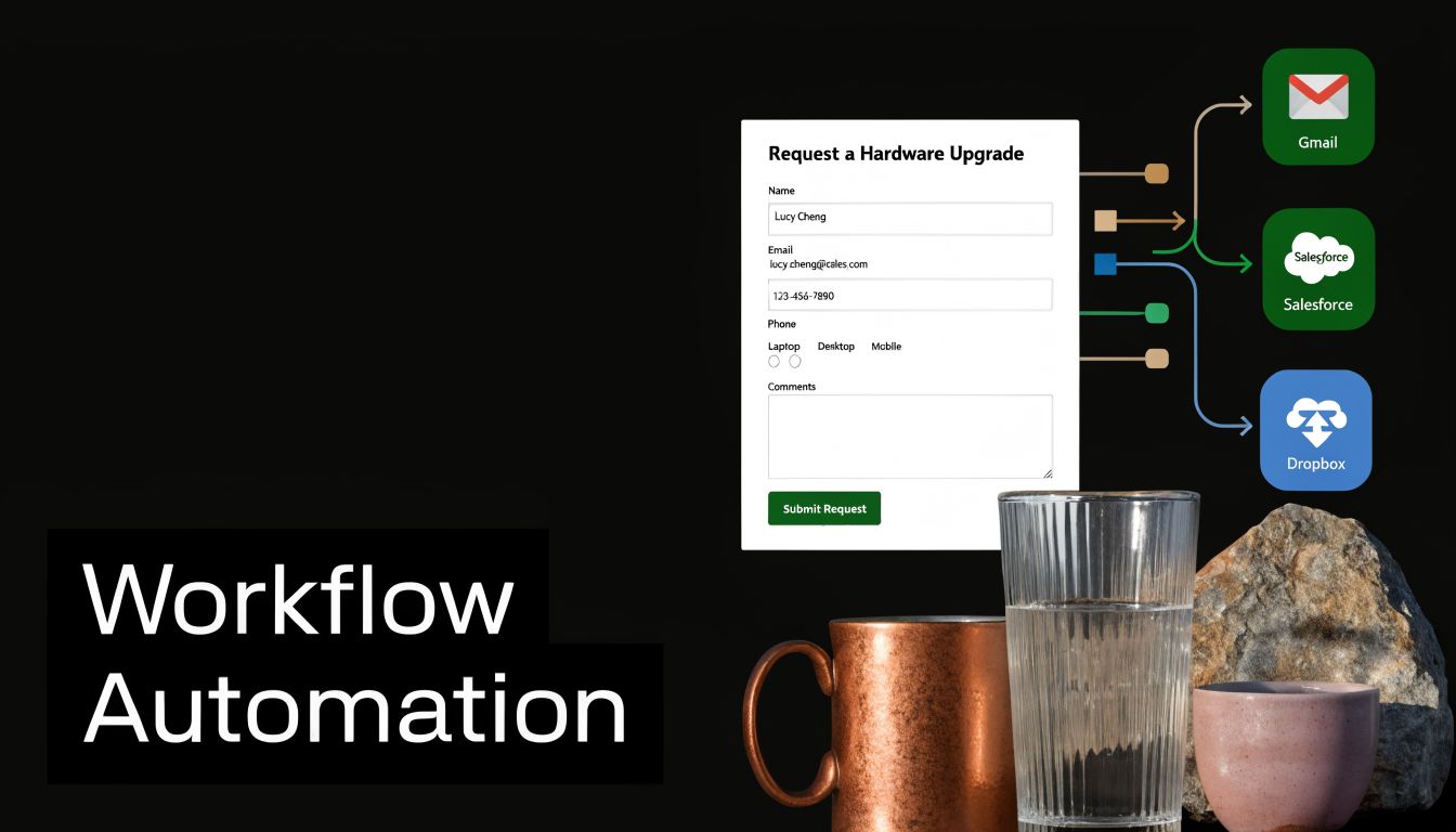
A strong setup treats the form as the front door to routing, scoring, and nurture. If someone registers for a demo, webinar, or gated resource, their answers should decide what happens next: which CRM record gets updated, which rep gets notified, which email sequence starts, and whether the lead goes straight to sales or into a warmer path first.
That is how a registration form stops being a passive database entry and starts working like a conversion system.
The practical priority is clean field mapping. If job title enters your CRM one way, your email platform another way, and your reporting tool not at all, segmentation breaks fast. Teams then waste time fixing records by hand, and the registrant gets generic follow-up because the systems cannot agree on who they are or what they asked for.
Set up the integrations that remove manual work first:
- CRM sync: Create or update contacts in HubSpot, Salesforce, or your CRM with standardized fields and deduplication rules.
- Team notifications: Send high-intent submissions to Slack or email with enough context for a fast reply.
- Email automation: Trigger confirmation emails, reminders, onboarding flows, or nurture tracks based on form selections.
- Payment processing: If registration includes a fee, connect Stripe or another payment tool without forcing users through a clunky second step.
- File and record storage: Route uploads and submission logs into Google Drive, Dropbox, or internal systems that operations can use.
Conditional logic matters here too. The answers that changed the form experience should also shape the workflow behind it. If an enterprise prospect selects a large team size, send that lead to sales with priority. If a student registers for educational content, keep the path lighter and more self-serve. For teams building that kind of handoff, this guide to form analytics and workflow optimization is a useful reference point.
BuildForm supports embedded forms, conditional flows, CRM connections, team notifications, and analytics-based routing. That combination is useful when the goal is not just collecting registrations, but getting each submission into the right next step with less delay.
Use one rule to keep the workflow honest: every field should either qualify the lead, personalize the follow-up, trigger an action, or fulfill the registration itself. If a field does none of those jobs, remove it or stop syncing it downstream.
The trade-off is straightforward. More integrations create more power, but they also create more points of failure. Start with the systems tied directly to speed, segmentation, and revenue. Then expand once the first path works consistently. If your broader optimization plan includes post-submit journeys as well as on-page conversion work, this resource on how to improve your site's conversion rate is worth reviewing.
Tracking Analyzing and Improving Completion Rates
The first version of a registration form is rarely the best one. Teams improve forms when they stop relying on opinions and start watching where users struggle.

Look at field-level friction
The most useful form analytics don’t just tell you total submissions. They show where people slow down, abandon, or correct errors repeatedly.
That field-level view is where optimization gets practical. If users reach the company-size question and drop off, you can test whether the label is unclear, the options are awkward, or the field belongs later. If many users start but never submit after a phone number request, that field may be creating more resistance than value.
Leveraging analytics to track partial submissions and identify bottlenecks can improve form success rates by 25% to 40%, according to this form analytics and iteration overview. That improvement comes from reacting to behavior instead of guessing.
For a deeper CRO lens beyond forms alone, this guide on how to improve your site's conversion rate pairs well with field-level analysis.
Build a weekly optimization loop
A lightweight review rhythm works better than occasional redesigns. Check the same set of signals every week or after meaningful traffic volume:
- Completion rate: Are enough starters finishing?
- Drop-off by field: Which question causes the biggest leak?
- Time to complete: Are users getting stuck or hesitating?
- Partial submissions: What intent can you salvage or analyze?
- Device pattern: Are mobile users struggling more than desktop users?
If your stack supports it, a dedicated form analytics workflow makes it easier to compare versions and isolate what changed.
Good optimization work changes one thing at a time and watches the downstream effect.
A few tests usually produce useful signal fast:
| Test | What you learn |
|---|---|
| Remove one field | Whether it was worth the friction |
| Split a long page into steps | Whether pacing improves completion |
| Rewrite CTA copy | Whether users understand the next action |
| Reorder questions | Whether momentum improves early in the flow |
The teams that get the most from forms treat them like living conversion assets. They review, adjust, and keep tightening the path from intent to submission.
A strong registration form should do more than collect names. It should reduce friction, adapt to the user, feed your workflow, and give your team visibility into what needs fixing next. If you want to build that kind of form without heavy development work, BuildForm is worth exploring for conversational flows, conditional logic, integrations, and analytics that help turn registrations into qualified pipeline.