Stop Guessing: Turn Customer Feedback into Your Growth Engine
Most feedback forms fail before the first answer comes in. The bar is high. HubSpot research shows 90% of consumers consider an immediate response to a customer service inquiry vital or extremely important, and 60% define immediate as 10 minutes or less. That expectation shapes feedback collection too. If you ask at the wrong moment, ask too much, or make the form clunky on mobile, you don’t get a representative view of customer sentiment. You get the loudest opinions.
That’s why a strong example of a customer feedback form isn’t just a pretty layout. It’s a system. The trigger matters. The first question matters. The follow-up logic matters. The handoff into Slack, your help desk, or your CRM matters just as much.
We’ve found the best-performing forms do one job at a time. They measure loyalty after enough product exposure. They measure satisfaction right after a support interaction. They ask about effort at the moment friction is still fresh. Short, focused forms consistently outperform bloated questionnaires, and the teams that win with feedback are the ones that operationalize it instead of filing it away.
If you’re working on improving B2B customer feedback, this guide will feel practical fast. Each example below is broken into a template you can build, including question structure, conditional logic, and where to route the responses next.
Table of Contents
- 1. Net Promoter Score NPS Survey
- 2. Customer Satisfaction CSAT Survey
- 3. Customer Effort Score CES Survey
- 4. Product Feedback Form Template
- 5. E-commerce Post-Purchase Feedback Form
- 6. Website and UX Feedback Form
- 7. Support Ticket and Service Feedback Form
- Comparison of 7 Customer Feedback Forms
- From Feedback to Action Your Next Steps
1. Net Promoter Score NPS Survey
NPS is one of the few feedback formats executives, product teams, and customer success can all read the same way. One score gives you a clean trend line across segments and time periods. The catch is timing. Send it before a customer has reached real value, and you collect guesswork instead of loyalty signals.
We’ve found NPS works best after a milestone the customer can recognize. That might be 30 days after onboarding, the first successful project, a second purchase, or a closed support cycle for high-touch accounts. A homepage visit or first login rarely gives enough context for a useful answer.
When NPS works best
NPS is strongest when the goal is relationship sentiment, not transaction feedback. It helps teams track whether customers are becoming more likely to recommend the brand over time, and whether changes in onboarding, pricing, support, or product quality are shifting that sentiment in the right direction.
Benchmarks can give you rough context, but they are a poor operating target. Score distributions vary a lot by industry, price point, and audience. We care more about trend lines inside the same customer base, measured at the same trigger point, with the same scale and follow-up question.
The open-text response does the essential work.
A score of 6 and a score of 9 both matter, but the explanation is what tells you what to fix, what to message harder, and which accounts need follow-up. If you want sharper follow-up prompts, this guide to customer survey question examples for better follow-up prompts is a useful reference point.
A BuildForm template we’d use
A practical NPS form usually needs four fields:
- Core loyalty question: “How likely are you to recommend us to a friend or colleague?” on a 0 to 10 scale.
- Reason capture: “What’s the main reason for your score?” as a required text field.
- Conditional branch: If the score is 0 to 6, show “What could we improve?” If the score is 7 to 8, show “What’s missing for you?” If the score is 9 to 10, show “What do you value most?”
- Follow-up permission: “Can we contact you about this feedback?” with email and consent.
That conditional logic is what turns a generic survey into a useful workflow. Promoters give you language for reviews, referrals, and positioning. Passives usually point to gaps in clarity, adoption, or perceived value. Detractors surface friction that can lead to churn if nobody follows up.
If you need inspiration for the open follow-ups, these examples of feedback questions are useful starting points.
On the automation side, route low scores to Slack or your help desk, attach account data from your CRM, and assign an owner with a response deadline. We’ve found that NPS programs fail for a simple reason. Teams collect sentiment, export a chart, and stop there. The better setup treats every low score as a save opportunity and every high score as proof of what the product is doing right.
2. Customer Satisfaction CSAT Survey

CSAT surveys are common for a reason. They measure satisfaction at the interaction level, which makes them faster to act on than broader loyalty metrics. A customer can rate a delivery, a support exchange, or a checkout experience in seconds, and your team can trace that score back to a specific part of the journey.
That event-level focus is what makes CSAT so useful. Amazon-style post-purchase prompts and Zendesk-style support surveys work because they ask about one recent moment, not the whole relationship. We’ve found response quality stays higher when the customer only has to judge what just happened.
Where CSAT works best
Use CSAT after a discrete experience with a clear owner. Good candidates include support ticket resolution, order delivery, onboarding milestones, appointment completion, and returns. Those triggers give you a clean read on operational quality because the context is still fresh and the follow-up team knows what to inspect.
Benchmarks matter less than consistency. Teams get more value from using one scale, one trigger, and one definition of a positive score than from chasing an industry average. The score becomes useful when you can compare support queues, fulfillment partners, or onboarding flows over time.
Survey length is the usual failure point. Teams often bolt on too many follow-ups to a simple transactional survey, then watch completion rates fall. For CSAT, short forms usually win. If you need help choosing the right follow-up prompts, these product survey question examples for post-interaction feedback are a strong starting point.
A BuildForm template we’d use
A practical CSAT form usually needs four parts:
- Primary satisfaction question: “How satisfied were you with your recent experience?” on a fixed 1 to 5 scale.
- Outcome check: “Did this solve your issue today?” as a yes/no field.
- Conditional follow-up: If the score is low, or the outcome is “no,” show “What went wrong?” and “What should we improve?”
- Hidden context fields: Pass agent name, order number, delivery type, ticket ID, or plan tier into the form automatically.
That structure gives you both speed and context. A customer with a positive experience can submit in one tap. A frustrated customer gets space to explain the failure, and your team gets enough metadata to investigate without sending a second message.
A rating without context is easy to chart and hard to improve.
The automation should stay just as focused. Trigger the form after ticket closure, purchase completion, or delivery confirmation. Route low scores to Slack, your help desk, or a support recovery queue with the customer record attached. Route high scores into a review or testimonial workflow only when the timing fits and consent is clear.
We’ve found the best CSAT programs treat the survey as an operating input, not a reporting exercise. If the form captures the right trigger, the right follow-up question, and the right metadata, it becomes a repeatable BuildForm template your team can use across support, ecommerce, and success without rebuilding the logic each time.
3. Customer Effort Score CES Survey
Gartner has described customer effort as a stronger predictor of loyalty than delight in many service interactions, which is why CES earns a place in this lineup of customer feedback forms. It measures friction in a specific task. That makes it useful for teams trying to fix broken flows, reduce repeat contacts, or remove steps that should not be there in the first place.
CES works best after a single job is done or abandoned. Booking an appointment, resetting a password, completing onboarding, tracking an order, resolving a support issue, or processing a return are all good candidates. We’ve found the signal gets muddy fast when teams ask about the whole relationship instead of one defined action.
Timing matters more here than it does in broader sentiment surveys. Ask right after the task ends, while the customer still remembers the exact click, screen, or handoff that caused friction. If you already see drop-off in analytics but cannot tell whether the problem is speed, confusion, or repetition, CES gives you language you can act on.
The BuildForm template we’d use
A strong CES form is short, but it should not be vague. The goal is to capture one rating, one reason, and enough context to route the issue without forcing a second follow-up.
We’d build it like this:
- Core CES question: “How easy was it to complete this task today?” using a consistent 5- or 7-point scale.
- Task context: Hidden fields for journey name, device type, account tier, order ID, ticket ID, or workflow step.
- Reason field: “What made this easy or difficult?” as a short open-text response.
- Conditional friction question: If the score is low, ask “Where did you get stuck?” with options such as login, payment, navigation, unclear instructions, missing information, page speed, or waiting for support.
- Optional recovery field: If the issue blocked completion, ask “Did you finish the task?” to separate inconvenience from failure.
That last distinction matters. A customer can report high effort and still complete the task. Another can abandon entirely. Those cases should not land in the same queue.
Good CES forms also need restraint in the interface. If the process felt hard, the form has to feel easy. Keep it to one screen where possible, make the scale labels obvious, and show follow-up questions only when the score warrants them. These form UX design principles for reducing friction matter more in CES than in almost any other feedback format because the survey itself is part of the experience you are measuring.
Automation and routing that make CES useful
Value comes from what happens after submission. A low-effort score with no routing plan becomes another chart in a dashboard.
A practical setup sends responses based on severity and context. Low scores can go to Slack, your help desk, or an operations queue with the hidden metadata attached. Product issues should be tagged by journey and step. Service issues should include the ticket or conversation ID. If the customer says they could not complete the task, route that response faster than a complaint about extra clicks.
Qualtrics notes that CES is commonly used to evaluate a specific interaction such as service or support and is most effective when paired with a direct follow-up question about the reason for the score, as explained in its guide to Customer Effort Score (CES). That pattern lines up with what we’ve seen in practice. Rating first, then one targeted follow-up, gives teams enough detail to fix process problems without turning a quick survey into work.
A hard process followed by a hard survey gives you noisy data and fewer responses.
CES is strong for process improvement and weak for measuring overall sentiment. Use it to find friction in a defined workflow. Use NPS or CSAT for broader relationship signals. When teams keep that boundary clear, CES becomes less of a generic survey and more of a repeatable BuildForm template with clear questions, conditional logic, and routing rules your team can reuse across checkout, onboarding, support, and returns.
4. Product Feedback Form Template
Product feedback forms are where teams usually overbuild. They ask about every feature, every use case, every wishlist item, and every demographic detail in one sitting. The result is predictable. People abandon the form or leave shallow answers.
A better example of a customer feedback form for product input feels focused and adaptive. Monday.com-style ongoing product feedback and beta-style feature evaluation work because they collect input tied to actual usage. They don’t ask everyone everything.
What detailed product feedback should look like
A product form should start with relevance. Ask what area of the product the person used. Then branch into questions tied to that context. That single design decision keeps the survey useful without making it long.
High-performing feedback forms tend to use a simple, single-goal design, clear visual hierarchy, recognizable branding, timing linked to user behavior, and rating scales paired with open text fields, according to Jotform’s customer feedback form examples. That’s a good framework for product feedback in particular because product teams need both structured scoring and real language from users.
A conditional flow that keeps the form short
Here’s the BuildForm pattern we’d use for a product feedback form:
- Feature selector: “Which area are you giving feedback on?” with options like dashboard, reporting, onboarding, integrations, or billing.
- Usage question: “How often do you use this feature?” with simple choices.
- Experience rating: “How well does this feature meet your needs?”
- Conditional open text: If the score is weak, ask “What’s missing or frustrating?” If the score is strong, ask “What do you value most?”
- Prioritization question: “What should we improve next?”
This is the point where AI summarization can help. Open text gets messy quickly. Product managers don’t need another spreadsheet full of disconnected comments. They need themes, repeated pain points, and a way to separate usability issues from feature requests.
For stronger question design, this collection of product survey questions is a practical place to refine your prompts.
We also like attaching metadata behind the scenes. Plan, role, account size, feature flags, and lifecycle stage are often more useful than asking customers for descriptive details directly. The customer sees a short survey. Your team still gets segmented data.
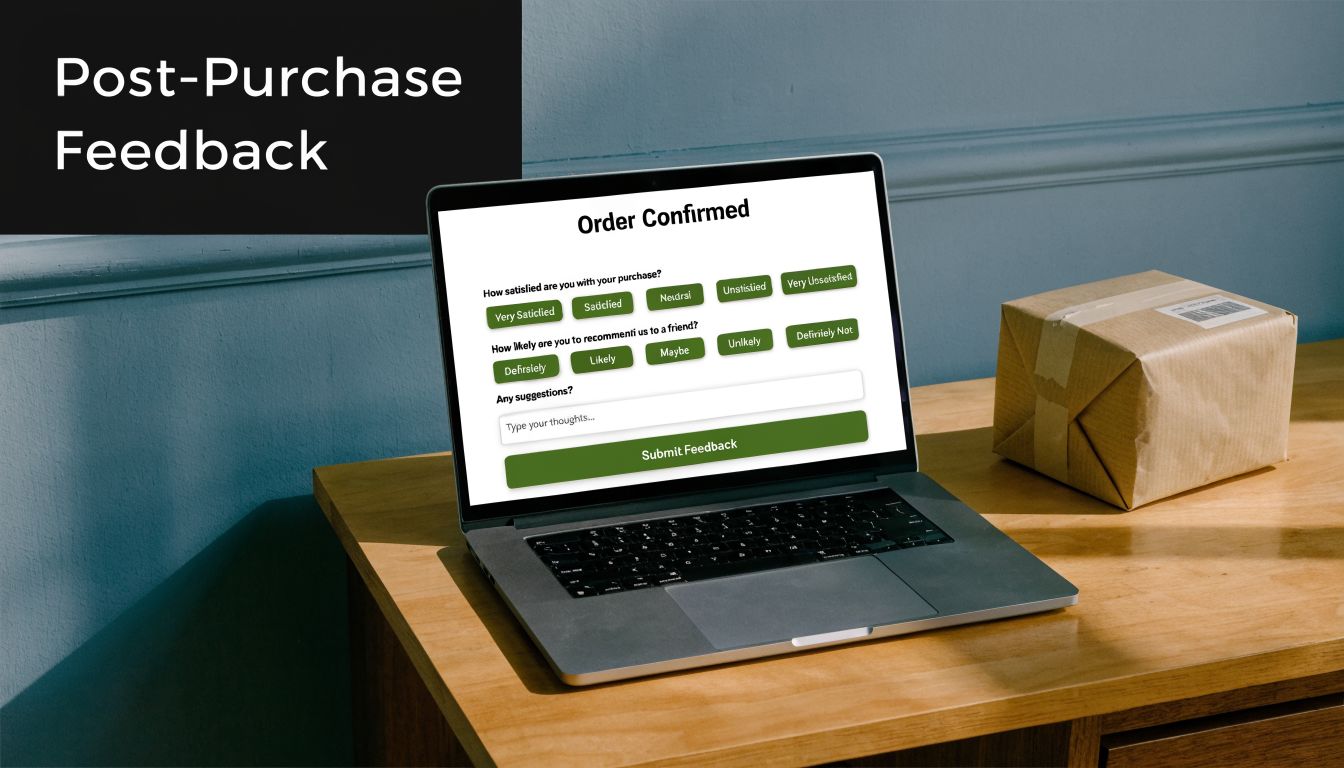
5. E-commerce Post-Purchase Feedback Form
Baymard Institute has repeatedly shown that checkout friction still costs ecommerce brands sales, with cart abandonment tied to issues like extra costs, forced account creation, and delivery uncertainty. A post-purchase feedback form helps you capture the customer’s version of those problems while the experience is still fresh.
This format matters because it sits between conversion data and operational reality. Analytics can show where a customer dropped, stalled, or converted. A short follow-up form explains why they hesitated, what felt unclear, and whether the order experience held up after delivery.
The timing needs to match what you want to learn. If the goal is checkout feedback, send the form soon after purchase. If the goal is packaging, delivery, or first-use quality, trigger it after the order arrives. We’ve found teams get cleaner data when they treat those as separate feedback moments instead of forcing both into one survey.
Split the form by customer moment
For ecommerce, we usually build this as a two-part BuildForm template.
The first version is a purchase experience form. It focuses on confidence, friction, and anything that nearly stopped the order. The second is a delivery and product-reality form. It checks whether shipping, packaging, and the item itself matched what the store promised.
That split improves response quality. Customers answer faster because each form asks about one memory, not the whole journey.
Here’s a practical structure for the post-purchase version:
- Checkout ease rating: “How easy was it to complete your purchase today?”
- Near-dropoff question: “Did anything almost stop you from ordering?”
- Delivery confirmation: “Did your order arrive on time and in good condition?”
- Expectation match: “Did the product match the description and photos on the product page?”
- Improvement prompt: “What should we improve about the buying experience?”
Conditional logic does the work here. If a customer says the product arrived damaged, show fields for issue type, photo upload, and preferred resolution. If they report hesitation during checkout, ask whether the problem was shipping cost, delivery speed, payment options, promo code issues, or trust signals. If everything went well, keep the path short and ask one final question about what gave them confidence to buy.
That gives you a form you can use, not just a screenshot-worthy survey.
A template that feeds the right team
We’ve found post-purchase feedback becomes much more useful once routing is built in from day one. Low checkout scores should go to growth or ecommerce operations. Delivery complaints belong in support. Repeated comments about product-page mismatch should go to merchandising or product marketing, because that usually points to weak photography, unclear sizing, or overpromised copy.
A simple automation flow looks like this:
- Send low checkout ratings to Slack for the ecommerce team
- Create a support ticket for damaged, missing, or late orders
- Tag product-page mismatch responses by SKU or category
- Push positive responses into a testimonial or review request flow
- Log all answers with order ID, device type, traffic source, and shipping method
Metadata matters a lot in this form. We prefer to pass order value, new vs returning customer status, fulfillment partner, and product category into the record automatically. The customer gets a short survey. Your team still gets enough context to spot whether complaints are concentrated in one carrier, one device type, or one product line.
Keep purchase-friction feedback separate from product satisfaction feedback. One improves conversion. The other improves fulfillment, merchandising, and retention.
If you want a post-purchase form that teams will keep using, optimize for routing first and reporting second. The best version is short for the customer, specific enough for diagnosis, and structured so each response lands with the person who can fix the problem.
6. Website and UX Feedback Form

Website feedback forms often fail because they interrupt before they help. A pop-up that fires on page load doesn’t collect UX insight. It creates a UX problem. If you want useful feedback on copy clarity, navigation, bugs, or page flow, the trigger has to align with behavior.
That’s why Hotjar-style on-page widgets and Qualaroo-style contextual prompts are more useful than generic “How are we doing?” boxes. They invite feedback when a visitor has interacted with the page enough to notice what works and what doesn’t.
Why most on-site feedback widgets underperform
The biggest blind spot is mobile. Plenty of advice says to keep forms short and simple, but there’s still very little practical guidance on solving mobile-specific abandonment with adaptive design, progressive disclosure, or device-aware layouts, as noted in Trustmary’s discussion of customer feedback form gaps. That matters because desktop and mobile users don’t behave the same way inside a form.
We’ve found static widgets are especially weak on small screens. They compete with navigation, take over too much space, or ask for typing before trust is established. A better setup starts with one tap-friendly question and only opens a text field if the user signals a problem.
A better website feedback build
A useful website and UX feedback form usually starts with one of these prompts:
- Page clarity prompt: “Did this page answer your question?”
- Navigation prompt: “Was it easy to find what you needed?”
- Issue report prompt: “Did anything on this page feel broken or confusing?”
- Annotation-style follow-up: “Tell us what happened” or “Which part was unclear?”
Use triggers carefully. Exit intent can work on desktop. Scroll depth or time-on-page is often safer for content pages. On product pages, a prompt after sustained interaction can surface pricing confusion, missing details, or comparison friction.
If you’re tuning the interaction itself, this guide to form UX design is a solid companion read.
One practical build choice makes a big difference. Hide longer text fields until the visitor selects “No,” “Confusing,” or “Report an issue.” On mobile, that small step reduces effort and keeps the initial interaction lightweight. It also improves data quality because the people who type are the ones with something specific to say.
7. Support Ticket and Service Feedback Form
Support teams get the highest-quality feedback in the shortest window. Right after a chat ends or a ticket is marked solved, customers still remember the handoff, the wait time, and whether the answer fixed the problem. That timing advantage disappears fast, so the form has to be short and tightly scoped.
We’ve found service feedback works best when it measures two different things: the support experience and the resolution outcome. If you blend those into one vague question, scores become hard to act on. A frustrated customer may rate the interaction poorly because the refund policy was rigid or the bug still exists, even if the agent handled the case well.
What to measure after a support interaction
The strongest version of this form starts with a single rating question tied to the interaction itself, then uses conditional logic to sort the follow-up.
A practical BuildForm template looks like this:
- Q1: Service rating
“How satisfied were you with the support you received?” - If score is low, show Q2
“What went wrong?” - If score is low, show Q3
“Is your issue resolved?” - If issue is unresolved, show Q4
“Would you like us to follow up?”
That flow keeps the form light for happy customers and gives support leads enough detail to act on poor experiences. For enterprise teams, Medallia’s guidance on closed-loop feedback management is useful because it focuses on routing responses to the right owner and following up while the context is still fresh.
The hidden fields matter as much as the visible questions. Pass agent name, ticket ID, queue, channel, product area, resolution status, and first-response time into the form automatically. Customers should never have to restate case details your systems already have.
A support form that drives action
Keep the visible form to two or three steps. That usually means one rating, one optional comment, and one conditional resolution check for low scores.
Use prompts like these:
- Core rating: “How satisfied were you with the support you received?”
- Open comment: “What could we have done better?”
- Resolution branch for detractors: “Is your issue fully resolved?”
- Recovery permission: “Can we contact you to fix this?”
This structure creates cleaner operations data. If the score is low and the issue is unresolved, the case likely needs recovery or escalation. If the score is low but the issue is resolved, the team should review tone, wait time, policy friction, or transfer quality instead of assuming the agent needs coaching.
Good support feedback should create a queue for action within hours, not a reporting deck at the end of the quarter.
For automation, trigger the form at ticket-solved, conversation-closed, or chat-ended events. Send low ratings to Slack or your help desk as alerts. Create a follow-up task when a respondent says the issue is unresolved. Tag repeated complaint themes so support ops and product teams can review patterns weekly. That is the difference between collecting service feedback and using it.
Comparison of 7 Customer Feedback Forms
| Survey | 🔄 Implementation complexity | 💡 Resource requirements | ⭐ Expected outcomes | 📊 Ideal use cases | ⚡ Key advantages |
|---|---|---|---|---|---|
| Net Promoter Score (NPS) Survey | Low, single-question with optional follow-up; easy automation | Low, simple form, CRM/webhook integrations; needs sufficient sample size | High ⭐, clear loyalty benchmark; predictive of referrals/churn | Customers at key milestones (30 days post-purchase, quarterly SaaS checks) | ⚡ Single, comparable metric; easy trend tracking |
| Customer Satisfaction (CSAT) Survey | Very low, 1–2 rating questions; simple branching | Minimal, embeddable stars/emojis; integrates with helpdesk | Moderate ⭐, measures immediate sentiment; actionable operationally | Post-transaction or post-support resolution (checkout, ticket close) | ⚡ Fast to complete; high response rates; team-level actionability |
| Customer Effort Score (CES) Survey | Low, single effort question with optional comment | Minimal, trigger after task completion; route results to product/support | High ⭐, pinpoints friction; strong retention predictor | After support cases, checkout, onboarding handoffs | ⚡ Identifies process friction; highly actionable for UX/product |
| Product Feedback Form Template | High, multi-section, ranking, conditional flows; analysis overhead | Higher, product team involvement, PM tool integrations, analysis time | High ⭐, rich qualitative + quantitative insights for prioritization | Beta tests, feature launches, roadmap prioritization with power users | ⚡ Deep input for roadmap decisions; direct feature validation |
| E‑commerce Post‑Purchase Feedback Form | Low–Moderate, embedded/confirmation-page or timed email; conditional paths | Low, e‑commerce platform integration; may include incentives | Moderate ⭐, immediate insight into checkout/delivery issues | Immediately after purchase/confirmation or post-delivery | ⚡ Timely feedback to reduce returns and fix fulfillment bottlenecks |
| Website & UX Feedback Form | Moderate, exit‑intent/behavior triggers plus annotation tools; QA required | Moderate, widget, screenshot/annotation capability, cross-device testing | Moderate–High ⭐, contextual feedback pinpointing page issues | High-traffic or conversion-critical pages (pricing, docs, checkout) | ⚡ In-context visual feedback reduces diagnostic time |
| Support Ticket & Service Feedback Form | Low–Moderate, auto-dispatch on ticket closure; conditional escalation | Moderate, tight helpdesk/CRM integration and localization for global teams | High ⭐, links feedback to agents; improves service and training | After chat, phone, or email support interactions to assess agent performance | ⚡ Quick, agent-specific insights; integrates with escalation workflows |
From Feedback to Action Your Next Steps
The best example of a customer feedback form isn’t the one with the nicest design. It’s the one your team can act on the same week it goes live. That usually means choosing one touchpoint, asking one core metric question, adding one smart follow-up, and wiring the response into the team that can fix the issue.
If you’re just getting started, don’t launch all seven form types at once. Pick the touchpoint with the clearest business value. For SaaS, that’s often support resolution, onboarding, or feature feedback. For ecommerce, it’s usually post-purchase, delivery, or on-site UX. Start where friction is visible enough that your team can recognize the signal quickly.
The second step is to tighten the scope. Keep each form focused on a single moment. NPS is for loyalty. CSAT is for satisfaction with a recent interaction. CES is for friction inside a task. Product feedback is for roadmap input. Website widgets are for usability and clarity. When teams blend these jobs together, the responses become harder to interpret and much harder to route.
Closed-loop follow-up is where the value compounds. A low support score should notify the service lead. Repeated complaints about checkout should reach ecommerce ops. Requests for the same feature should land with product. Positive responses can inform testimonials, positioning, or retention messaging, but only after you’ve handled the operational basics first.
Review cadence matters too. Weekly is better than quarterly for many teams because patterns show up faster and the customer context is still fresh. Read the verbatim comments, not just the averages. Scores tell you where to look. The language customers use tells you what they mean. That’s especially true when several people describe the same part of the experience as confusing, slow, or missing.
There’s also a real design lesson running through every form in this guide. Short wins. Relevant wins. Conditional logic wins. Mobile-friendly wins. Static, one-size-fits-all surveys usually underperform because they ask every respondent to do the same amount of work, even when their context is different. That’s unnecessary friction.
If you’re building these systems now, BuildForm is one option that fits this workflow well because it supports conditional logic, adaptive form flows, integrations, and analytics that help teams see abandonment and completion behavior in real time. The tool matters less than the discipline, though. Trigger the form at the right moment. Ask fewer questions. Route every meaningful response to a person who can act on it.
That’s how feedback becomes a growth engine instead of a reporting exercise. Start with one form. Ship it. Review it every week. Improve the experience that triggered it. Then expand from there.
If you want to turn any example of a customer feedback form into a working, adaptive flow, BuildForm gives you a practical way to do it. You can generate forms quickly, add no-code conditional logic, connect responses to your stack, and refine mobile performance with real-time analytics instead of guesswork.