You’re probably in a familiar spot. Traffic is coming to the site, campaigns are running, and people are clicking through. But when you check the pipeline, there isn’t much to show for it.
That gap often comes down to one small asset that carries a huge job: the lead generation form.
A lot of teams treat a form like a data capture box. Name, email, company, submit. But that framing misses the core point. A form is the moment a stranger decides whether to start a relationship with your business. If the experience feels confusing, intrusive, or low value, they leave. If it feels clear and useful, they raise their hand.
The smartest way to think about a lead generation form is as a strategic conversation. Good forms don’t just collect information. They guide, reassure, qualify, and move people toward the next step.
Table of Contents
- The Bridge Between Visitor and Lead
- Choosing the Right Type of Lead Form
- Anatomy of a High-Converting Form
- Key Metrics for Measuring Form Performance
- How to Optimize Your Forms for Maximum Conversion
- From Build to Pipeline Implementing Your Form
- Frequently Asked Questions About Lead Generation Forms
The Bridge Between Visitor and Lead
A visitor lands on your page with a question in mind. They want a demo, a guide, a quote, a discount, or an answer. Your lead generation form is the bridge between that interest and an actual business opportunity.
That’s why forms matter more than many marketers first realize. 84% of marketers rely on form submissions as their primary method for converting visitors into leads (Exploding Topics). In practice, that means your form isn’t a minor page element. It’s one of the main ways marketing turns attention into pipeline.
A physical store analogy helps. If someone walks into a showroom and no one greets them, they wander. If the front desk asks for too much before helping, they leave. But if a staff member quickly understands why they came in and points them to the right next step, the conversation moves forward.
A website works the same way.
Why the form is more than data capture
A weak form says, “Give us your information.”
A strong form says, “Tell us just enough so we can help.”
That difference changes everything. When the form feels like a helpful exchange, people are more willing to engage. When it feels like paperwork, they hesitate.
A lead generation form should answer the visitor’s unspoken question: “Why is this worth filling out right now?”
This is also why form strategy can’t live in a silo. Offer, page copy, audience intent, follow-up, and field design all affect the outcome. If you want a practical companion resource on that bigger system, Scalelist's lead generation recommendations are useful for connecting form choices to broader campaign planning.
What new marketers often miss
New coordinators usually focus on getting a form live. That’s understandable. But the bigger job is making sure the form matches the promise on the page.
A visitor who wants a downloadable template expects a short exchange. A buyer requesting a customized demo expects more qualification. If those expectations and the form design don’t line up, conversions suffer and sales gets weaker leads.
Choosing the Right Type of Lead Form
Not every lead generation form should look or behave the same. The right structure depends on what the visitor wants and how much commitment the moment justifies.
A newsletter signup asks for a small step. A demo request asks for a bigger one. A webinar registration sits somewhere in the middle. If you use the same form logic for all of them, you’ll either create too much friction or collect too little context.
Match the form to buyer intent
The easiest way to choose a form type is to ask one question first: What job is this form doing?
If the job is opening a conversation, keep it short and clear. If the job is qualifying serious buyers, ask for more context. If the job is segmenting interest, build a flow that adapts based on answers.
Here’s a practical way to view this:
- Contact or inquiry forms work when someone is already close to talking to sales or support.
- Gated content forms work when you’re exchanging useful information for contact details.
- Demo or consultation forms work when a rep needs enough detail to personalize follow-up.
- Registration forms work when the user is committing to an event, session, or timed experience.
- Quiz or assessment forms work when the experience itself helps qualify and educate at the same time.
If you want examples of how these formats show up across different industries, this roundup of lead generation form examples is a good reference point.
Lead generation form types compared
| Form Type | Primary Goal | Ideal Field Count | Common Use Case |
|---|---|---|---|
| Contact form | Start a direct conversation | Low | Service inquiry, quote request |
| Gated content form | Exchange value for contact info | Low to medium | Ebook, template, report |
| Demo request form | Qualify a sales opportunity | Medium | SaaS demo, product walkthrough |
| Webinar registration form | Secure attendance and topic interest | Medium | Live event signup |
| Free trial form | Remove friction to first product use | Low | SaaS onboarding |
| Quiz or assessment form | Segment and personalize | Variable, shown progressively | Product match, needs assessment |
A simple decision rule
Use the shortest form that still supports the next action.
That sounds obvious, but teams often get pulled in opposite directions. Sales wants more detail. Marketing wants fewer fields. The right answer usually depends on timing. Early-stage offers need less commitment. High-intent requests can support more questions if each one has a clear purpose.
Practical rule: If you can’t explain why a field improves routing, follow-up, or personalization, it probably doesn’t belong.
Anatomy of a High-Converting Form
A high-converting lead generation form isn’t just “short.” It’s well organized. Each part lowers uncertainty and helps the visitor keep moving.
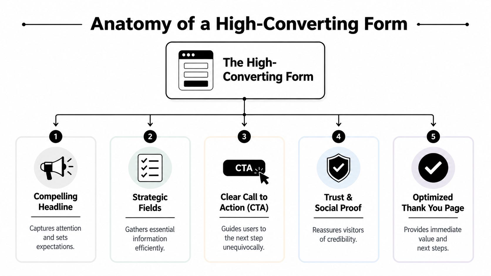
The biggest mistake people make is treating all form elements as equal. They aren’t. The headline carries one job. The field list carries another. The button, privacy language, and thank-you experience all affect whether the interaction feels easy and trustworthy.
What each part is doing psychologically
Start with the top of the form. The headline should make the value obvious, not clever. A visitor should know what they’re getting and why it matters without rereading it. A vague line like “Let’s connect” makes the user do extra interpretation work.
The supporting text reduces ambiguity. It allows you to tell people what happens next, how long it takes, or what they’ll receive. Even one sentence can lower hesitation.
The fields are where friction becomes visible. Every added field asks the user to spend effort, give up privacy, or both. That’s why field count matters so much. Reducing form fields from 10 to 4 can boost conversions by 120% (Akismet).
That result makes sense when you think about user psychology. Each question creates a small decision:
- Why do they need this?
- Is this worth sharing?
- Am I getting enough value back?
- What happens after I submit?
The form should answer those concerns through design, not force the user to guess.
Structural choices that quietly improve completion
A few design choices do a lot of work:
- Single-column layout keeps the flow obvious and easier to scan.
- Plain field labels beat jargon every time.
- Helpful defaults and autofill support reduce manual effort.
- A clear CTA should describe the outcome, not just say “Submit.”
- Trust signals like privacy language or consent context reduce anxiety.
If you want a deeper walkthrough of those design decisions, this guide to form design best practices is worth bookmarking.
Your form should feel like a guided path, not an exam.
The hidden role of the thank-you page
Many teams stop thinking at the submit button. That’s a missed opportunity.
The thank-you page confirms the action worked and tells the lead what happens next. For a content download, it should deliver the asset cleanly. For a demo form, it should set expectations about timing and follow-up. For an ecommerce lead capture flow, it might direct the visitor to a relevant category, offer, or onboarding step.
A good thank-you page keeps the conversation alive. It turns “I submitted” into “I know what to do now.”
Key Metrics for Measuring Form Performance
A form can look polished and still underperform. That’s why form work needs measurement, not just design opinions.
Many teams only track total submissions. That number matters, but it doesn’t tell you where the friction is. To improve a lead generation form, you need a closer view of user behavior.
Look beyond total submissions
A healthier measurement stack usually includes:
- Form views so you know whether people are even seeing the form
- Starts so you can tell whether visitors are engaging with it
- Completion rate to measure how many finish after starting
- Field drop-off to spot the exact point where people quit
- Average time to complete to reveal confusion or unnecessary effort
- Device-level performance to compare desktop and mobile behavior
Specialized tracking becomes useful. A general analytics dashboard can tell you a page converted poorly. Form-specific tooling can tell you whether the phone field scared people off, whether a required dropdown caused confusion, or whether mobile users struggled with spacing. For a hands-on explanation of that workflow, see this article on form analytics.
What common patterns usually mean
Patterns matter more than isolated numbers.
If people view the page but don’t start the form, the offer or placement may be weak. If they start but drop at one specific field, that field may feel unnecessary, invasive, or unclear. If mobile users abandon more often than desktop users, your layout, tap targets, or input types may be causing friction.
Here’s a simple interpretation guide:
| Signal | What it often means |
|---|---|
| High views, low starts | Weak value exchange or poor form placement |
| High starts, low completions | Too much effort or unclear questions |
| Drop-off at phone number | Trust issue or low perceived necessity |
| Long time on one field | Confusing label or difficult input format |
| Strong desktop, weak mobile | Mobile usability problem |
If you’re building a broader KPI dashboard around lead generation, Salesmotion insights on lead gen KPIs can help connect form metrics to the rest of your funnel.
Don’t ask, “Is the form working?” Ask, “Where does the conversation break?”
How to Optimize Your Forms for Maximum Conversion
Optimization works best when you stop treating the form like a fixed object. It’s a living part of the customer journey. You adjust it based on how people behave, what they need, and how much effort the moment can support.
A strong optimization process usually starts with friction, then moves into relevance, then into data quality.

Start with mobile friction
Mobile is often where forms lose people first. Small tap targets, the wrong keyboard, cramped layouts, and long visible forms create effort fast.
That’s why mobile-first form design matters so much. Mobile-first technical specs in lead gen forms, such as using HTML5 input types and ensuring large touch targets, can reduce friction by 40% and address the 60% drop-off rate seen on unoptimized mobile forms (monday.com).
That translates into practical design decisions:
- Use the right input type so email fields call up an email-friendly keyboard and phone fields call up a numeric keypad.
- Keep the layout single-column so users move straight down the page.
- Make buttons and inputs large enough to tap easily.
- Support autofill so users don’t have to type what their browser already knows.
A lot of marketers know these as best practices. Fewer connect them to psychology. On mobile, the user has less patience and less physical precision. Every avoidable tap, zoom, or correction increases the chance they bail out.
Turn static forms into guided conversations
Once the technical friction is under control, the next gain often comes from making the form feel less like paperwork.
A static form shows everyone the same questions in the same order. A conversational or adaptive form responds to the user’s intent. That changes the emotional tone of the experience. Instead of “fill this out,” the interaction feels more like “help us point you in the right direction.”
A few methods work especially well:
Progressive profiling
Instead of asking everything at once, ask for the minimum now and gather more context later. This is useful when the first conversion is informational, not sales-ready.
The logic is simple. Early in the relationship, the user hasn’t earned enough trust with you yet. So don’t ask them for enterprise-level detail on the first interaction.
Conditional logic
Conditional logic reveals only the questions that matter based on previous answers. If someone selects “I’m comparing vendors,” you can ask about timeline. If they choose “I just want the guide,” you can keep it short.
This preserves relevance. It also makes the form feel smarter because the user isn’t forced through irrelevant fields.
Journey-based segmentation
Some forms can do more than collect leads. They can sort those leads by need, urgency, or product fit while the person is still interacting with the page.
Segmented forms yield 2x higher SQL rates according to the verified data tied to Ironmark USA. The reason is intuitive. When you tailor the path inside the form, sales doesn’t just get a contact. They get context.
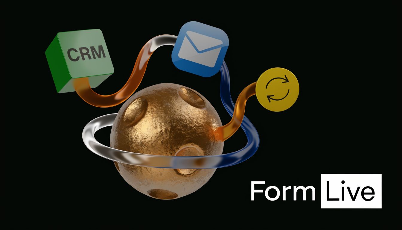
One modern way teams handle this is with tools that support conversational logic, adaptive flows, analytics, and CRM connections in one place. BuildForm is one example. It lets teams create AI-assisted, conditional forms that adapt to answers instead of showing one static field list to everyone.
A short explainer is useful here if you want to see conversational form thinking in action:
Capture context without adding visible friction
One of the most overlooked optimizations is the use of hidden fields.
Hidden fields let you capture contextual data like landing page source, referrer details, or campaign parameters without asking the visitor to type anything extra. That matters because it helps marketing and sales understand where the lead came from without increasing visible effort.
According to the verified data tied to Trustmary, hidden fields can improve sales close rates by 20-30% through better personalization. That makes sense. If a rep knows which campaign, page, or offer brought the lead in, their follow-up can be more relevant from the first message.
The best qualification data isn’t always the data you ask for directly. Sometimes it’s the context you capture quietly in the background.
A useful optimization stack often looks like this:
- Visible fields collect only what the user should reasonably expect to give.
- Conditional logic reveals only what’s needed for that path.
- Hidden fields capture channel and page context automatically.
- Analytics show where users hesitate, abandon, or complete.
That combination turns a static form into a real conversation. It’s easier for the visitor, and it gives your team better information.
From Build to Pipeline Implementing Your Form
A lead generation form doesn’t create value until it’s live, connected, and followed up properly. Otherwise, good strategy can still fall apart. The form looks great, but the lead sits in an inbox, the CRM field mapping breaks, or the follow-up email never lands.
A practical launch checklist
Start with the basics. Embed the form on the right page, then test the full path yourself. Submit it as a user would. Check whether the record appears in your CRM, whether the right person gets notified, and whether the thank-you experience matches the promise on the page.
Then review the handoff:
- CRM routing should send the lead to the right list, owner, or stage.
- Notifications should alert sales or success teams without delay.
- Confirmation emails should arrive quickly and contain the expected asset or next step.
- Thank-you pages should keep momentum going with a clear follow-up action.
Email delivery deserves special attention. If your confirmation or nurture emails land in spam, the whole experience feels broken to the lead. A useful troubleshooting reference is MailGenius’s guide on how to stop email from going to spam in Gmail.
Fast follow-up matters because the lead is most engaged right after submission.
Finally, test edge cases. Try mobile. Try a broken required field. Try a duplicate submission. A reliable form pipeline is part UX, part operations.
Frequently Asked Questions About Lead Generation Forms
Should I ask for a phone number
Only if the next step clearly requires it.
If someone is requesting a sales call or consultation, a phone number may make sense. If they’re downloading a checklist or joining a newsletter, it often feels too heavy. The rule is simple: the field should match the value exchange.
Is a longer form ever better
Yes, when the user expects a higher-touch next step and your team needs context to respond well.
A short form usually increases volume. A more detailed form can improve qualification. The mistake isn’t using a longer form. The mistake is using one when the offer doesn’t justify it.
What should happen after someone submits
Three things should happen quickly.
First, the user should get confirmation that the form worked. Second, they should receive the promised value or clear next steps. Third, your team should have the information routed into the systems they already use so follow-up isn’t manual.
Should I use a single-step or multi-step form
Use the format that makes the effort feel manageable.
Single-step forms work well for simple offers. Multi-step forms can help when you need more detail but don’t want to overwhelm the user up front. The deciding factor isn’t trendiness. It’s whether the structure supports clarity and momentum.
What’s the biggest mistake teams make
They design the form for internal convenience instead of user confidence.
Visitors don’t care how your CRM is organized. They care whether the interaction is worth their time, whether it feels safe, and whether the next step is obvious. Build from that perspective first.
If you want to turn forms into guided, adaptive conversations instead of static field lists, BuildForm offers AI-powered form building, conditional logic, analytics, and integrations that help teams capture leads with less friction and better context.