Baymard Institute reports that the average documented cart abandonment rate is about 70%, and one recurring cause is checkout form usability problems such as too many fields, weak input design, and missing convenience features, as cited in this analysis referencing Baymard's checkout findings. That should change how you think about an online order form.
Many organizations still treat the form as admin. It isn't. It's the last moment where a buyer decides whether completing the purchase feels easy enough, safe enough, and worth the effort on the device in their hand.
A high-converting online order form reduces cognitive load first. Field count matters, but so does timing. Asking for the wrong detail too early creates hesitation. Forcing mobile users to type what you could infer, prefill, or delay creates friction. Requiring trust before you've earned it causes drop-off. Good forms respect attention. Great forms protect momentum.
Table of Contents
- Why Your Online Order Form Is Leaking Revenue
- Designing the Foundation for Trust and Clarity
- From Field Selection to Secure Payments
- Optimizing for Clicks Not Frustration
- Using Data to Find and Fix Conversion Bottlenecks
- Automating Your Workflow After Submission
Why Your Online Order Form Is Leaking Revenue
An online order form leaks revenue when it asks buyers to stop and think too often.
That usually happens in ordinary ways. A field label is vague. The form asks for a phone number before showing shipping methods. Error messages appear only after submission. A mobile buyer has to switch keyboards three times. None of these issues looks dramatic in a design review, but together they make completion feel like work.
The mistake is treating friction as a visual problem only. Friction is often a sequencing problem. If the form asks for information before the buyer understands why it matters, trust drops. If the form shows every possible path at once, the buyer has to sort the interface in their head before they can place the order.
Practical rule: Every field should answer one of two questions. Does the business need this to fulfill the order right now, or is it asking for convenience at the customer's expense?
Poor online order forms also fail because teams optimize for internal completeness instead of buyer momentum. Sales wants qualification data. Ops wants every edge case covered. Finance wants strict billing detail. Legal wants broad consent language. The customer just wants to finish.
That's why the right question isn't “What information should we collect?” It's “What can we postpone, infer, prefill, or remove without hurting fulfillment?” Once you work from that lens, better decisions follow. Multi-step flows make more sense. Conditional logic becomes necessary. Mobile design stops being a smaller desktop and becomes its own conversion environment.
Designing the Foundation for Trust and Clarity
An online order form works best when it feels obvious from the first tap. Buyers shouldn't need to decode the structure or wonder why you're requesting a detail. They should be able to predict what comes next.
That's one of the biggest changes in the shift from paper ordering to digital workflows. Online order forms moved order capture from manual paperwork to centralized digital records, which lets businesses create a cleaner order database and reduce manual errors, as described in Typeform's guide to how online order forms store and organize submissions. That operational shift matters, but the customer-facing effect matters just as much. The form is now part of the buying experience, not just a recordkeeping artifact.
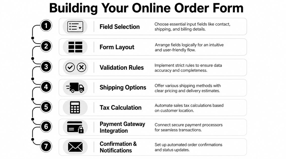
Start with only what the order needs
Trust begins with restraint. If you sell a digital download, don't ask for a shipping address. If fulfillment happens by email, don't lead with a phone field unless there's a clear reason. If “company size” won't affect the transaction, don't put it in the critical path.
A strong form foundation usually includes these components:
- Buyer identity details that support delivery or confirmation, such as name and email
- Order-specific information like product choice, quantity, options, or service scope
- Fulfillment details only when they're necessary, such as shipping address or scheduling preferences
- Payment inputs at the point where value is clear and totals are already understandable
Data minimization becomes practical, not theoretical, at this stage. Asking for less unexplained data triggers less suspicion.
A buyer doesn't judge your form field by field. They judge the form by how much effort and trust it demands before it gives them confidence.
Build a sequence that answers unspoken questions
Field order should mirror the buyer's mental checklist. What am I buying? What does it cost? How will I receive it? What do you need from me? How do I pay?
When teams reverse that sequence, completion suffers. Asking for detailed personal information before confirming product configuration or delivery creates anxiety because the buyer still lacks context. Showing payment fields before the total feels stable creates hesitation because the buyer fears hidden changes.
A simple flow often looks like this:
| Form stage | User question | What belongs here |
|---|---|---|
| Product selection | What am I ordering? | item choice, variants, quantity |
| Fulfillment setup | How will this reach me? | shipping, delivery, scheduling |
| Contact details | How will you confirm it? | name, email, phone if needed |
| Payment | What am I paying now? | total, tax, payment fields |
For teams refining structure, this broader guide to form design best practices is useful because it forces the right conversation early. Not “what can the form technically collect,” but “what sequence makes the buyer feel in control.”
From Field Selection to Secure Payments
A good build process starts with subtraction. Before choosing styles, gateways, or integrations, decide what the shortest credible path to purchase looks like. Then add complexity only where the order requires it.
Choose the minimum viable field set
Most online order forms need fewer fields than teams think. Start by separating requirements into three groups:
- Essential to take payment
- Essential to fulfill the order
- Nice to have after submission
That third group is where many forms go wrong. Marketing preferences, referral source, internal segmentation, and optional discovery questions often belong on a thank-you page or in a follow-up flow, not before checkout.
Use this as a practical filter:
- Keep now when the answer changes price, fulfillment, or legal delivery requirements
- Ask later when the answer helps sales, reporting, or personalization but doesn't block the transaction
- Remove entirely when nobody can point to a concrete operational use
If you need a field library to make these decisions faster, this reference on types of form fields helps match field type to intent, which reduces both clutter and validation errors.
Use conditional logic to delay complexity
Conditional logic is one of the most powerful tools in form building because it reduces visible complexity without removing capability.
If a buyer selects a digital product, hide shipping entirely. If they choose pickup, don't show delivery-date windows meant for courier orders. If they select “business purchase,” reveal VAT or company billing fields only then. This keeps the form relevant without making it look incomplete.
Here's where teams benefit from thinking like a CRO specialist instead of a form designer. The point of conditional logic isn't cleverness. The point is to preserve momentum by showing only the next decision that matters.
A simple decision structure looks like this:
| User choice | Reveal | Hide |
|---|---|---|
| Physical product | shipping address, delivery options | digital delivery fields |
| Digital product | email delivery details | shipping section |
| Pickup | collection window, pickup location | courier methods |
| Business purchase | company name, billing identifiers | business-only fields for personal buyers |
This is also the point where one tool choice can shape execution. BuildForm, for example, supports no-code visual logic and adaptive flows, which is useful when you need the form to change based on product type, order path, or buyer intent without handing every update to engineering.
If your form shows every possible branch to every user, you're making customers process your internal complexity.
Make calculations and payment handling invisible
Modern online order forms can automatically calculate totals, tax, and payments, while inventory can update when customers make selections, according to Cognito Forms' explanation of automated calculations and payment-ready order forms. That matters because manual math destroys confidence fast.
Users shouldn't have to estimate their final cost, wonder whether shipping is included, or discover extra charges only after pressing submit. They also shouldn't need to reconcile line items mentally. The form should do that work.
Secure payment handling follows the same principle. Buyers need clarity before they need reassurance. Show the order summary, confirm the amount, then present payment. Don't bury fees. Don't make users edit product choices from a payment-only screen. Don't force a full page reset because one card field failed validation.
A cleaner payment experience usually includes:
- Visible order summary before payment entry
- Auto-calculated totals that update as options change
- Tax handling based on relevant location logic
- Inventory-aware availability so buyers don't attempt to purchase unavailable options
- Confirmation messaging immediately after submission, with next steps clearly stated
Forms convert better when the buyer doesn't have to double-check the machine.
Optimizing for Clicks Not Frustration
A lot of form optimization advice is still too cosmetic. It focuses on colors, button styles, or generic simplification. Those things matter less than structure. The biggest gains usually come from making the path easier to understand and easier to complete on a phone.

Why simpler layouts win
Benchmark data summarized by Fluent Forms shows that single-column layouts improve completion by 15.4%, multi-step forms convert 86% higher, and inline validation can boost success rates by 22% in form contexts, based on this roundup of online form conversion benchmarks. Those numbers line up with what practitioners see in testing. When the form is easier to parse, people finish it more often.
Single-column layouts reduce visual decision-making. Users move downward, not back and forth. Multi-step forms work when they chunk effort into manageable pieces and make progress feel finite. Inline validation helps because users can fix issues at the moment they occur instead of discovering a stack of errors at the end.
The catch is that these patterns only work when they're implemented well. A multi-step flow with vague step labels can feel slower than one page. Inline validation that fires too early can feel accusatory. Single-column layouts still fail when every field looks equally important.
What mobile users need from your form
Mobile form friction is partly about screen size, but mostly about effort. Thumbs are imprecise. Keyboards cover context. Typing is slow. Buyers are often interrupted.
That changes what “good UX” means. On mobile, a high-performing online order form usually does these things:
- Uses smart defaults where the likely choice is obvious and low-risk
- Shows the right keyboard for each field, especially numeric and email inputs
- Supports address autocomplete to reduce typing burden
- Reveals fields progressively instead of front-loading every possibility
- Keeps button copy concrete so users know exactly what happens next
For teams evaluating supporting tools beyond the form itself, these mobile-optimized lead capture tools are worth reviewing because they show how mobile-first input patterns can reduce effort in real browsing conditions.
A quick visual walkthrough helps make these trade-offs easier to spot in practice:
Where teams still create avoidable friction
The common failures aren't exotic. They're habits.
- Over-explaining with placeholder text instead of writing clear labels
- Using long dropdowns where autocomplete or radio choices would be faster
- Forcing optional questions into required paths
- Hiding shipping cost or delivery timing until too late in the flow
- Making error recovery hard by clearing entries or jumping users to the wrong place
The best test for friction is simple. Hand the form to someone on a phone and watch where they pause. Pauses often reveal uncertainty, not inability. If users hesitate, the form is making them think too much.
Using Data to Find and Fix Conversion Bottlenecks
Once the online order form is live, instinct becomes less useful than evidence. Teams often know completion is weak but not where the experience breaks. The fix isn't a redesign spree. It's better instrumentation.
123FormBuilder recommends tracking where users spend the most time or where they drop off, because abandonment insights and completion metrics can reveal which specific fields create exits, as explained in its guide to analyzing form friction and abandonment points.

Track behavior at the field level
Field-level analysis changes the quality of your decisions. If users abandon after shipping method selection, that suggests something different from abandonment after phone number entry. One may signal pricing shock. The other may signal privacy resistance or input friction.
Useful signals include:
| Signal | What it can reveal |
|---|---|
| Drop-off by field | where trust or effort breaks down |
| Time on field | confusion, poor labels, hard input formats |
| Error frequency | validation mismatch or unclear requirements |
| Partial submissions | how far users get before leaving |
Partial submission data is especially valuable because it shows intent. If users consistently reach payment and leave, your issue probably isn't top-of-form messaging. If they leave early, structure and trust are stronger suspects.
Measure the exact point of hesitation. “The form underperformed” is too vague to improve anything.
Run smaller tests with clearer hypotheses
A/B testing works better when the change is tied to one suspected friction source. Don't test five ideas at once because the result will be hard to interpret.
Good hypotheses tend to look like this:
- If we move optional business fields behind a conditional branch, more personal buyers will complete
- If we replace a dropdown with address autocomplete, mobile users will move through fulfillment faster
- If we rename the final button to reflect the next action, fewer users will hesitate at submission
What usually doesn't work is broad aesthetic tweaking. Swapping accent colors or button radius rarely fixes a field that feels invasive or a step that appears premature.
The strongest optimization loop is short and repeatable. Observe the bottleneck. Form a narrow hypothesis. Ship the smallest change that addresses it. Review the next set of user behavior. Then repeat. That discipline beats occasional redesigns because it keeps your team working on real buyer resistance instead of opinions.
Automating Your Workflow After Submission
A form that converts well but dumps work onto your team is only half-finished. The best online order form reduces effort for the buyer and for the business after submission.
Send order data where work already happens
Once a customer submits, the form should trigger the next action without someone copying data between tools. That usually means routing orders into a CRM, sending fulfillment details to operations, notifying sales or support in Slack, and logging records in your internal workspace.
If you're mapping these handoffs, examples like these business process automation examples are helpful because they show how repetitive operational tasks can move out of email and spreadsheets into defined workflows.
The practical gain is consistency. Teams respond faster when notifications arrive in the systems they already watch. Finance has cleaner records when payment and order details stay linked. Support resolves issues faster when order context is available without manual digging.
Treat submission as the start of the workflow
Post-submission automation should cover more than alerts. It should shape the entire next step for the customer.
That can include:
- Confirmation emails with order details and expected next actions
- Internal routing rules based on product type, region, or urgency
- CRM updates so sales or account teams see the order in context
- Task creation for fulfillment, onboarding, or service delivery
For teams planning those connections, this overview of the integration of forms into business workflows is a useful reference point. It helps translate a submitted form from a static record into the trigger for an actual process.
A well-built online order form doesn't end at the submit button. It starts a cleaner customer lifecycle, with less manual work, fewer avoidable errors, and a faster path from purchase to fulfillment.
If you want to build an online order form that reduces friction, adapts to user input, and connects submissions to the rest of your workflow, BuildForm is one option to evaluate. It supports conversational and conditional form flows, payment-friendly setups, analytics, and integrations so you can improve both conversion and operations without rebuilding the process from scratch.